Extreme values (otherwise known as ‘outliers’) are data points that are sparsely distributed in the tails of a univariate or a multivariate distribution.
The understanding and management of extreme values is a key part of data management. Extreme values influence statistical analysis and it is important to find ways to discount their influence.
Extreme value management follows these steps:
- Data validation to sieve out any nonsensical or impossible data.
- Variable transformations to contain variation.
- Judgment of distributional form to identify skewness, multi- modalities and unexpected patterns.
Sample size and distributional form
The discussion of extreme values is only relevant when the sample is large enough and there is good knowledge of distributional form.
That is to say, given the Law of Large Numbers and the population probability distribution from which the sample is drawn, we can confidently say that a value is much smaller or much larger than typically expected.
It is easy to be fooled by an impression of extreme values in skewed distributions. Extreme values comes naturally with natural skewness. The largest the skewness the more seemingly extreme are the values. Here is an example of a sample of randomly drawn values from a log-normal distribution, for sample size n=5, 50, 500, 5000:

The far left-hand side graph describes the distribution of a random sample of 5 observations drawn from a standard Log-normal; four observations are clustered tightly together and 1 observation (shown in red) is far off to the right. Regardless if we increase the sample to 50, 500 and 5,000 the extreme observation in red still appears to be somewhat extreme. But this is just a natural consequence of drawing values from a highly skewed probability distribution.
See what happens when we transform the standard log-normal to a standard normal distribution (i.e. we take the log transformation of the above variable):

The observation highlighted in red is equal to z = 4 in the standard Normal scale. For small samples, at n = 5 or n = 50, the red-coloured observation appears as extreme, but as we increase the sample to 500 or 5,000 it no longer seems extreme – it is just another value in the tails of the normal distribution.
Indeed, the red-coloured value has only a probability of 0.000031 to be observed, but this does not mean that it is unlikely to be observed. It really depends on the context on whether we should define z = 4 as an extreme value or not.
Sources of extreme value
If extreme values persist in large samples and we have good knowledge of the underlying probability distribution, then this could be because of one of the following reasons.
First, the extreme values could be due to truly extraordinarily large random noise, e.g. in a standard normal distribution the probability that we observe the value of -5 or 5 is equal 0.00000028. Although this is a low probability we cannot say that this is improbable.
Second, the extreme values may be a result of falsely assuming that they belong in the population of interest. All data analysis begins by making the assumption that the sample is drawn from a population with shared characteristics (i.e. the observations are identically distributed). If an observation is exceedingly small or large it could be because it belongs to a different population.
Third, the extreme values could be result of human error or machine error. Genuine errors can be easily picked when they are too large or too small, but we cannot pick up errors that wrongly assign observations with values that fall within the expected part of the density.
Univariate vs. multivariate values
Univariate extreme values are relevant to the analysis of one distribution (one variable). Multivariate extreme values are relevant to the analysis of combined or conditional distributions (many variables).
A value that be classified as extreme in a univariate relation may not be extreme in a multivariate relation.
A value that may be classified extreme in a multivariate relation may not be extreme in a univariate relation.
To demonstrate this effect, consider a random sample of audit fees paid by the top firms listed on the ASX, relative to the ratio of total assets over total subsidiaries. Total assets is a strong determinant of audit fees because it represents the size of the audit (i.e. the more assets the more work for the auditor). Total assets per subsidiary measure the average size of the audit relative to the complexity of having to go through the many subsidiaries to find this information:
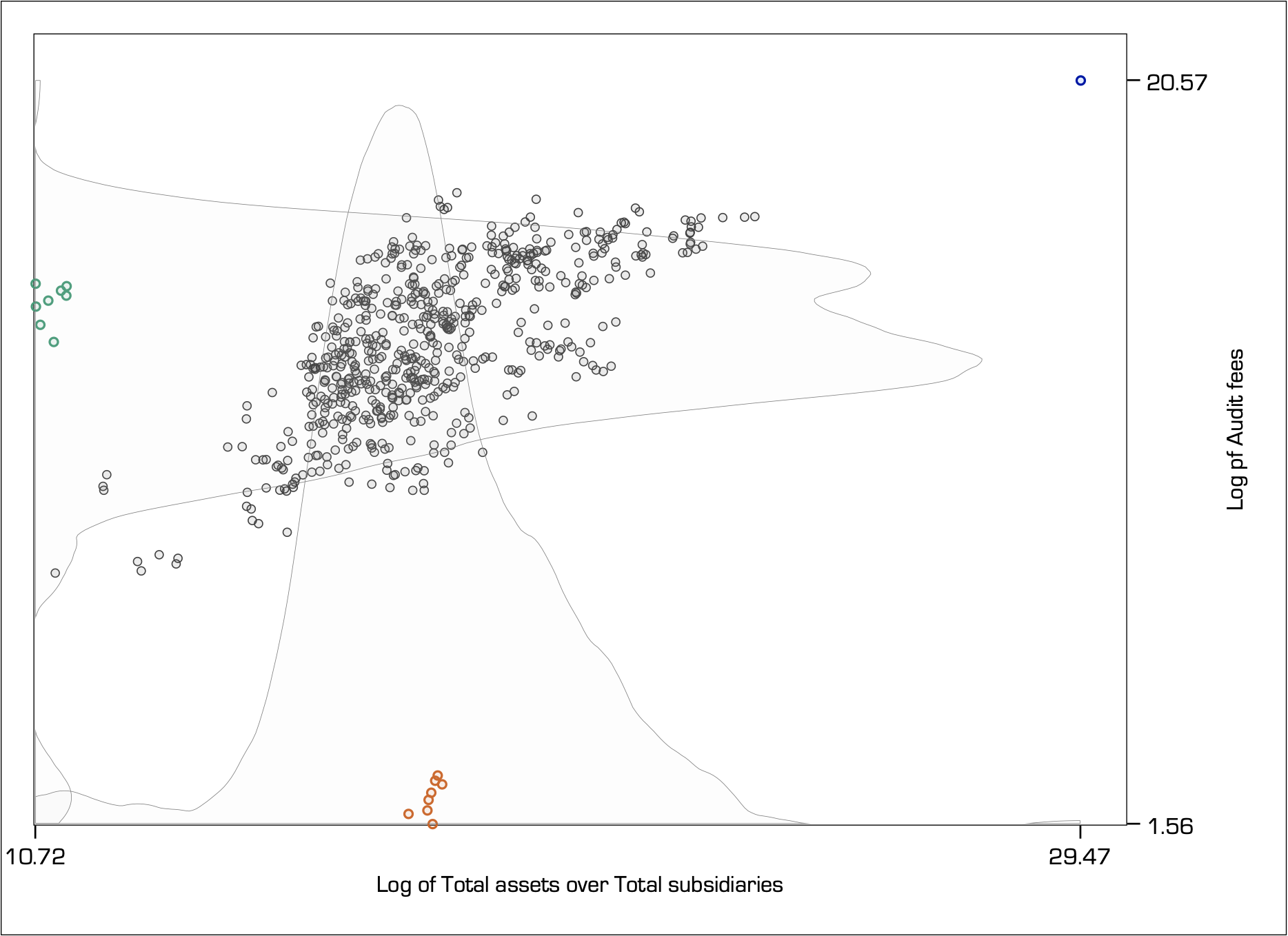
The univariate kernel densities estimate the shape of the distribution for the Log of Audit fees (y-axis variable) and the Log of Total assets to Total subsidiaries (x-axis variable).
For the y-axis variable, notice how the green-coloured observations are at about average, but the orange-coloured observations appear extremely small. So, the orange observations could well be classified as extreme for the y-axis variable.
The opposite happens for the x-axis variable. Here, the orange-coloured observations are simply at about average and the green-coloured observations are extremely small, so they would be classified as extreme for the x-axis variable.
Also, for both the y-axis and the x-axis variables, the blue-coloured observation in the top right hand-side corner appears to be extremely large.
However, when we shift our focus on understanding the bivariate relation (i.e. as shown by the scatter plot), the classification of extreme values becomes more complex. The green, orange and blue-coloured observations all appear to be far away from the centre of the bivariate density yet they have a different effect in the estimation of the conditional mean.
Leverage effect
The furthest away an extreme value is from the mass of the bivariate density the greatest is its influence. This effect is known as leverage.
The graph below shows the relation between two independent simulated standard normal variables for a sample of 1,001 observations. As shown in the far left hand-side graph, the correlation is close to zero thus the near flat linear fit. The introduction of a single multivariate extreme value to the top right ‘leverages’ the relation upwards. The further away the extreme value lies the greatest the leverage (lines indicate the fit from the linear regression model):

Another way of thinking about this effect is in terms of zooming in or out. If you zoom in where the greatest mass lies, then you exclude the extreme value. The more you zoom out to include values that lie well away from the main mass, then you place increasingly more weight to them. Notice how in the far-right hand-side graph the mass of 1000 observations has been visually reduced to almost the same mass as the single extreme value.
Leverage is an important definition in regression analysis and can be measured. The leverage of observation i is defined as the partial derivative of the fitted value for observation i, with respect to its observed value. In other words, leverage measures the degree to which the observed value influences the estimation of the fitted value.
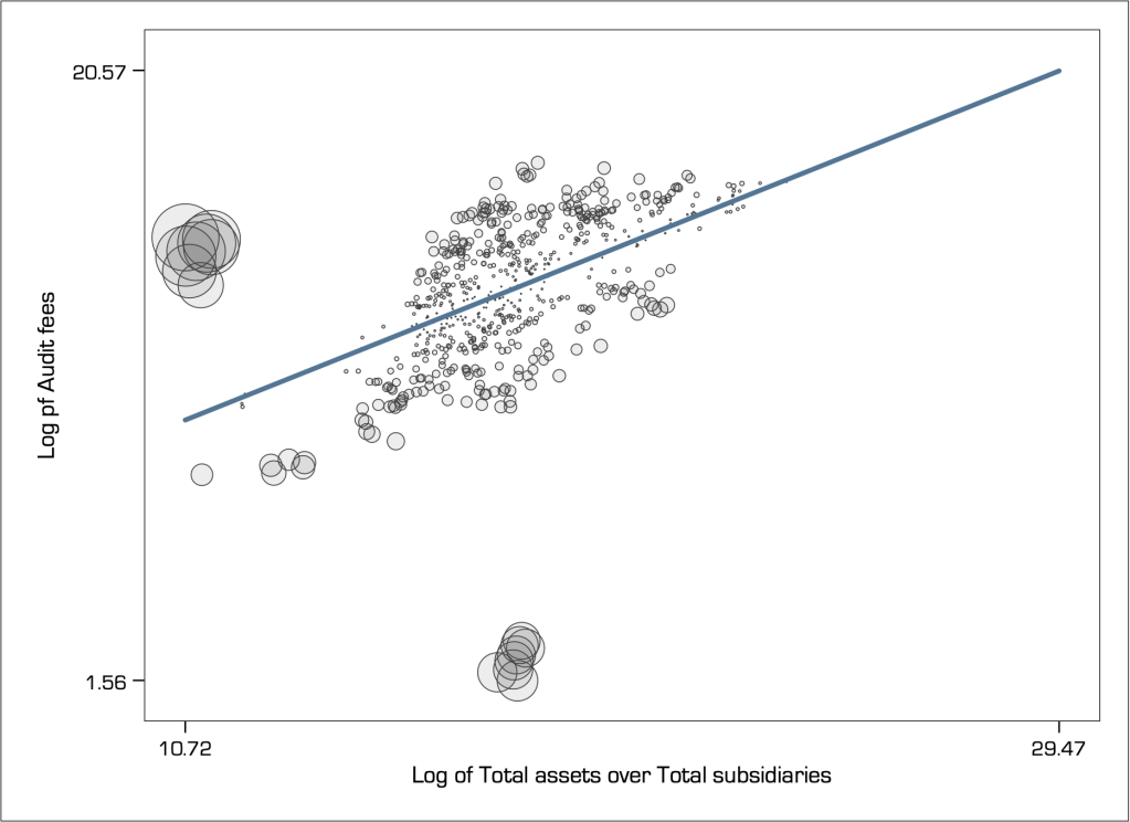
We can visualise the relative effect of leverage using a weighted scatter plot (i.e. a so-called bubble chart). Here is how it looks like for the audit fees example discussed just above:

In multivariate relations, leverage is an important definition of extreme value. It is now evident that the single observation in the top-right hand-side corner of the graph has the greatest leverage, followed by the group of observations formerly shown in green. However, the observations formerly shown in orange colour have very little leverage, because their position is right in the centre of the x-axis variable.
I like to think about the leverage effect in terms of a inverted seesaw. The pivot point is in the middle of the x-axis range and therefore the density in the middle has little effect in leveraging the seesaw to the right or left. However, a single even small object placed far away to one of the ends has a very large leverage effect.
Squared residuals
However, although the observations formerly shown in orange colour have very little leverage they still have very large residuals thus resulting in a poor fit of the model. On the contrary, although the single observation in the top-right hand-side corner of the graph has the greatest leverage it has near zero residual.
Thus, leverage alone is not a sufficient statistic for identifying extreme values and must be complemented with a cross-examination of residuals. Specifically, we look at the squared residuals because we do not care if they are positive or negative, we just want to judge how big they are, and taking the square amplifies their effect.
A popular model diagnostic in this respect, that is commonly used to judge any model fit and the effect of extreme values, is the leverage vs. squared-residual plot.
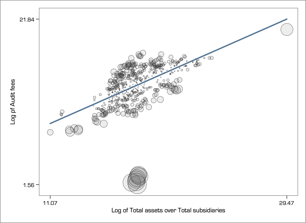
There are also several statistics that have been developed that take into account the combined effect of leverage and residuals in the detection of extreme values (e.g. Welsch’s distance, DFBETA, DFITS, and more). My favourite statistic, that I have found to perform consistently well is Cook’s distance (Cook 1977). We can visualise the relative Cook’s distance again using a weighted scatter plot, as follows:
Cook’s distance identifies two groups of observations (the formerly green-coloured and blue-coloured observations) as being extreme. But it classifies the single observation with the highest leverage as not extreme at all (it is barely noticeable and lies right on the path of the linear fit). Indeed, this seems unreasonable.
Masking
It seems that the single observation with the highest leverage does not appear to be extreme because it is masked by the influence of another one or more observations that are classified as extreme. If we were to eliminate those other extreme values the ‘mask would drop’ and this observation would be revealed as extreme. For example, here is how the Cook’s distance looks like when I remove the group of extreme observations on the left:
Notice how that single observation in the top right of the graph has now turned into extremely influential, i.e. its masked has dropped.
Swamping
Swamping describes the situation where an extreme data point ‘swamps’ another neighbouring data point with its own influence so that it also classified as extreme. If the extreme value is dropped from the dataset then the pull is eliminated and the other data point is no longer classified as extreme.
For example, see what happens if I eliminate from the sample the group of observations in the bottom of the scatter graph with the largest residuals:

The Cook’s distance now appears large only for the group of observations in the far left, where for all other observations it has reduced considerably to the extend that no other observation appears to be extreme. That is to say, the group of observations that I have eliminated were swamping with their influence many other observations so that they appeared to be as extreme.
To drop or not to drop extreme values?
As we saw above, this is not an easy question, and entirely depends on how one judges the influence of extreme values.
In many applications, focusing on analysing average behaviour makes perfect sense because forming inferences on the basis of predicting extraordinarily large or small values is very much unreliable, and often not useful. Indeed, much research routinely eliminates extreme values, because it wants to eliminate their influence on average calculations.
However, dropping extreme values is overall a controversial approach for the following reasons:
- Data that passes validation checks is valid data. There is no scientific reason to discard valid data because it does not fit with some preconceived normative expectation on how the data ‘should’ behave.
- Extreme values are interesting in their own right and may guide more appropriate modelling. They may indicate structural breaks, shifts in expectations, change in variance, clustering behaviour, or just truly abnormally large noise that can be smoothed out. Discarding extreme values would alter the shape of distributional form.
- The swamping effect explains that it is possible to eliminate typical data because of the pull of a single extreme value, where the masking effect explains that as we drop one extreme value another one is likely to take its place so where do we stop?
Dropping extreme values also depends very much on the context. For example, deciding on how likely it is to rain today is very much a consideration involving averages, but deciding how likely it is to be hit by a hurricane should include the tails of the distribution because of the implied consequences of failing to consider a relatively low likelihood event.
As another example, consider portfolio formation. The great majority of financial research focuses its energy in developing portfolio choices that work on average, that is most of the times one would receive positive returns. In this case, the elimination of extreme value seems a natural choice as you do not want extreme events messing with your calculation of averages. However, as discussed in Nassim Taleb’s The Black Swan, extreme values emanate from rare events that carry higher economic impact than the collective impact of all frequent events put together. In other words, extreme values may shift distributions altogether so it would be reckless to simply ignore them.
If the aim is to analyse typical behaviour and not necessarily understand the behaviour of extreme variation, then we do not necessarily need to drop extreme values and instead use robust methods of analysis.
Extreme values in time
In time-series and dynamic panel datasets, we simply cannot remove any extreme value because then the time series would become discontinuous and the analysis impaired.
In fact, Fox (1972) describes time series outliers as ‘extreme innovations’, meaning that their impact is likely to be serially correlated. This means that the extreme value is affected by previous observations but also affects subsequent observations. In another words, extreme values are key to modelling the evolution of variation (e.g. structural breaks).
Back to Data reduction ⟵ ⟶ Continue to Visual implantations
