Reference areas, like reference lines, are non-data visual elements that provide context for enhancing visual decoding.
Reference areas are similar to reference lines but with the difference that they are areas and not lines. Since areas occupy greater space than lines, they should be used cautiously and their visual prominence should be reduced.
Like reference lines, reference areas can also take many forms. For example, areas can be used to indicate estimates or targets, as in placement of the white-shaded area that indicates expectations 2018-2023 in the analysis of US federal tax revenue.
Areas can also be used to enhancing visual perception, e.g. see the alternate row placement of reference areas in the analysis of Tallest to shortest, and the contrast of blue and red coloured areas in the analysis of Imbalance in military spending.
A good example for understanding the utility of reference area is the analysis of Contractions and recoveries. This analysis is effectively a study on reference areas, that criticises the traditional way of referencing periods of economic contraction (recessions), and offers a more accurate representation of reference area.
Excellence in using reference areas
Perhaps the best example that I have seen of using reference areas in data graphs is by New York Times in its analysis of summer temperatures in the Northern hemisphere:

The original graph is animated so it is best to go to the source and see this in its full glory. The graph uses the reference area of the frequency (density) of temperatures recorded during 1951-1980 in light grey colour, and overlays on top the frequency of temperatures recorded in later periods. The reference area makes it clear that the temperature distribution has shifted to the right, thus making what used to be hot now normal, and increasing the frequency of extremely hot at least tenfold.
Confidence bands
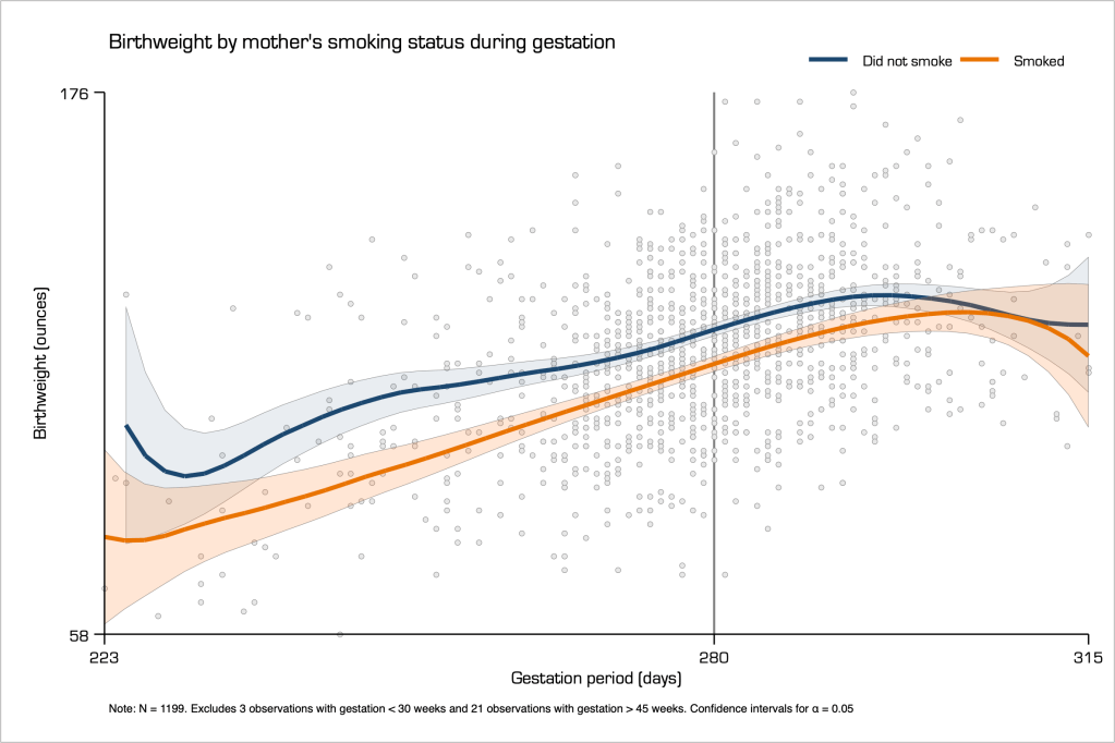
Confidence bands around model estimates are effectively reference areas. For example, consider the relation of birthweight with gestation period. Evidently, the longer the gestation period the bigger the baby. However, widespread medical research explains that smoking during gestation would harm the baby in many ways, one of which is how much it grows in the womb.
Below, I provide a scatter graph of the relation between birthweight and gestation period, conditional on the mother’s smoking status during pregnancy. I also fit two local polynomial regressions for each sample of smokers and non-smokers, and the estimated line on non-smokers sits much higher than that of smokers.
However, the total sample of 1,199 observations is not large, so it is important to look at the statistical significance these estimates. Hence, the addition of confidence bands, here at the 95% confidence level. Given this level of confidence, we can say that on average babies would be born heavier for mothers who do not smoke by comparison to those who smoke. This is true for the period of gestation at which the two confidence bands do not overlap. In very low and very high gestation periods the two confidence bands overlap and therefore we cannot say that there is any difference in birth-weights. This may be because we do not have enough observations in these data regions.
Fan charts
The so-called ‘fan charts’, originally invented by the. Bank of England, visualise a series of consecutive confidence intervals in their projections of macroeconomic measures. Here is an example from their August 2016 report:

This is an excellent application of reference areas and reference lines. In the left hand side graph, the solid line indicates the observed inflation index, and the shaded grey area with the confidence bands indicates the period of projections. There are three confident bands. The darker red colour indicates the projections with confidence of 90%, the lighter red colour the projections with confidence of 95%, and the lightest red colour the projections with confidence of 99%.
The right hand-side graph, which concerns GDP growth projections, follows the same principle but with a twist. The Bank of England also provides the projections that were made in the past for what is now an observable period, and appends to the new projections for the future. In this way, the Bank of England effectively show how good they are in projecting GDP growth since the observables are within the 99% confidence level bands.
Back to Reference lines ⟵ ⟶ Continue to Aspect ratio
