The general advice is to avoid using multiple axes for encoding different numerical scales.
However, sometimes it may be necessary to have multiple axes in order to meet the graph objective. In this case, the multiple axes should be clearly identified.
Here is an example from a paper that I co-authored with Dr Shawn Ho and Prof Artem Prokhorov from the University of Sydney; the paper is on financial constraints and investment efficiency.

The graph shows two timelines with two different y-axis scales. On the left hand side, we have the change in total debt securities and loans – a measure of investment funds that are available in the economy. On the right hand side, we have the average estimated investment efficiency using a statistical model that we describe in the paper. Investment efficiency is a measure of how efficiently companies can deploy finance to meet their investment opportunities.
The graph objective of this graph is to show the co-movement of these two measures, particularly with respect to the recessionary shocks (as identified by NBER). Given the different scales, the only way to show this co-movement is by deploying double y-axes. Still, we made sure that we clearly identify the two y-axes. Every visual element in orange colour refers to the left-hand side y-axis and, every visual element in blue refers to the right-hand-side y-axis.
Here is another example of using double y-axes. I often see graphs comparing the stock prices of different companies using a common y-axis. This is terrible idea because the scale is different for every company. It is not the price that is important to compare but the market capitalisation. The scale of stock price is relative to the number of shares outstanding.
Consider the comparison of the S&P500 index and the price of Google, using a common y-axis scale versus two separate y-axes scales:
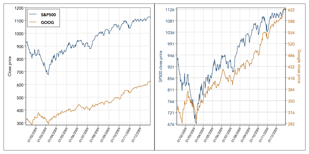
The left hand side graph with the common y-axis scale is misleading as it suggests a less variable price series for Google with a flatter time trend. The right hand side graph with the two y-axes scales shows that google’s price is as volatile as the S&P500 index and has near identical trend.
Back to Scale range ⟵ ⟶ Continue to Line connection
