The aspect ratio of a data graph is defined as the height-to-width ratio of the graph’s size.
Most software determine the default aspect ratio using your monitor’s display size, which could be anywhere close to 4:3, 5:4, 16:10 or 16:9. These is by no means a recommended aspect ratio and certainly not suitable for all graphs.
Perceived slopes
The choice of aspect ratio determines the perception of steepness in slope. Generally, you may think of three classes of aspect ratios: wide, square and tall. Consider the following example of a y = x relation, using three different aspect ratios:

Given the y = x relation, the correct aspect ratio is the one in the middle – the square aspect ratio of 1:1. The wide aspect ratio of 1:2 suggests a less steep slope and the tall aspect ratio of 2:1 suggests a much steeper slope. Here is another example using real data, the life expectancy of US males:
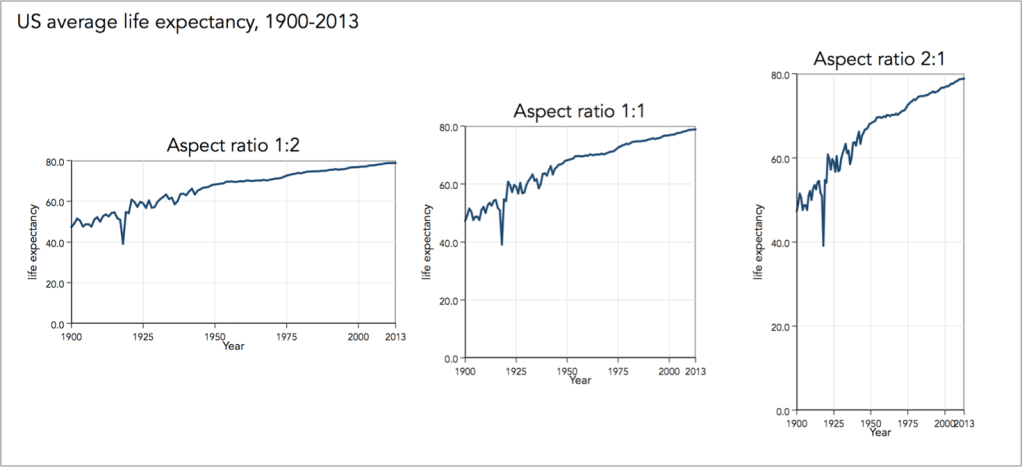
The wider the aspect ratio the flatter the perceived slope and the taller the aspect ratio the steeper the perceive slope.
Timeline plots
Timeline plots, such as the one shown just above, are specifically designed to encode trend, seasonal and cyclical variation. In other words, timeline plots encode the rates of change by comparing the steepness of sequential slopes from one point in time to the next.
The accuracy in decoding the rates of change is directly determined by the choice of aspect ratio. For a straight line that connects two coordinates, the optimal aspect ratio for conveying the true rate of change is given by that line’s slope, e.g. for the y = x relation the true rate of change is conveyed by a 45 degree line. For a collection of several lines, as in a timeline plot, the question becomes of calculating some sort of average that would optimise the typical orientation (for the technical detail see Christodoulou, 2017).
As an example, consider the timeline of sunspot activity. Sunspots are regions on the sun with reduced surface temperature caused by concentrations of magnetic field flux. The number of sunspot correlates with the intensity of solar radiation that can damage electronic equipment and solar cells on satellites. Here is the timeline series of the number of sunspots using Stata’s default aspect ratio:

From the above graph we can clearly see a solar cycle of sunspot activity, repeated every 11-13 years. But all we can see are peaks and troughs of the cycles , some higher and some lower than others, but nothing else in between. Instead, a very wide aspect ratio reveals another very important piece of information that is critical to modelling sunspot activity:
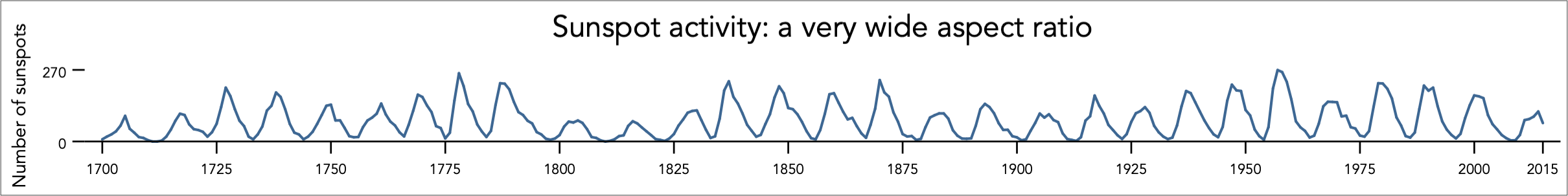
Now we can see that the sharper the peak the sharper the increase and the more gradual is the decrease. For the lower peaks the rate of increase is pretty close to the rate of decrease. Considering the very long time series with 316 time steps (years from 1700 to 2015), it is best to split the timeline into panels, let say of centuries long, but still maintain the wide aspect ratio:

Note how the last decade is repeated in the next panel of each century long data. This ensures a continues reading from one panel to the next. This idea as well as the data are borrowed from the Solar Influences Data Analysis Center (SIDC). It is the right choice of aspect ratio that makes this a winning data graph.
In Christodoulou (2017), I explain that not always timeline plots benefit from very wide aspect ratios. Sometimes we need to have tall or square aspect ratios.
Back to Reference areas ⟵ ⟶ Continue to Reordering
