Once we define the coordinate system and encode the point implantation, we can move to drawing lines and areas.
Here are some examples of coordinates systems and the transition from point, to line, to area:
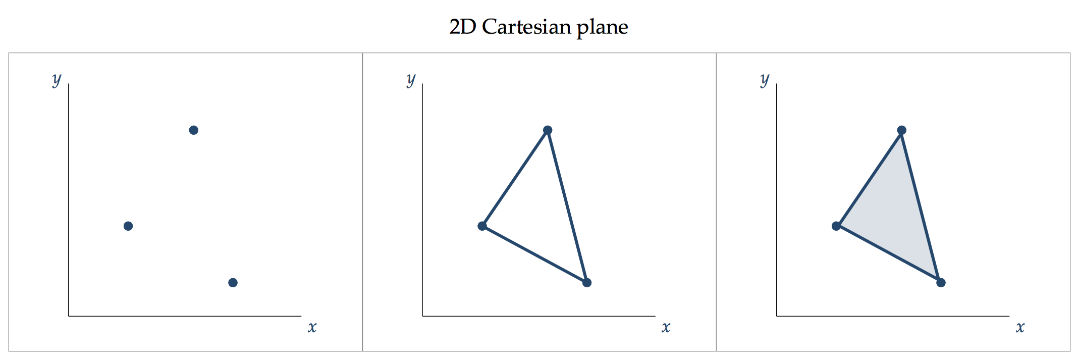
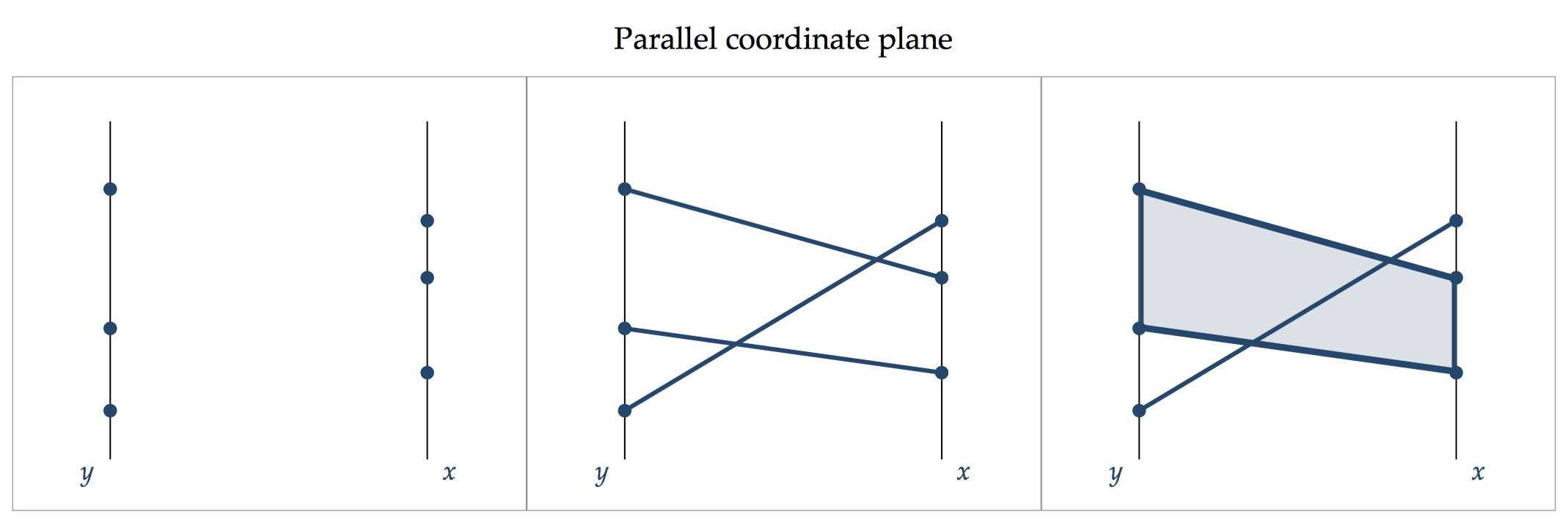

Every added dimension, as we progressed from points, to lines, to areas presents the opportunity to encode additional information.
A point encodes two pieces of information: the ordinate value of y and the abscissa value of x.
The added dimension of line encodes another piece of information, i.e. the connective relation between two points, and the explicit direction (e.g. slope).
The added dimension of area encodes a fourth piece of information: the size of the area or the presence vs. the absence of depth.
The key lesson is that the choice to move from points, to lines, to areas must be justified by the pieces of information that we wish to encode. Showing lines or areas for the sake of beautification is consider a sin in data visualisation and violates the quality of encoding consistency.
Recasting from point, to line to area
To demonstrate a real data example of how one can move from points, to lines and areas consider the time series movement of the FTSE All-share closing price for each year during 1960-2017.
Stata’s graphics engine, specifically its twoway suite of graphs, is specifically build to understand this fundamental principle of transition between visual implantations and how one can move from a point to a line to an area. This is done by specifying the recast() option:
. twoway (scatter close year)
. twoway (scatter close year, recast(line))
. twoway (scatter close year, recast(connected))
. twoway (scatter close year, recast(spike))
. twoway (scatter close year, recast(dropline))
. twoway (scatter close year, recast(dot))
. twoway (scatter close year, recast(bar))
. twoway (scatter close year, recast(area))
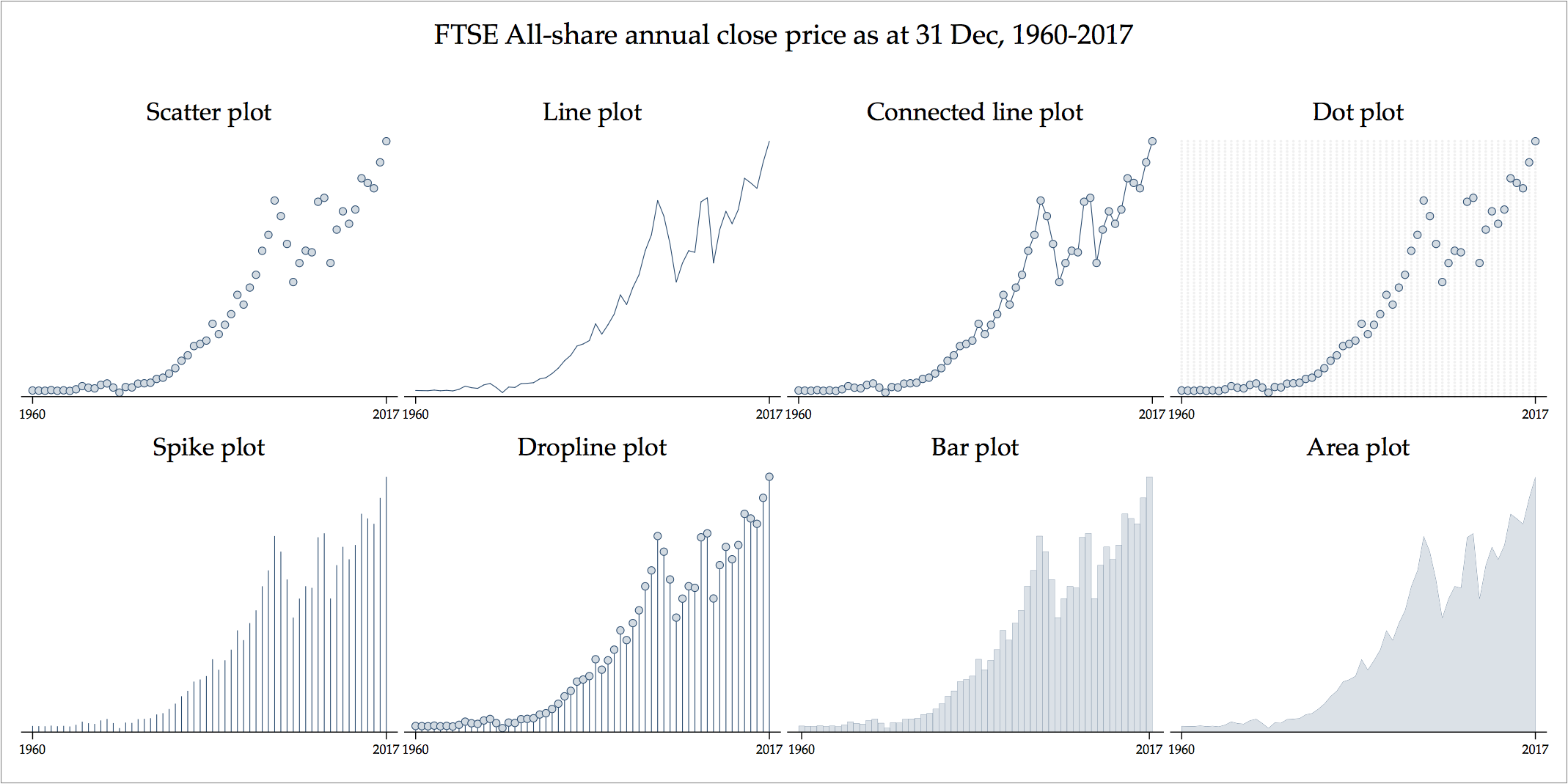
This is the same data being encoded with different visual implantations. The assigned chart monickers (e.g. ‘spike plot’ or ‘dropline plot’) mean nothing more than the transition across visual implantations. For example, the so-called ‘connected line chart’ involves the encoding of point visual implantations plus the information that adjacent points ordered in terms of y-axis values (the years) are connected, thus the additional encoding of the line visual implantations.
Here is another example with two time series, the FTSE All-share high and low price for each year during 1960-2017, in what Stata calls ‘range plots’:
. twoway (rscatter high low year)
. twoway (rscatter high low year, recast(rline))
. twoway (rscatter high low year, recast(rconnected))
. twoway (rscatter high low year, recast(rspike))
. twoway (rscatter high low year, recast(rcap))
. twoway (rscatter high low year, recast(rcapsym))
. twoway (rscatter high low year, recast(rbar))
. twoway (rscatter high low year, recast(rarea))
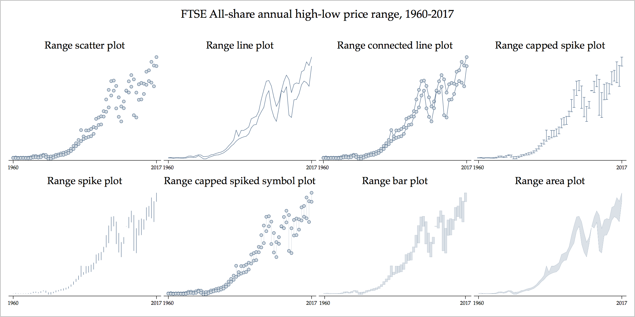
The choice between either of the above competing data graphs depends on which one we believe conveys the best information of range between high and low prices. I find the range spike plot to be the most appropriate at encoding variation for this data.
Learn more
See the case study for how to build a graph from first principles, using the concept of visual implantations.
Back to Visual implantations ⟵ ⟶ Continue to Case study
