An important enhancement step is ordering the presented information in accordance to the graph objective.
Ordering is often a trial-and-error process, where we have to try several iterations before we conclude to the most informative version of the data graph.
The best way to demonstrate this is through examples.
Reordering timelines
Consider first the graph objective of how the decline in one type of financial fraud coincides with the increase of another type of financial fraud. The data is fictional because the real data is proprietary and cannot be publicly disclosed. To make this exercise even more interesting, assume that the outlet allows only monochrome publications, so our choice of retinal variables is limited. Here is the standard graph that one would do, in order to look at the timeline evolution of the frequency in each type of fraud.

The graph format makes it very difficult to decode any useful information. It is mess of lines and numbers. A way to fix this mess is by reordering the information in the graph. Instead of having a common timeline for every type of financial fraud, we could repeat the timeline for each one individually, as follows:

Now it is clear how as one type of fraud declines another increases.
Reordering frequencies
This is a more typical example of ordering. The graph objective is to show the volume of marriages and divorces by state in the US. The default ordering of the bars is alphabetical, by state:

This order of information is not interesting, as it does not address the graph objective. Instead, a much more helpful order would be by magnitude. This can be done either by order of marriages:
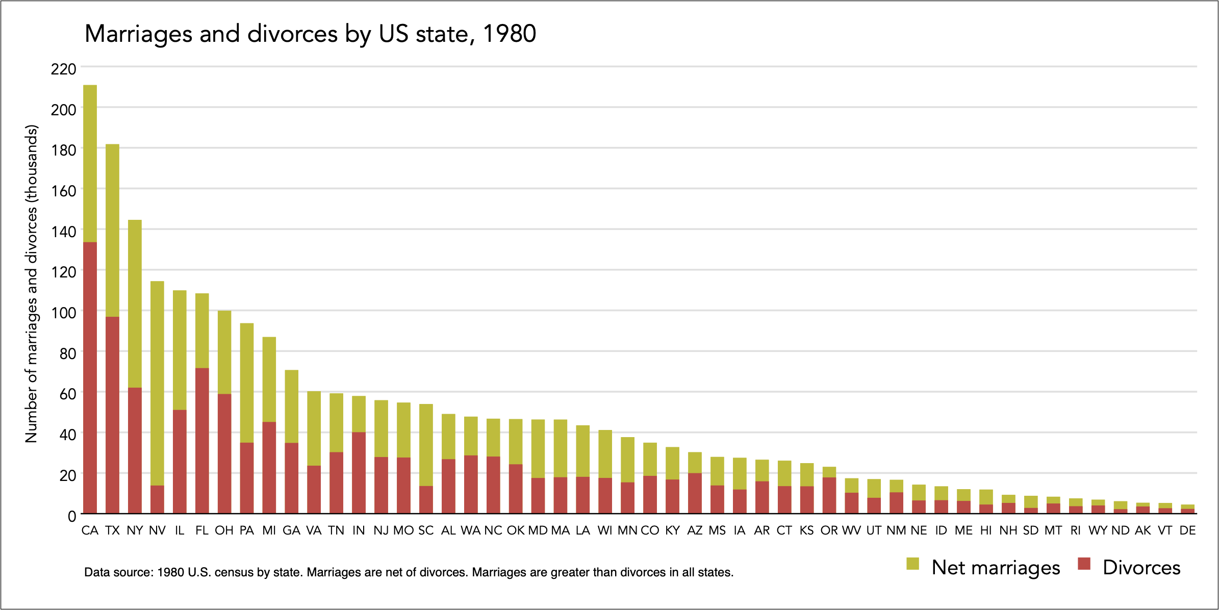
Or by order of divorces:
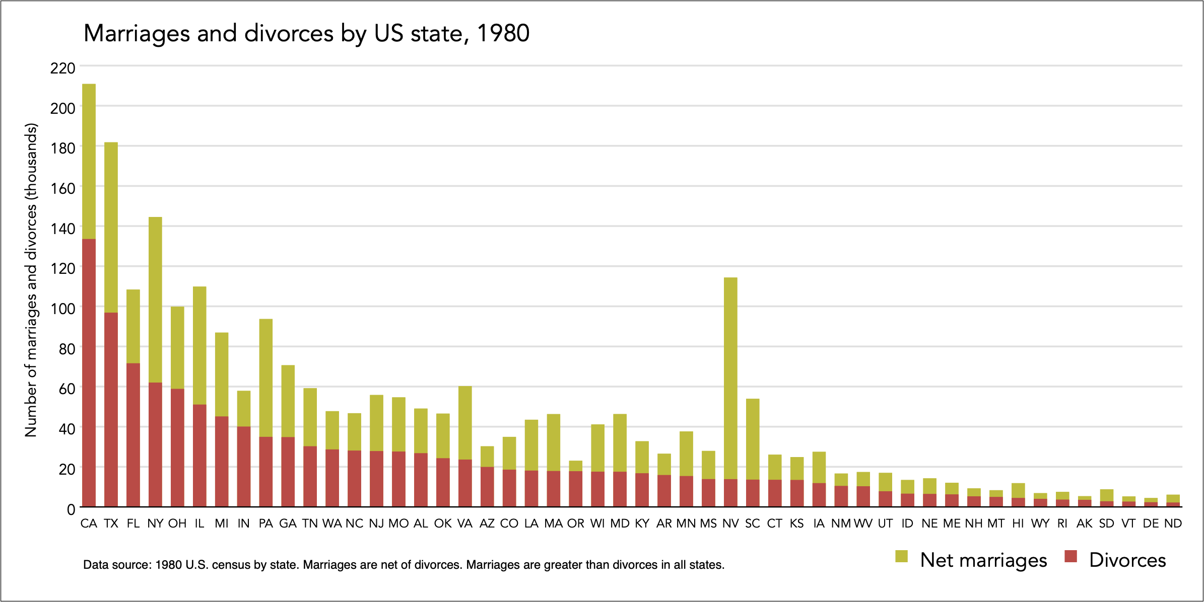
Now it is easy to see with confidence which state has the most or least marriages and divorces.
Back to Aspect ratio ⟵ ⟶ Continue to Jittering
