Decoding efficiency is a relative quality, that comes only fifth in the priority of qualities of data graphs. Efficiency has to do with comparing competing data graphs that first satisfy the qualities of accuracy, relevance, completeness and consistency.
Decoding accuracy is the topmost quality that is independent to decoding efficiency, but conforming to relevance, completeness and consistency may cause differential degrees of efficiency. Therefore, if the graph is accurate, and encoding is relevant, complete and consistent then we say that “a graph is more efficient than another if its decoding requires a shorter observation time” (Bertin 1967, p.139).
Efficiency is directly determined by the audience’s capacity to decode. It is imperative to account for the familiarity and training of the audience with appropriate encoding mechanisms.
Identification is key to achieving efficiency, and it holds that the sharper the external, internal and direct identification the quicker the decoding. Graph enhancement can also play an important role to achieving a higher degree of efficiency.
A critical condition for efficiency is iteration. Because the same data can be graphically encoded in myriad ways, the competing visuals must be ranked according to their qualities. Indeed, the Graph Workflow model is described as an iterative experimental estimator. Following visual decoding, the process begins again until one meets all qualities of data graphics, abides to standards and satisfies the parameters set by our limited visual perception.
Example
Consider the following small dataset, containing four groups of athletes each evaluated in terms of its mean physical ability for flexibility, speed and strength. Each group has a different coach. The data is very simple, but very difficult to decode by looking at just the table of values:
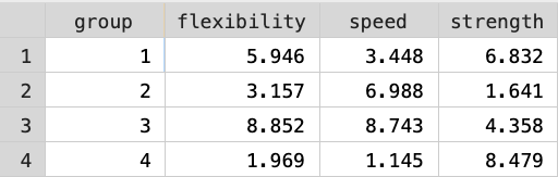
A bar chart could help encode this data and perhaps reveal the differences between the four groups. Stata’s default bar chart gives an accurate, relevant, complete and consistent solution:
However, this bar chart is not very efficient because it takes a long time to decode the information, and I do not feel fully confident about the information that I decode from this data graph.
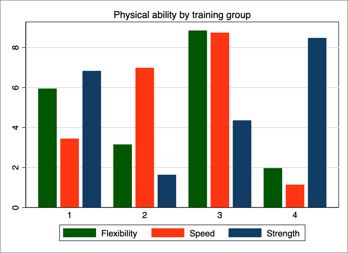
Perhaps a horizontal bar chart could be more efficient. Also, it might be best to remove the whitespace between the bars within each group to make it clearer that every set of bars belongs to different group (this follows the Gestalt principle of proximity):
This seems to be an improvement in efficiency because it is easier to decode the groups, and the horizontal orientation makes it easier to decode the lengths of the bars. Yes, the data graph is still inefficient and I feel that there should be something else that I can do to improve decoding efficiency.
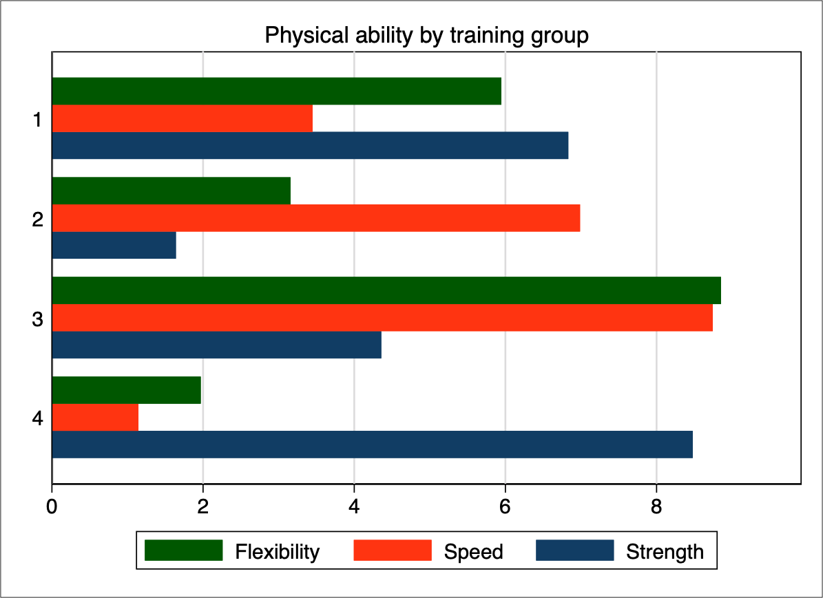
According to the Graph Workflow model, the first step in constructing a data graph is data management and this step must be revisited in every iteration. The graph objective of this data graph is the contrast of mean physical ability by training group, and the statistical context is a comparative analysis of magnitudes across groups. In this case, the scale of the magnitude does not matter, i.e. it does not mean anything to have speed 2 or 8. This is a made up scale anyway. What we want to show is the relative speed of each group.
Therefore, I recast the scale of each physical ability as a proportion to the total across the four groups. Then, I graph again the horizontal bars but this time stacked to a total
I find this bar chart to be more efficient to decode. I feel that it is easier to decode both across-group variation (i.e. which group has the most flexibility, speed and strength), and within-group variation (e.g. how having great strength goes at the expense of losing flexibility and speed).
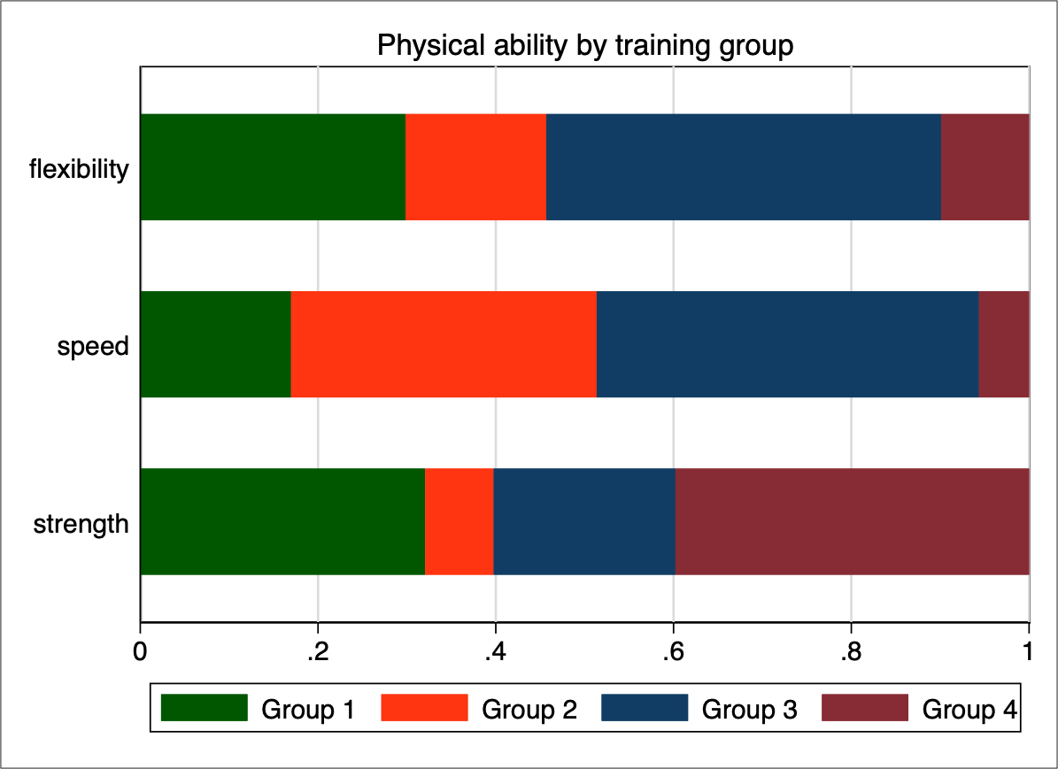
We are not done yet. The above graph appears to be an improvement, but the default colours are highly saturated and there are distracting elements. We also need to improve identification and overall design. Here is what I believe to be an even more efficient version of this bar graph:

Back to Consistency ⟵ ⟶ Continue to Simplifying complexity
