The Gestalt principle of closure explains that when decoding visual information we tend to translate the information into recognisable objects that satisfy the Law of Prägnanz, that is the objects are perceptually organised into ordered, symmetric or balanced shapes.
Closure is directly related with fictional visual illusions, that explain how we like to organise visual perception by drawing connections between existing pieces of information in order to create objects that do not in fact exist.
Decoding scatter graphs
The decoding of data graphs often involves the use of some form of closure. This is particularly evident in scatter graphs, where the key graph objective is presenting or discovering discernible patterns in relations. In other words, we draw imaginary connections between scatter points in order to create familiar patterns.
Consider the below scatter graph, with the relation between y and x. A quick look at this scatter graph leads us to perceive a relative strong linear relation with some random noise, that is we draw a connection between points to imagine an average line running through the graph. It is not so evident that we do that because of the cloud of data.
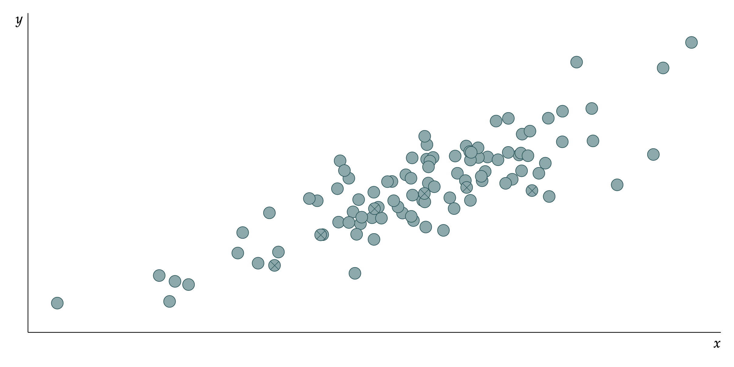
Notice how in the above scatter graph, certain data points are encoded using the ⨂ shape. On purpose, I encode these collection of points as barely noticeable, but still not difficult to perceive when examined carefully.
The scatter graph below focuses attention to only these points. What do you perceive now? It is likely now that you perceive a quadratic line (a concave curve). The quadratic line does not exist but the first information that we decode from this graph is a quadratic line and not the scatter points. In fact, we often do not even bother to investigate the individual scatter points and focus only on the recognisable object of a curve.

Suppose that this set of points suggesting a quadratic relation was a categorical construct of some sort (e.g. a person or a company) in the greater cloud of data. Remember that this set of scatter points were also part of the top scatter graph, but you failed to see the quadratic line there because there was a more dominant shape – the straight line.
Decoding discontinued lines
The principe of closure suggests that disconnecting a line series due to the lack of data can be very much misleading, because our brain will simply fill in the blanks by connecting the shortest line between the two points.
Consider the evolution of life expectancy for the average US male over the last during 1900-2000. Suppose that we have incomplete or poor quality data for the periods 1906-1907, 1916-1922 and 1940. Then, a typical data graph with discontinuous timeline would look like this:
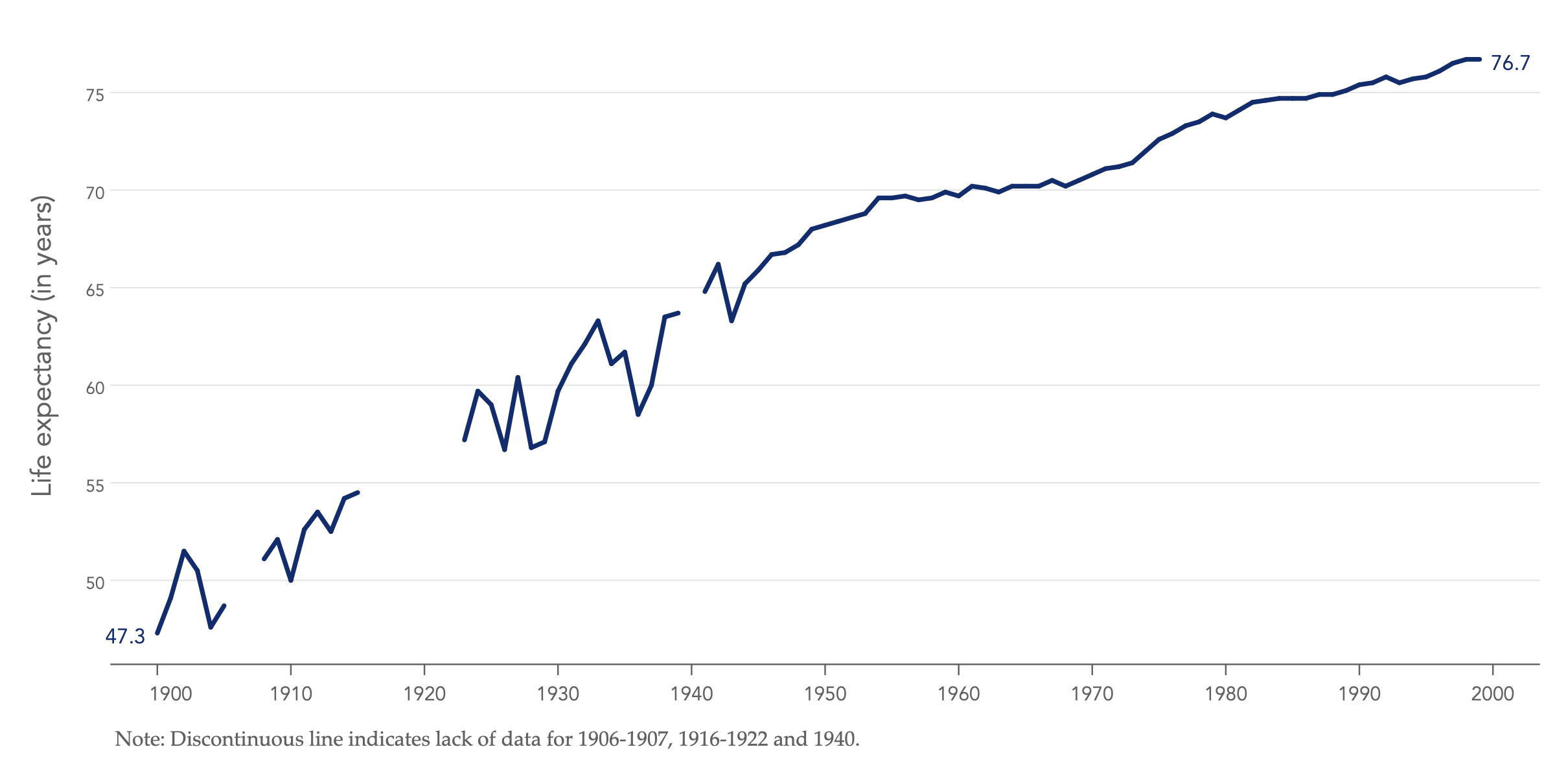
This is a dangerous practice because we will naturally seek closure in the discontinuity and without realising draw imaginary lines to connect the gaps, as follows:

For those familiar with the life expectancy data, as I also show in the analysis on US life expectancy of males, during 1917-1918 there was a sharp drop in life expectancy due to the world pandemic of Spanish influenza killing 3-5% of Earth’s population at the time. Thus, drawing an imaginary straight line from 1918-1923 effectively discounts the possibility of a sharp change in life expectancy (or whichever is the measure of interest at hand).
If the discontinuous lines cannot be shown in separate graphs, then we must find a way to weaken closure. One way to do this is to show the discontinuity gaps as ‘holes’ in data, thus emphasizing the notion of missing data, as follows:

This approach has two advantages. First, we perceive that the larger the (the light grey circles) then the larger the problem of missing data. Second, the use of a circle shape forces to seek closure through two equally competing direction, along the upward periphery of the circle or the downward periphery of the circle, thus making the possibility of an increase or decrease equally likely.
Back to Enclosure ⟵ ⟶ Continue to Connection
