The choice of axes scale range, that is the choice of a minimum and maximum, directly determines the accuracy in visual decoding.
Data properties
The minimum and maximum on an axes scale should always be determined on the basis of data properties.
Specifically, if the variable has a lower bound and the graph objective is concerned with contrasting categorical variation, then we must always show zero as the minimum, and the data will determine the maximum.
If the variable is bounded on both ends, as in proportions or prevalence rates, then we must always show both bounds as the minimum and maximum, e.g. when contrasting competing proportions then we should show the value of 0 as minimum and the value of 1 as maximum. The only exception is when the proportions as so small that showing the value of 1 makes them illegible, in which case it probably means that the value of 1 is highly unlikely and there is no benefit in showing it.
If the variable is described by an unbounded source of variation , then there is no need to show zero as minimum unless zero is a likely attainable value or a policy target. The maximum will be determined by the data.
Showing zero as minimum
One of the more common questions in data graphing is whether we should show zero as the minimum value in every scale.
Two American Statistical Association standards for data graphing ask that “For a curve the vertical scale, whenever practicable, should be so selected that the zero line will appear on the diagram“, and “If the zero line of the vertical scale will not normally appear on the curve diagram, the zero line should be shown by the use of a horizontal break in the diagram“.
It is now well-accepted that showing line breaks on an axis is in fact a bad idea and that should be avoided altogether. Yet, if the scale does not start from zero then it is indeed a good idea to highlight the omission of zero, but this depends on the context.
As explained just above, when comparing categories the default position is to always show zero, otherwise the perceived differences between categories is overstated.
To illustrate this effect, consider the data on choices of travel modes as discussed in the analysis on Melbourne-Sydney Travel. There are four possible ways one can travel from Melbourne to Sydney: air, bus, car or train. Below is a set of bar charts showing the frequency of choice across the four travel modes.
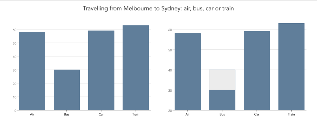
The left-hand side graph shows the categorical frequencies with the baseline of zero on the vertical axis. The graph correctly shows that the choice of Air, Car and Train is about twice as large as the choice of Bus.
The right-hand side graph shows the same categorical frequencies but now using the baseline of 20. The graph misleads now by suggesting that the choice of Air, Car and Train is about three times as large as the choice of Bus.
Note how I have maintained the same vertical height of value 60 across the two graphs, and as a result how the value 30 in the left graph is of equal height with the value of 40 on the right graph. Notice also the grey-highlighted bar portion in the Bus category on the right-hand side graph. This is not data, and it is just there to indicate the magnitude of the ‘lie’ as consequence of using the baseline of 20 and not 0.
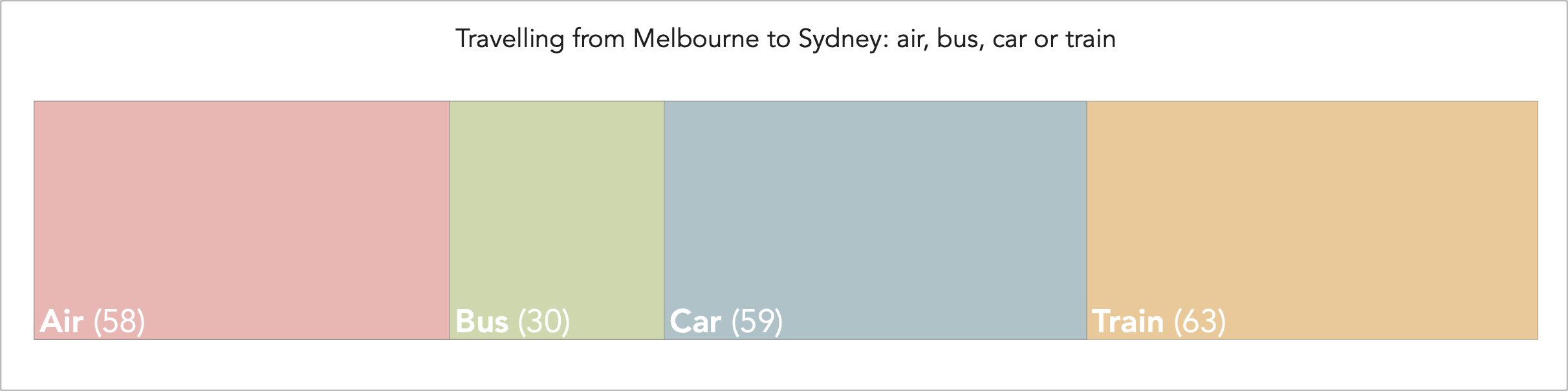
Often such data is compositional, whereby categories can be shown to add to a total. In this instance, the choice of travelling by air, bus, car or train adds to the total number of travel choices, and sometimes it is best contrasted using a stacked bar chart, as for example:
Not showing zero
Blindly applying the rule to always show zero as minimum may result in considerably inaccurate data graphs. For example, as discussed in the analysis of the quality of decoding accuracy, consider the following chart that was tweeted by the National Review:
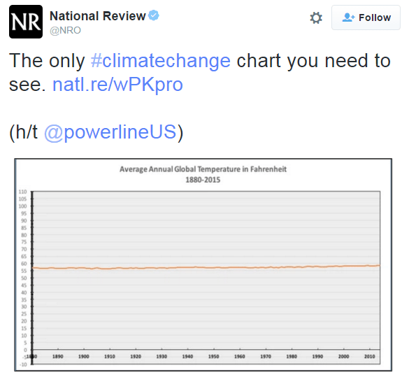
By showing zero on the vertical scale, and here also a preposterously large maximum, the graph gives the false impression of a flat trend in average annual global temperature over the last 200 years. Showing zero in this context is nonsense, because the data is of continuous interval-ratio variation and zero is an unattainable value; see also the discussion in decoding accuracy.
False origin vs. True origin
The practice of showing zero as the minimum value when analysing continuous interval-ratio scale variables, is also known as the imposition of false origin. This is a bad idea hence the derogatory label. But, as I also demonstrate here the blind use of the true origin as determined by the variables’ minima is also a bad idea.
In a scatter plot, the imposition of false origin changes the perceived steepness of the slope. Consider the following example, with simulated data with the following relation:

The set of scatter graphs below show the relation between y and x. The top-left graph shows the relation using the data minima and maxima, i.e. what we call true origin. the top-left graph shows the relation using the zero as minimum and the maxima from the data, i.e. what we call false origin. The bottom-left graph shows the relation using the data minimum and maximum for the y variable and the zero and maximum for the x variable, and the bottom-right graph gives the opposite.

Which one of all the slopes represents the true slope?
The answer is none. The imposition of false origin certainly has an effect on the visual perception of the steepness in the slope but we cannot say that they are more or less accurate for decoding that the slope derived from using the true origin.
To ensure accurate decoding of steepness in slopes we must calculate the angle of the slope and impose an aspect ratio that would tilt the line to the right angle. We know that the slope is roughly equal to 0.4 (as per our simulated model). The degrees of the angle of the slope are then equal to:

Then, using the aspect ratio of the graph, keep the height of the graph constant at 1 and solve for the width of the graph. The solution to the aspect ratio is then height 1 : width 1.5249, where the latter calculation is from:

and the correct data graph with the accurate representation of the steepness in the slope is as follows:

Scale and perception
The imposition of false origin has another even more damaging effect on visual perception. As explained by Cleveland, Diaconis and McGill (1982), we increase the scale on both the vertical and horizontal dimension the perceived correlation between the two variables increases. This is because the scatter of data is now perceived to have lower residuals.
In the example above, notice how the top-right graph suggests has a much tighter bivariate density than in the top-left graph, hence suggesting a more stronger correlation between the two variables.
Back to Graph enhancement ⟵ ⟶ Continue to Multiple axes
