The context is always the data. Any encoding choice that is not related to data or does not directly help in decoding information is irrelevant. All encoding tools and identification narratives must bear significant substance in assisting visual decoding.
Bertin (1967) proposes a law of visibility, where only variable elements are prominent and elements that are common (that do not represent variation) are eliminated or at least reduced. Similarly, Cleveland (1994) advocates for the reduced visual prominence of non-data graph elements that act as reference tools, such as the axes labels, captions and legends.
Tufte (1983) calls distracting graph elements chart-junk and measures relevance as the ratio of ink used to plot the data itself to the ink used to plot other non-data visual elements. Chambers, Cleveland, Kleiner and Tukey (1983) talk about the caveats of perceived graphed structures that may be attributable to the data or the artefacts of the display (i.e. encoding choices), and similarly advise to minimise chart clutter.
Therefore, two important principles for relevance are the parsimony in inking and the economy in applying encoding tools.
All in all, relevance is best summarised in the words of Joel Katz’s (2012, Designing Information, p.19):
“Determining the appropriate content from the communication of information requires a rigorous process of examination:
Is it true?
Is it relevant?
Is it necessary?
Does its inclusion add or detract?
Is it a form that the audience will understand?“
Meaningless decorations
Any pictorial representations or using non-data elements have no place in scientific data graphs as they impair quick and accurate decoding. Any attempts to ‘beautify’ data graphs are misguided and amount to mere chart-junk. Here is an infamous example from YouGov.co.uk:
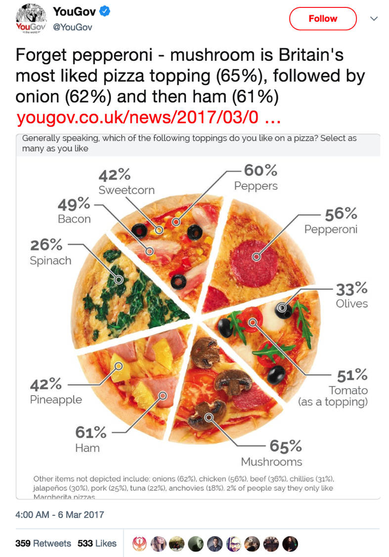
This graph is a mess. It has very low decoding accuracy because every slice of the pie chart is inaccurately equally large, and the percentages add up to more than 100%. Also, the graph has very low encoding relevance because it is plagued by meaningless decorations that makes decoding nearly impossible.
Stata is also guilty of providing ill-fated advice on designing even simple graphs. See my analysis on the US life expectancy of males that improves the data-ink-ratio and decreases the visual prominence of non-data elements, thus making encoding more relevant.
Back to Completeness ⟵ ⟶ Continue to Encoding consistency
