The following discussion on colour hue rests on the assumption that you plan to publish a data graph in full colour. Black and white are not considered colour hues.
If you plan to publish the data graph in monochrome, then abandon the colour retinal variable altogether and move on to the next: value.
The power of colour
Colour hue is the most powerful but also the most dangerous retinal variable. Hence the forewarning:
Never use colour as a decorative element
Also, the brain is easily exhausted when encoding multicolour information, so we must restrain ourselves to be very economical in the use of colour.
Colour is for nominal data
We have evolved to perceive coloured information as variation in context, which means that colour should only be used to encode contrasting qualitative nominal categories, as for example the Olympic circles:
Bertin (1967) explains that colour hue is an associative encoding tool, i.e. it has a qualitative nature and is therefore useful for contrasting categories. Above, the colour retinal variable encodes the five continents, but colour has no scale so it does not suggest that there is some sort of order.
Colour models
The tricky bit about the use of colour hues is establishing clear contrast. In this sense, the olympic logo is a clever use of the colour retinal variable because it applies near equidistant wavelengths across the the visible spectrum of light:

Humans have evolved with three light receptors in the retina that are responsible for the perception of colour. One light receptor is sensitive short-wavelengths (S-cones, responsible for blue), another is sensitive to medium-wavelengths (M-cones, responsible for green), and the third is sensitive to long-wavelengths (L-cones, responsible for red). This type of light processing for perceiving color information is known as trichromacy.
Trichromacy forms the basis for the RGB color model where Red, Green and Blue is combined together in different quantities to produce other hues. This is referred to as the ‘additive color’ model. Each color, takes a value from 0 to 255. Here are some examples:
- Fully saturated Red: (255,0,0)
- Fully saturated Green: (0,255,0)
- Fully saturated Blue: (0,0,255)
- White: (255,255,255)
- Black: (0,0,0)
- Living Coral Pantone colour of 2019: (98, 44.7, 40.8)
- Navy: (26,71,111) – this is my default encoding colour.
The inverse of RGB is subtractive CMYK color model that is used by four-toner printers, found in many organisations. Thus, using the CMYK scale would be necessary for exactly reproducing the colour palette prescribed by your employer. CMYK stands for mixtures of Cyan, Magenta, Yellow and blacK. Here are the same colours above now expressed in the CMYK scale (out of 100):
- Fully saturated Red: (0,100,100,0)
- Fully saturated Green:(100,0,100,0)
- Fully saturated Blue:(100,100,0,0)
- White: (0,0,0,0)
- Black: (0,0,0,100)
- Living Coral Pantone colour of 2019: (0,54,58,2)
- Navy: (76.6, 36, 0, 56.5)
Below is a contrast of the RGB and the CMYK scales, where the fully saturated red, green and blue are known as primary colours and the hues of cyan, yellow and magenta are known as secondary colours. Black is not a colour bur rather the absence of light and white is the full brightness of light.
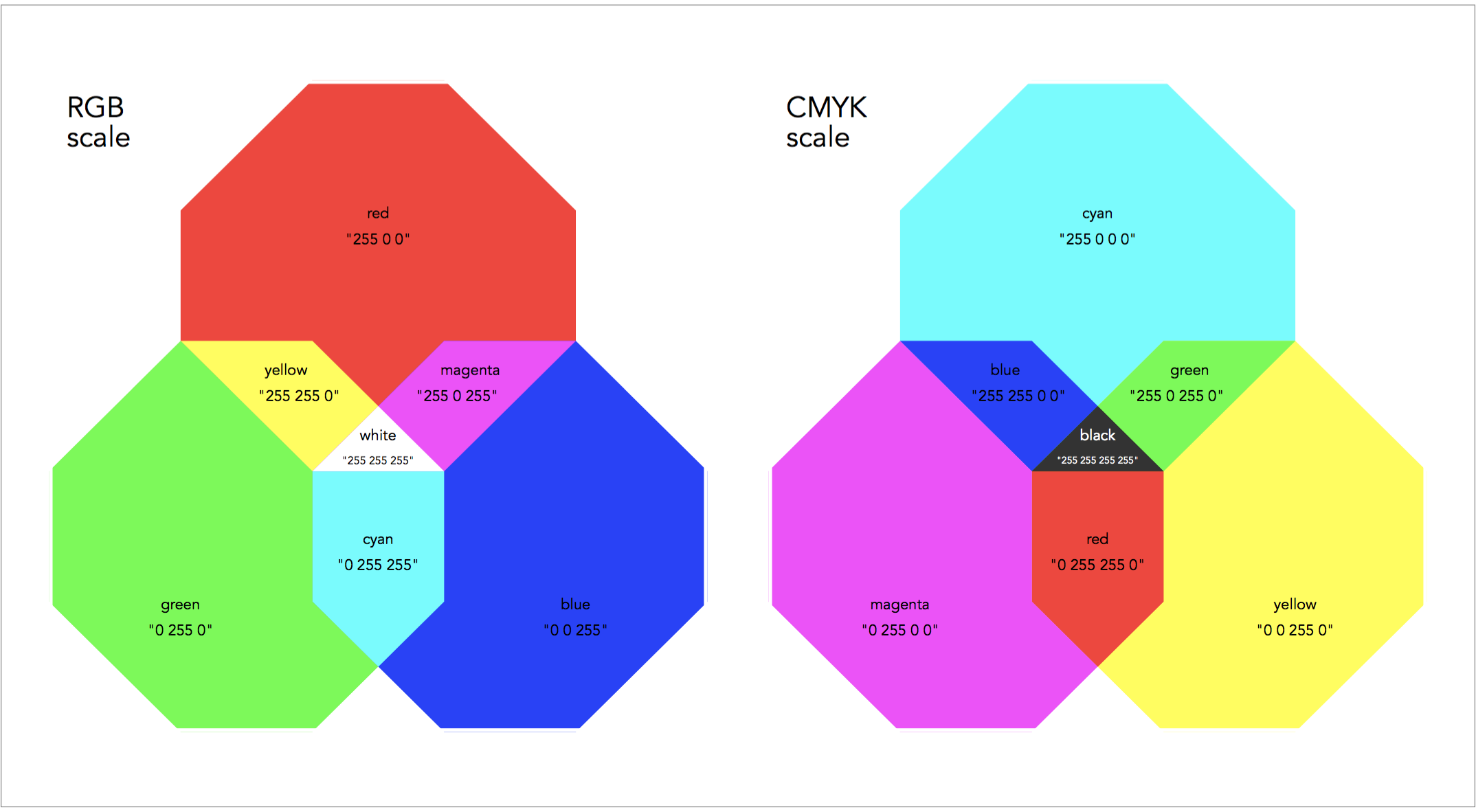
The above figures have an important message. We can use the colour retinal variable to contrast up to maximum seven qualitative categories (red, green, blue, yellow, cyan, magenta, and black or white depending on the background).
Maximum number of colours
Below I show an example of a data graph applying the primary and secondary colours in full saturation. The use a white background makes decoding painful with fully saturated colours – it feels like staring straight at a spotlight. The use of a dark background helps decoding considerably; for another example see my analysis on NBA shot success.

This is maximum number of colour hues that can be contrasted with effectiveness in a graph, and that is already stretching the limits.
The professional advice for using colours as a contrasting tool is to never go beyond 3-4 colours, otherwise they many hues may create artefacts. If there are more categories, then it is best to combine the colour retinal variable with other retinal variables, or even split the graph into small multiples.
Colour saturation
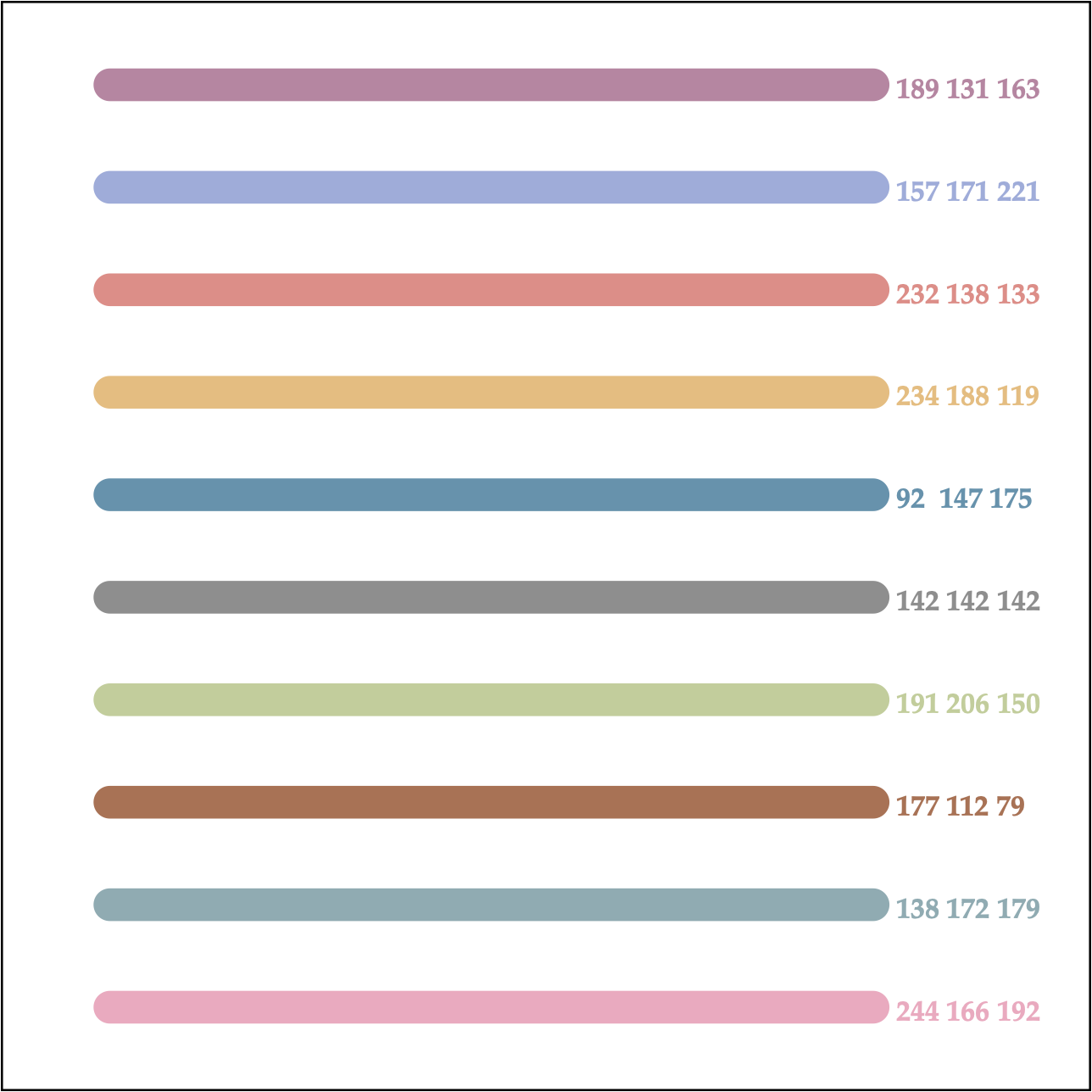
Fully saturated colours are problematic. It is best to always for softer colours. For instance, the pastel palette of colours is a great toolkit for choosing contrasting colours in data graphs. Here are some examples of my favourite pastel colours that can help with encoding nominal categorical data (with the RGB scale on the right):
Colours may also carry a meaningful interpretation in certain contexts. For example, in the financial world red indicates losses and black indicates gains. When contrasting voting results, let say Republican vs. Democrat in the US, then everyone expects to show Republican as red and Democrat as blue, but there is no need to show fully saturated red and blue.
Colour combinations
I find that one of the most frustrating aspects of data graph design is colour pairing.
The ultimate resource for learning about the power of colours on human perception and the effect of colour combinations are the legendary works of Paul Klee (1961) The Thinking Eye Notebooks and Joseph Albers (1963) Interaction of Color.
More modern resources for day-to-day work include the following wonderful online tools, which I regularly visit for picking colour combinations: Colordot, Adobe’s Color Wheel, Coolors.
As a fundamental premise, hue pairs must have high contrast to enable comparisons across categories. You can think of the visual spectrum of light and the RGB scale in particular as an appropriate guideline for specifying contrasting pairs.
For example, the RGB scale of (255 0 0) species a fully saturated red with no green or blue. It holds that the colour complement in RGB scale of (0 255 255), which is the secondary hue of cyan, is then the most suitable contrasting colour to red. Here is a demonstration of color complements that can be used as effective contrasting pairs, with the RGB scales shown on top of each graph:

Back to Retinal variables ⟵ ⟶ Continue to Color value
