Pie charts are the anathema of data graphing. They violate all qualities of data graphs.
Jacques Bertin (1981, p.111) frowns upon the pie chart as “completely useless“. John Tukey is equally damning who is attributed to saying that “There is no data that can be displayed in a pie chart that cannot be displayed better in some other type of chart.” William Cleveland (1994,p .268) explains the source of the problem as “pie charts do not provide efficient detection of geometric objects that convey information about differences of values.”
Indeed, it is generally accepted that bar charts or dot charts (comparative or cumulative) are considerably more accurate in conveying the same message.
Single pies
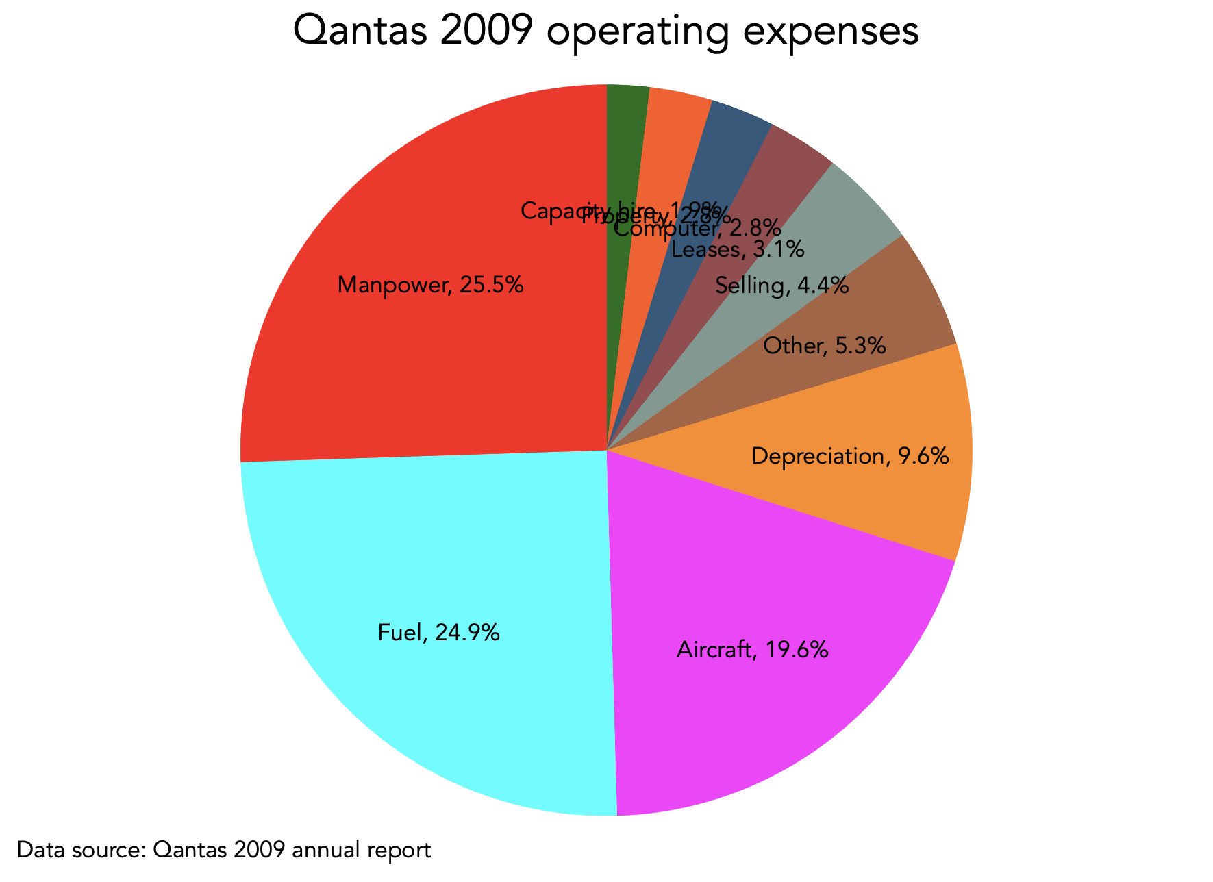
Here is a standard pie chart that shows the composition of Qantas’s operating expenses for 2009 (data sourced from the annual report):

Can you tell with certainty which operating expense is the largest? Is it Fuel or is it Manpower?
Can you tell the differences between the Property, Computer and Leases expenses? How about between Selling and Other?
Human perception is notoriously limited in judging differences in areas between geometric objects, particularly when judged in angle. Indeed, the thinner the slices get the more difficult (nearly impossible) is to judge any discernible difference. Specifically, we know that we systematically underestimate acute angles (smaller than 90 degrees) and overestimate obtuse angles (larger than 90 degrees). Also, angle bisectors (the line dividing the angle in two parts) that are horizontal are perceived larger than angle bisectors that are vertical.
One could argue that pie charts are typically identified directly to eliminate the ambiguity of which segment is the largest, as follows:

Now it is clear that Manpower is a larger expense than Fuel, and that Property expense is as large as Computer expense.
We still have the problem of having to go back and forth from the pie to the legend to figure out which is which. Then, another one could argue that we can also add labels next to the values and suppress the legend:
I could work on arranging the labels more eloquently but I will not bother because all we have done here is to show a table in rainbow radial orientation.
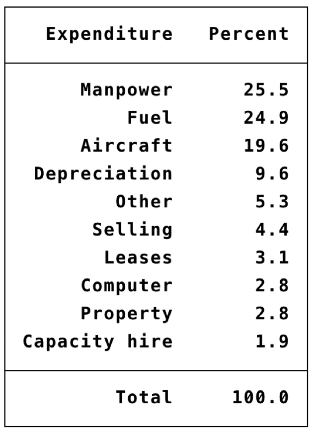
I would think that it would far more appropriate, in terms of accuracy in decoding, if we just presented the ordered table:
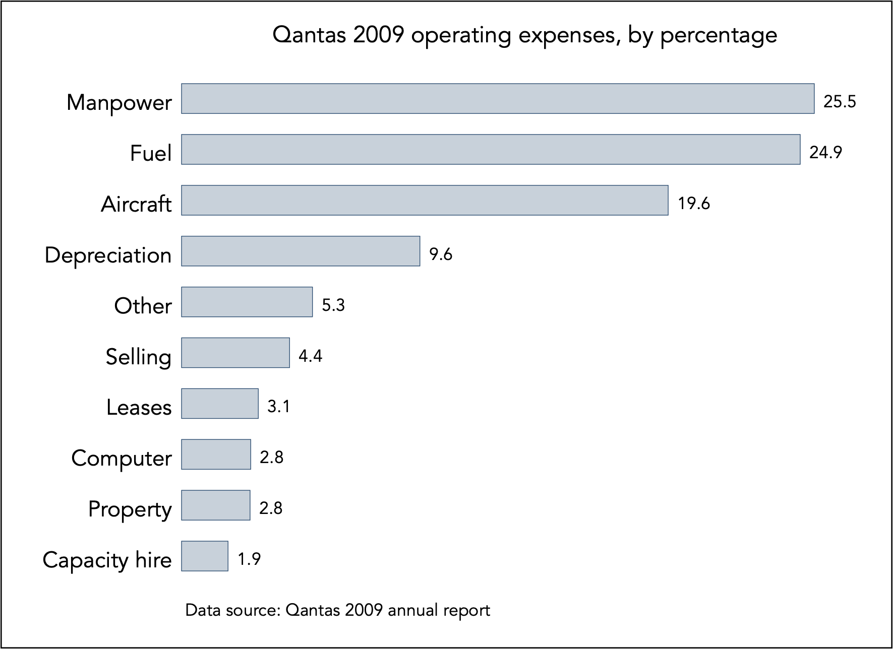
But then again, the horizontal bar chart is designed to convey exactly this sort of information but in a much more efficient manner:
Many pies
Often we see ill-fated comparisons of pie charts. These are doomed to fail.
Edward Tufte (183) thinks of pie charts as pure dumb methods for data graphing, but he is particularly damning when using several pies to form comparison. In his own words: “the only thing worse than a pie chart is several of them, for then the viewer is asked to compare quantities located in spatial disarray both within and between pies“.
Let us see why this is so. Try to make sense of the two pie charts in the next slide comparing Qantas’s composition of expenses over two years:
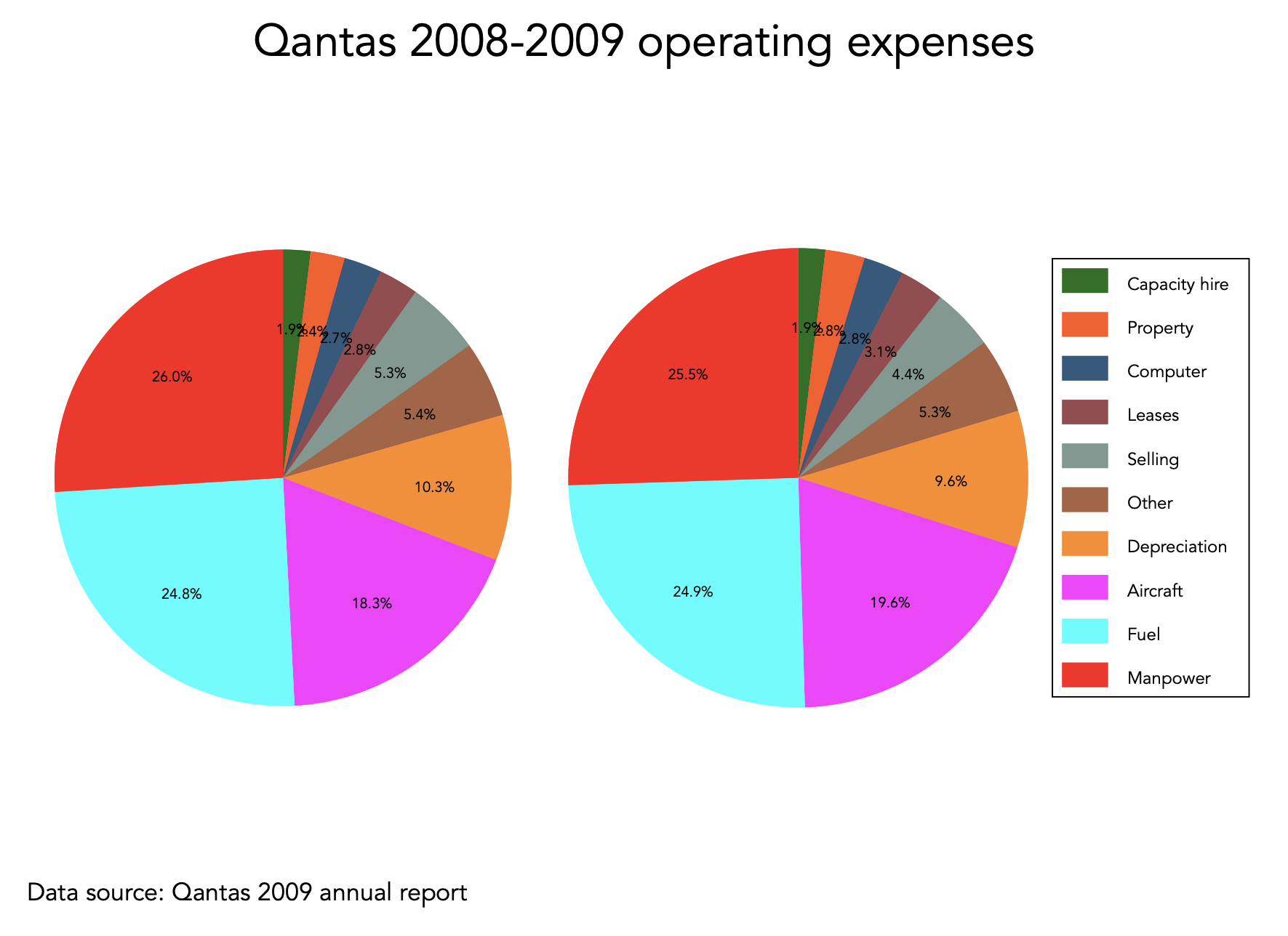
It is exceedingly hard to extract any meaningful comparison by comparing pie charts. According to John Tukey, there is always some other graphical method that can encode the data better than than a pie chart.
Proposed solutions
Here I demonstrate two approaches for encoding the same comparisons. First, here is a paired-coordinate arrow chart:
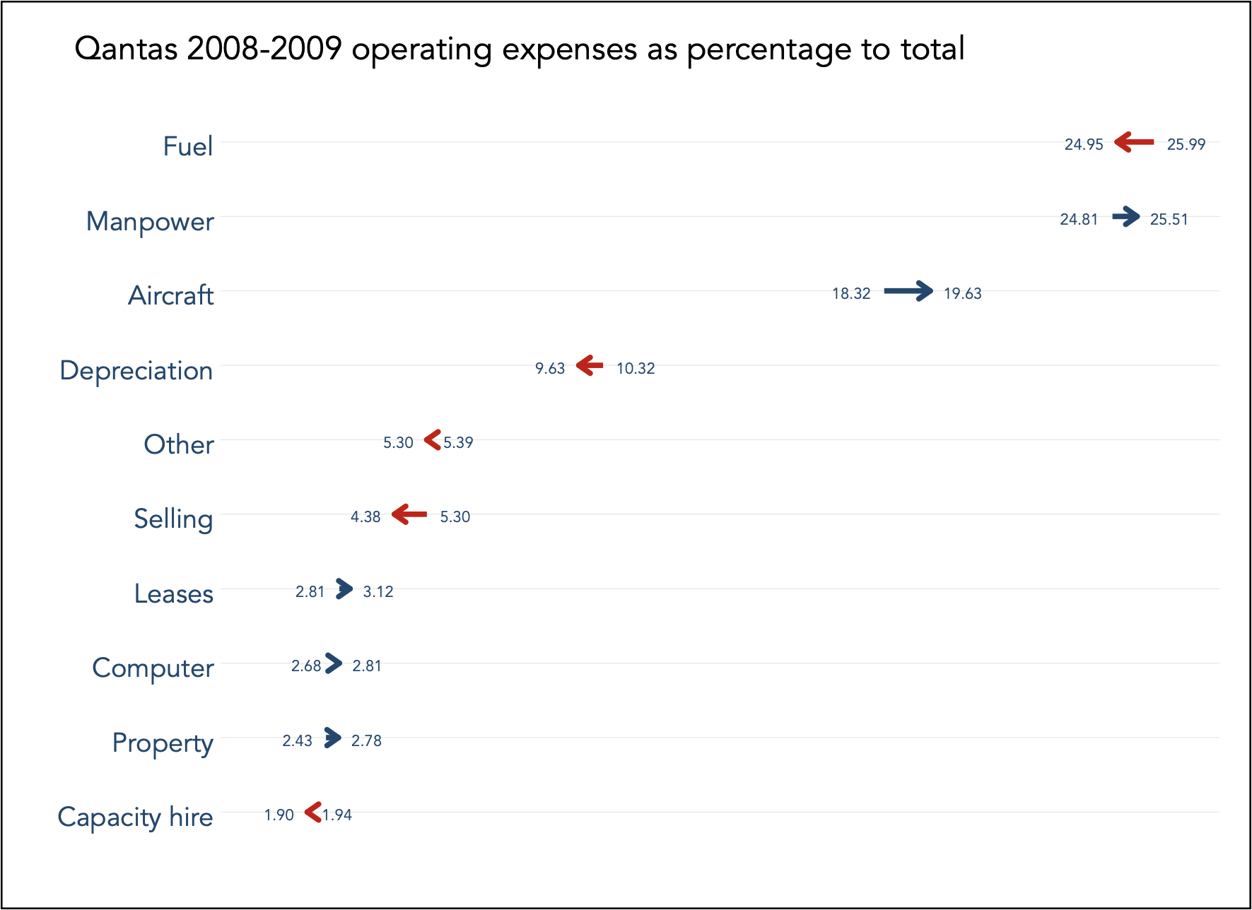
This solution makes clear two pieces of information: (i) what is the magnitude of each expense, from largest to smallest, in both absolute and relative terms, and (ii) by how much each expense has increased in one year. The only material increase is shown to be the Aircraft expense, and the only material decrease is Fuel expense.
The second solution is the so-called slope-chart:
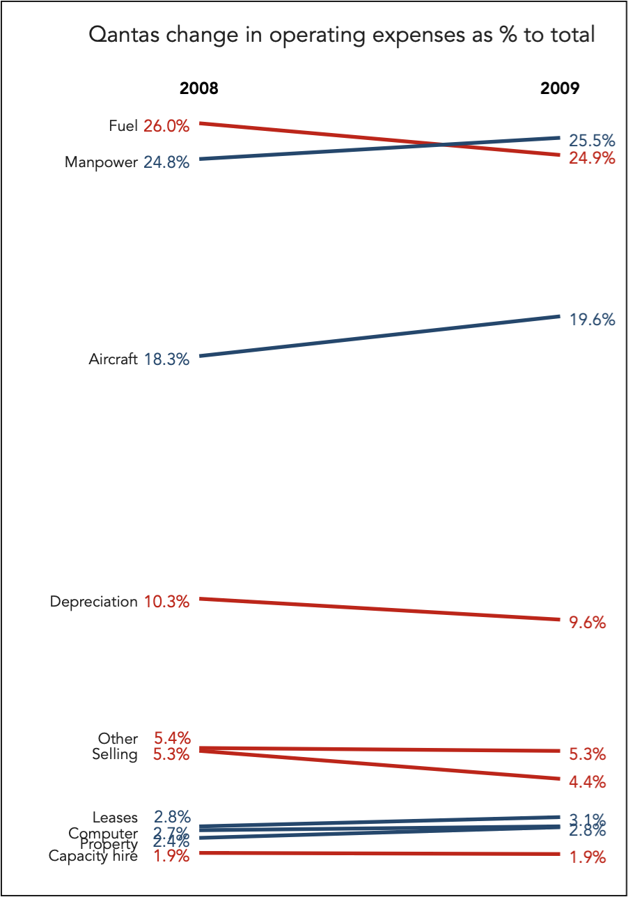
This solution emphasises the information conveyed by the sloping lines. That is to say, the focus is how steeply the expenses have changed. I still prefer the paired-coordinate arrow chart because I find that it encodes the magnitude of change more accurately. The slope-chart suggests that the rate of change in Aircraft expense is quite similar to the change in Manpower expense, where in reality the rates of change are 7.10% and 2.82% respectively. They are certainly not similar rates, and the paired-coordinate arrow makes this clear.
One likely use for pies
From experience, I found that pie charts or donut charts can be useful for encoding only two categories in dashboards for helping with real-time fast decision making. Here is a simulated example where two categories of Yes and No are contrasted:
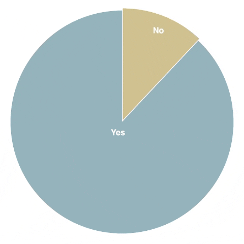
In real-time, the pie slices do not change dramatically and attention should only be captured if the slice of concern (in this case the ‘No’ category) increases suddenly hence highlighted in red if it exceeds a certain threshold (15% in this case).
Back to Colour limitations ⟵ ⟶ To Exploratory data analysis
