Often data graphing requires change in scale or combining scale in order to boost informativeness. Remember that the same data can take many forms and it is often the case that raw measurements need to change scale to suit graphical analysis.
Standardised scores
When comparing measurements on different scales it is easier and more accurate in terms of decoding to use standardised scores.
The standardisation process involves the subtraction of the mean and division by the standard deviation: z = (x –μ)/σ. The distribution shape does not change but the resulting distribution now has mean 0 and standard deviation of 1.
To give an example of how this transformation could be useful, consider the comparison of the distributions of admissions scores from two university admission exams, GRE and TOEFL, using their nominal values as presented in the left hand side graph just below:
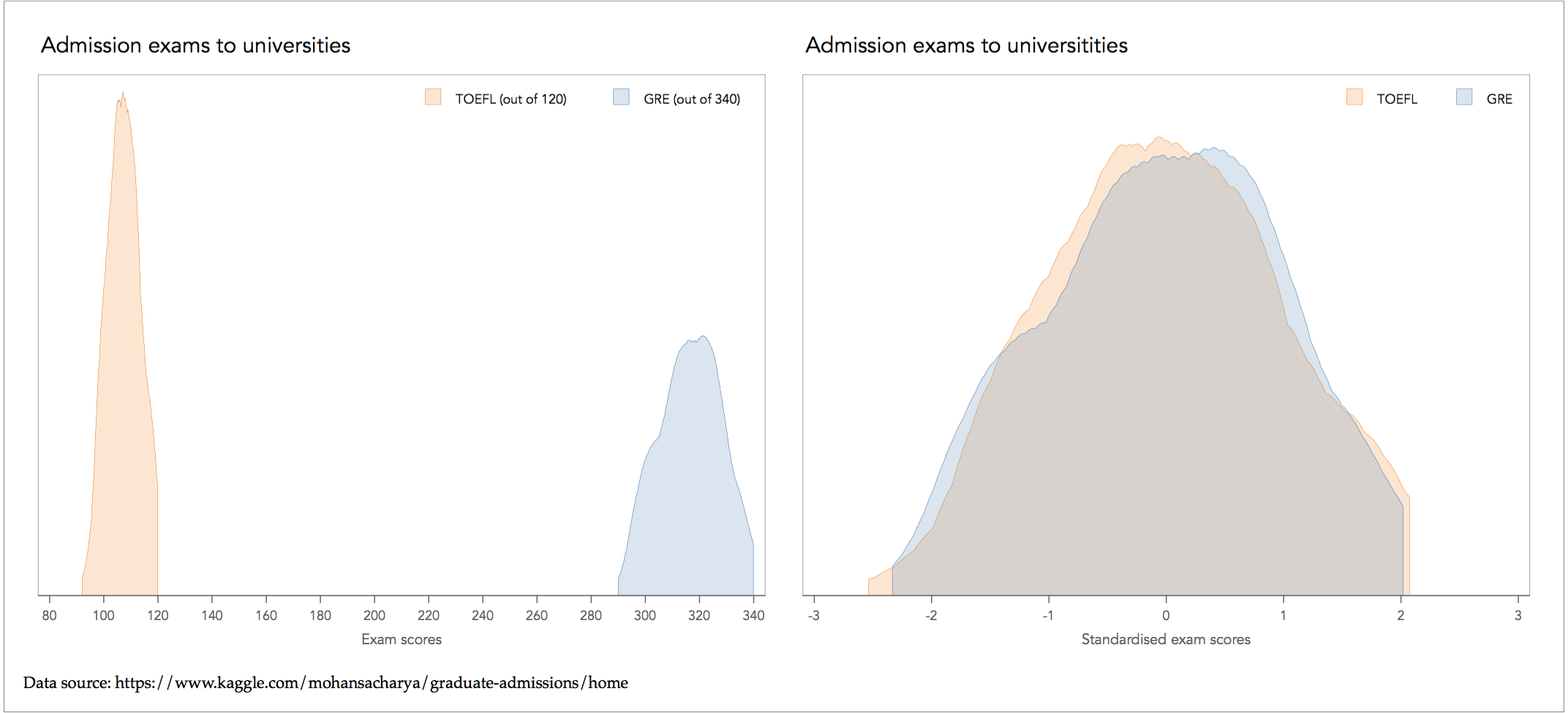
The comparison on the basis of nominal values gives the wrong impression that TOEFL is a much tighter distribution than GRE, thus is more likely to do well on average with TOEFL. This of course is a misleading insight because the two exams are measured on a different scale: TOEFL is judged with a maximum of 120 and GRE with a maximum of 340. By standardising the two distributions, we reveal that the distribution of TOEFL and GRE are not that different after all.
Standardised scores are exceptionally useful with Quantile-Quantile plots when judging distributional form:

The standardised QQ-plot confirms that the two distributions are pretty close to each other with the exception of some minor deviations in the tails.
Rates of change and indices
A rate of change is relevant for time-series data and calculates the change from time t-1 to t, relative to the value at t-1:

By multiplying by 100 expresses the rate of change in terms of percentage change. For example, for Sales in 2001 equal to $200ml and Sales in 2002 equal to $250ml, the rate of change from 2001 to 2002 is equal to (250-200)/200=0.25 or 25%.
An index measures the relative change of ordered time series data relative to a base value:

If the index is constructed over consecutive periods, then it can be used to identify trends over time. For example, if 2005 acts as the base value for an index of purchase expenses, then the value of purchases at t=2005 is set to 1 or 100%. If the index becomes 2 in t=2013, then we say that purchase costs have doubled over the period 2005-2013.
Recasting the index of a single time line preserves the perceived trend. As example is offered in the Taiji Cove drive hunt analysis.
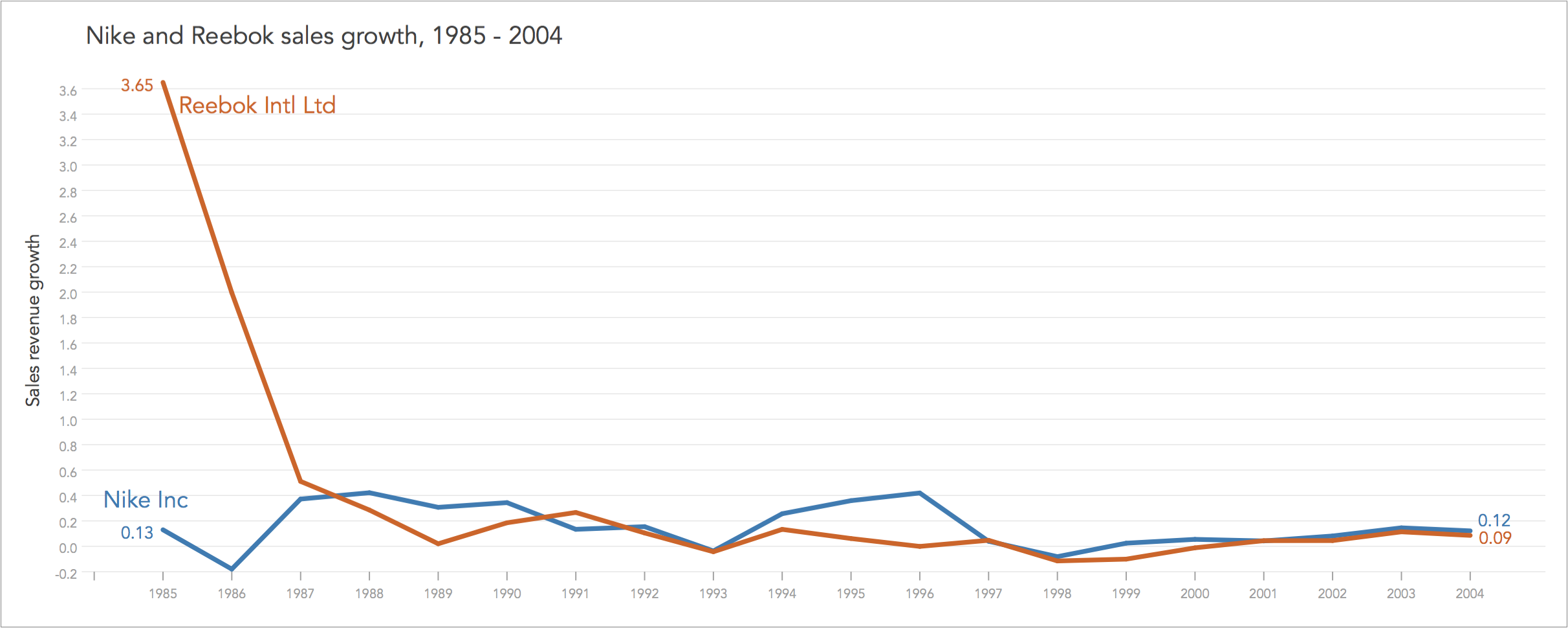
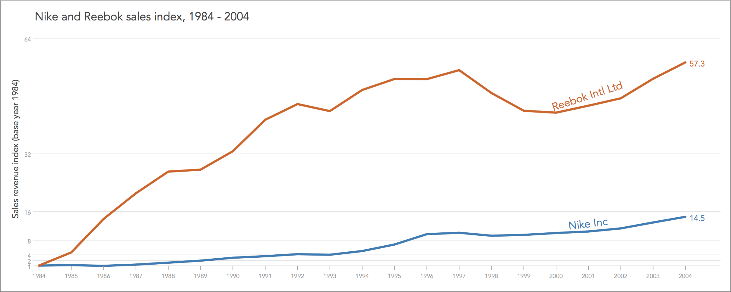
However, when expressing many measurements as indices changes the effect on visual perception changes dramatically. As an example, consider the contrast of the sales revenue of Nike Inc and Reebok International Ltd during 1984-2004. The data is sourced from annual reports. I present the timelines of sales revenue as nominal values (in US$ million), as rates of change, and as indices.
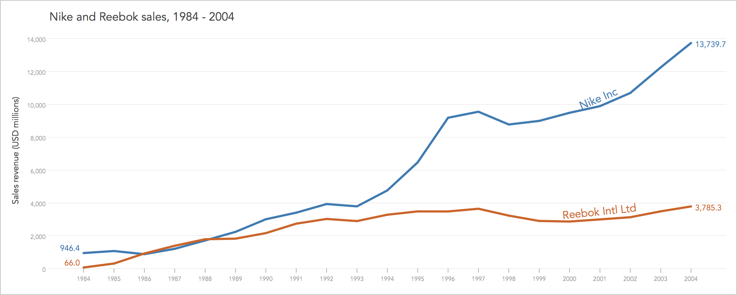
The same data is graphed under three different scales, each time decoding separate messages. The top graph in nominal values explains the difference in size between companies, showing how Nike started as much larger entity than Reebok that however caught up by 1987, but then Nike again outpaced it to end up 3 times larger than Reebok in 2004.
The middle graph, expressed in rates of change or more specifically here in terms of sales growth rate, explains the extraordinary growth of Reebok in 1985 and 1986. The two competitors eventually converge to the range of 6-10% as predicted by economic theory for companies operating in highly competitive product markets.
The bottom graph, expressed in indices, explains that although Nike is a much larger entity, over the period 1984-2004, it doubled about 3 times (from 1 to 2, to 4, to 8) whereas Reebok doubled about 6 times.
All graphs are useful and give us different insights, and may well be presented altogether, side-by-side.
Cumulative proportions
In graph objectives of composite nature where we look at how measures add to something bigger, or a total, then we may be better off combining the variables as cumulative proportions. This principle applies to several situations, e.g. composition of survey responses, composition of operating costs, composition of customer base by area, and so on.
Examples using cumulative proportions are covered in the analysis of the composition of the US tax revenue by source and Australia’s ageing working population using stacked area plots, Australia marriage equality postal vote using stacked bar plots, as well as in the analysis of BHP’s stock-and-flow movement and BHP’s waterfall of real capital using flow and waterfall plots.
Differences
If the Graph Objective requires the comparison of two measures on the same scale then it may be best to take their difference, e.g. see the analysis on US life expectancy of males.
In fact, if the comparison involves only two timelines then we should always consider taking differences because it is difficult to perceive the vertical distance of two evolving and volatile series. The reason is because we tend to compare the closest proximity between two lines and not necessarily the vertical distance. As an example, consider the timeline of Italy’s and Spain’s Gross National Income (GNI) per capita; the data is sourced from the World Bank:
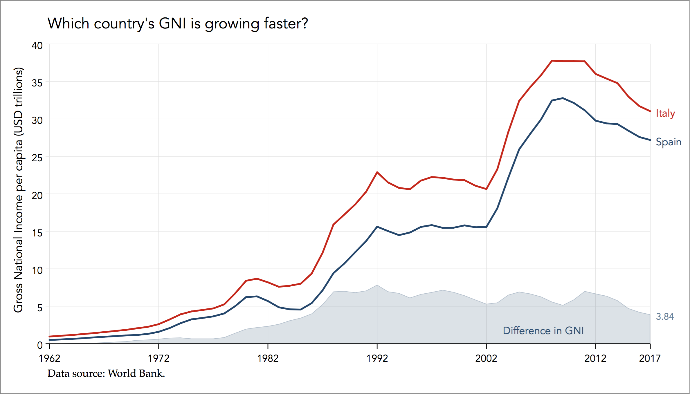
Perceiving differences by comparing the two timelines leads to erroneous inferences. Although it is easy to identify 1992 as the year with the largest difference it is very hard to perceive that this difference has remained stable during 1988 and 2012.
As another example of how differences can help bring new insights see the second Graph Objective in the analysis of the composition of the US tax revenue by source.
Above and below expected values
Sometimes the question of interest is to discover, report, and even measure the extend to which some observations deviate from their expected value. To do so we need some measure of expected value, that being some sort of conditional or unconditional measure of central tendency.
Back to Missing values ⟵ ⟶ Continue to Ratios
