Data graphing is an information system.
The input is the factual tabular data that is truthful and unambiguous. The output is the graphical encoding of this data. The data graph is a subjective interpretation on this truth that inescapably introduces a certain degree of decoding error.
The error produced by this graphical interpretation depends on the accuracy of a user decoding the graph. Therefore, unlike the data, the graphical output is subject to an estimation error from the user perspective. This error can be quantified in terms of how accurately we decode the key graph objective due to the encoding choices and the limitations in our visual perception.
Jacques Bertin was the first to develop a cohesive theoretical framework for data graphing, and collected his thoughts in the impressive 1967 volume on the Semiology of Graphics. This work is the main source of inspiration for the Graph Workflow model. One of Bertin’s most important contributions to the theory of graphics is the separation of quantified information (data) from the method that is employed for its visualisation, hence the description of data graphing as an information system.
Tables to graphs
Humans have not evolved to decode information from data tables. We have evolved to decode visual information.
Everyone must have heard the proverb that “a picture is worth a thousand words“, or a variation thereof. This is a highly accurate proverb because it reflects a biological fact. It is claimed that humans dedicate more than 50% of their brain’s neuron activity to processing visual information. We process nearly 10 million bits of visual information per second, and pre-attentive processing decodes information with high accuracy within 250 milliseconds (Healy and Enns, 2012).
As an example, consider the following table of volume of sales of iPods during 2002-2015:
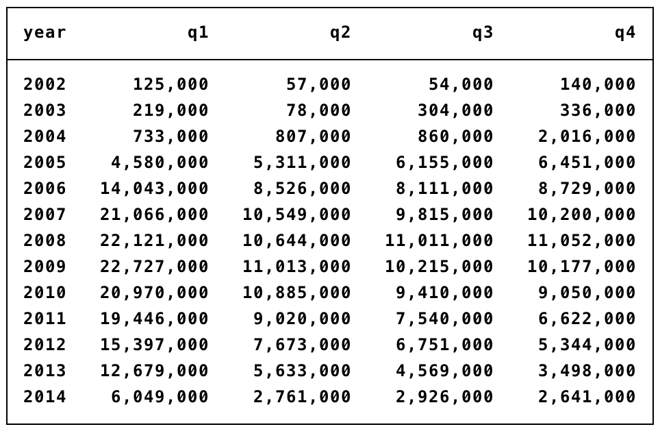
Give this table your full attention and try to answer the following questions:
- What sort of information can you decode by reading this table?
- How quickly can you decode this information?
- How much confidence do you have in the accuracy of the information that you have decoded?
- Will you remember this information after 10 minutes? How about after 1 day?
Now, repeat the same exercise but by looking at the following graph that visually encodes the same data:
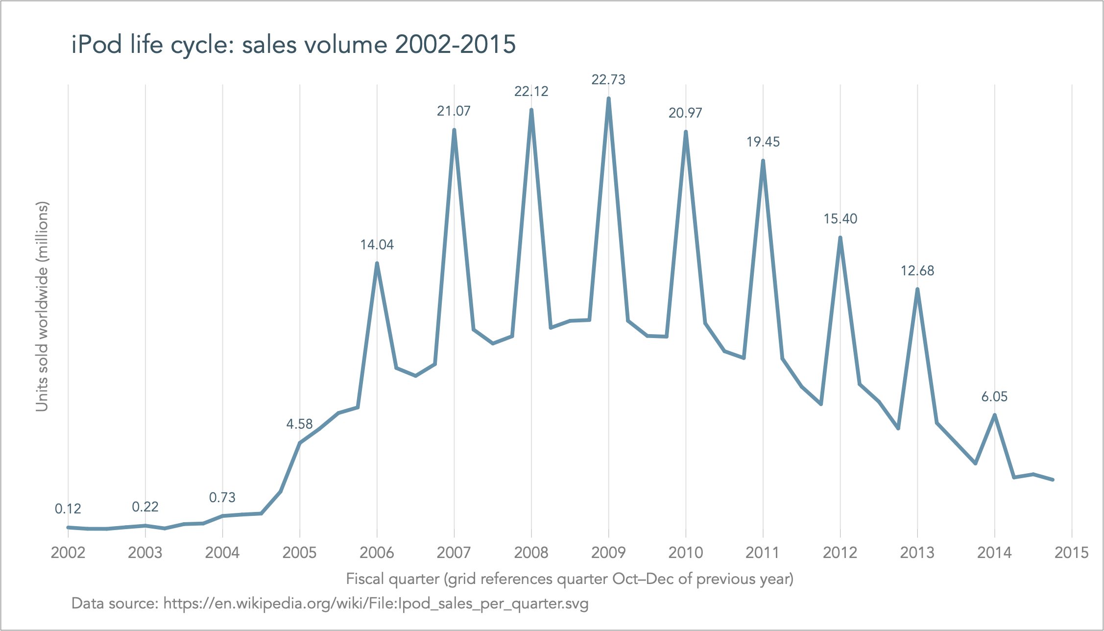
The graph makes it easy and clear to decode complex information not previously seen in a table. We can decode the full shape of the so-called ‘life cycle of a product‘, from its development stage with nearly non-existent sales to its growth period, saturation and decline. We can also decode the seasonal variation, where spikes are due to the December shopping sprees.
Importantly, it took us only seconds to decode this complex information, and we feel absolutely confident about the accuracy of the information. And I bet that even after a month you will still remember this graph in great detail.
This simple analysis demonstrates the power of data graphs particularly by comparison to decoding information from tables.
Back to Graph workflow model ⟵ ⟶ Continue to False pretences
