The first step in EDA is to develop an understanding on the distributional form of each variable that is under analysis.
John Tukey, William Cleveland and other EDA pioneers have developed an arsenal of visual methods for judging distributional form. I briefly introduce some of the most widely used methods, to which I often rely upon to judge distributional form.
Kernel density estimator
The kernel density estimator is a non-parametric estimator of a probability density function.
The easiest way to introduce the idea of the kernel density estimator is by considering the ubiquitous histogram. The histogram is a type of kernel density estimator, albeit a very restricted special case. The histogram fits non-overlapping uniform densities (rectangles) over the data, by assigning the same probability to a local range of data given the bin-width of the rectangle.
The kernel density estimator is a far more flexible type of density estimator. It can fit any type of symmetric and overlapping density, including the uniform, triangular, Gaussian (normal), and other densities specifically designed for this purpose, such as the Parzen and the Epanechnikov kernels.
Here is a list of the kernels that Stata can fit for kernel density estimation:
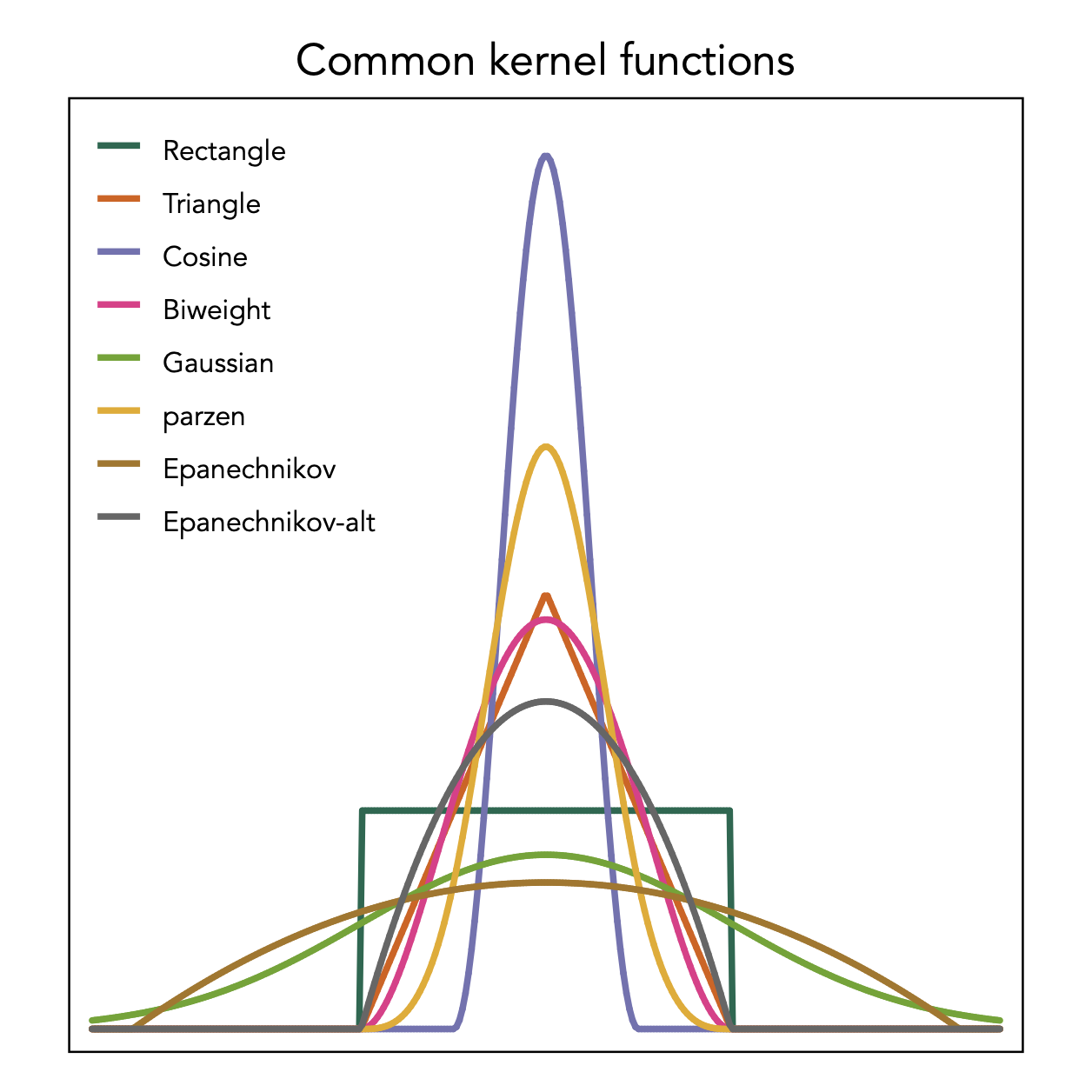
The rectangle shows the kernel employed by the histogram that is however used in a non-overlapping fashion. The kernel density estimator employs these kernel densities in an overlapping manner.
I like to use the Epanechnikov kernel to get an idea of the global or overall shape, and the Parzen kernel to understand a more detailed local description. As an example, consider the density description of the birthweight of a sample of 1,236 babies, using these two kernels:
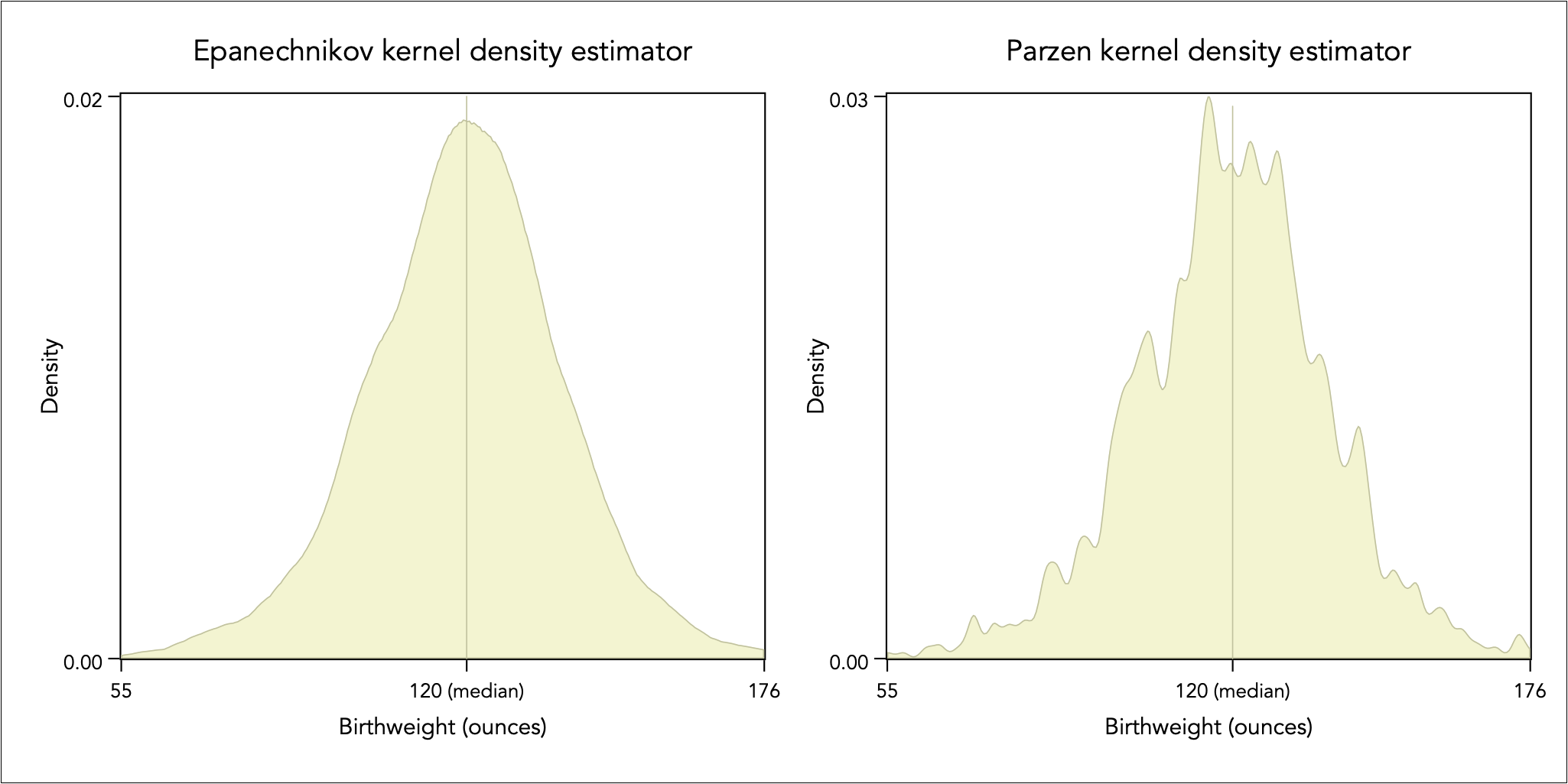
The Epanechnikov kernel can help uncover global distributional characteristics, such as skewness, peakedness, and asymmetry in tails. The Parzen kernel can reveal multimodal behaviour and dispersed data.
Symmetry plot
Although symmetry is a desirable property for analysing and graphing data, the analysis of asymmetry and skewness can be particularly insightful. A variable x is symmetrically distributed if it holds that:

where x(i) is the ith ordered value of x. The symmetry plot contrasts the left hand-side of the equation above against the right hand-side of that equation in a scatter plot.
As shown above, the Epanechnikov kernel density estimator suggests that the distribution is fairly symmetrical for baby birthweight, with the median of 120 ounces seemingly appearing in the middle of the distribution.

This perceived symmetry is not entirely correct. As the symmetry plot shows, the distribution is skewed to the left. The distance below the median becomes larger than the distance above the median as we progress away from the middle of the distribution, thus there is greater chance to observe much underweight baby by comparison to observing a much overweight baby relative to the typical baby (i.e. the median).
Box plot
The box-plot provides a visual statistical summary of a univariate distribution, and it is described in the data reduction analysis.
In brief, it uses an area implantation to encode the interquartile range between the third quartile and the first quartile (IQR = Q3 – Q1). The line inside the box gives the median (i.e. the second quartile, Q2). If the median does not lie in the middle of this area then this is an indication of skewness. The lines extending from the box, known as ‘whiskers’, outline the range of (Q1 − 1.5 IQR, Q3 + 1.5 IQR), which is half the distance between Q1 and the smallest value and half the distance between Q3 and the largest value. If one of the whiskers is longer, then this is indication of asymmetric tails. The point implantations indicate values lying beyond the whiskers, i.e. a definition of extreme values.
Continuing with the working example of baby birthweight, consider an examination of key statistics of the birthweight distribution, by the mother’s smoking status and age. I group age into the categories of 15-20, 21-25, 26-30, 31-35, and 36-45:
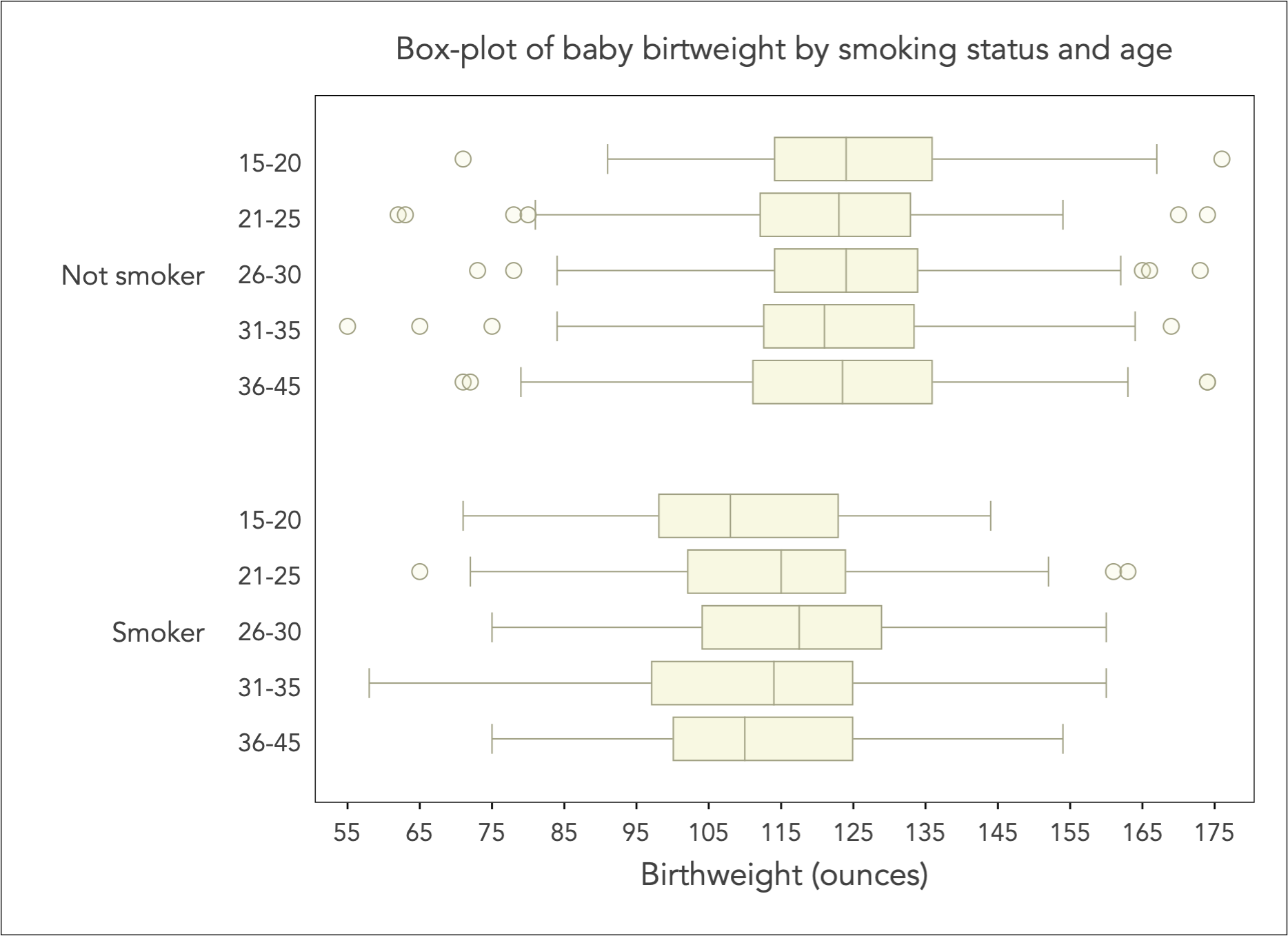
The box-plot is most useful when the distribution of continuous variable (here birthweight) is conditioned on categorical variation (here smoking status and age group).
There are two key messages from the box-plot above: (1) the typical (i.e. median) baby birthweight is uniformly for smoker mothers by comparison to non-smokers, (2) there is little variation across age groups within non-smokers but there is an evident shift in variation across age groups in smokers, with the most affected being the lowest or the very highest age groups.
Quantile-Quantile plot
The Quantile-Quantile plot, or QQ-plot for short, is an important EDA tool that enables the comparison of two distributions that are measured on the same scale.
It is imperative that the distributions are measured on the same scale. If they are not, then the only way one can use apply the QQ-plot is to first remove the effect of scale by standardising their variation.
A quantile is a position on the distribution where a certain fraction of values falls below that position, e.g. for the 25th quantile there are 25% of values falling below that position, for the 50% quantile there are 50% of values falling below that position and 50% falling above that position (hence the 50th quantile is the median).
The QQ-plot compares a set of quantiles from two distributions. Typically, we take about 100 equidistant quantiles on the distribution (i.e. the so-called percentiles). However, with very large datasets we may take even more points, could be 200, 500 or more. We can try different numbers and judge any differences.
Then all we have to do is to create a scatter plot by imposing a squared aspect ratio and a 45 degree reference line. Here is an example of the baby birthweight of women who smoked during pregnancy versus the birthweight of women who did not smoked during pregnancy:
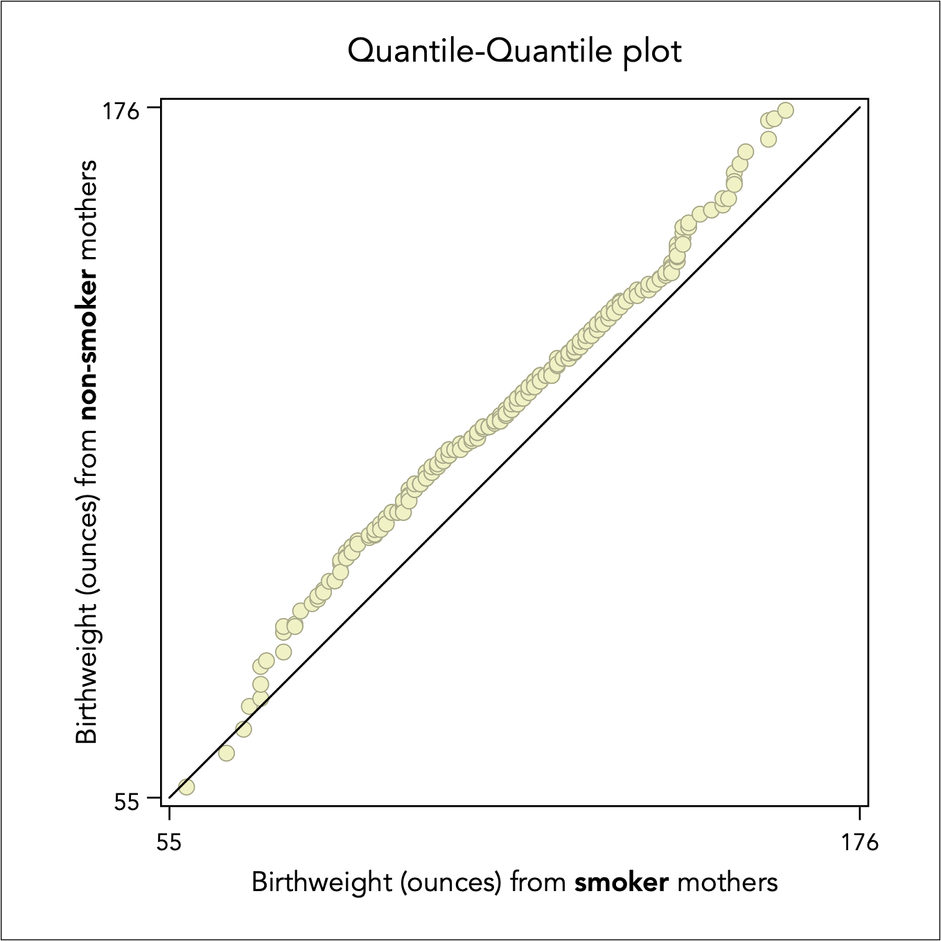
It is evident that baby birthweight of women who did not smoke is overall higher, as the scatter points lie above the diagonal 45 degree line.
Back to Exploratory data analysis ⟵ ⟶ To Assessing normality
