Accuracy is the most intrinsic quality of any information system.
Decoding accuracy in graphical representation is underlined by objectivity and impartiality. The data itself must be truthfully observed or simulated and be tractably verifiable. The data coordinates must then be encoded with exact precision. Any approximations, summaries, transformations or jittering must be clearly identified in the graph. Accuracy assumes high quality data that reliably measured and is free of material error. Accuracy leads to reliable decoding.
Low decoding accuracy means that the graph conveys an inaccurate representation of the data signal. For example, the data that is truthful and unambiguous may say that there is a positive trend in some relation, whereas a graph based on that data may suggest that there is no such trend. This is exactly what the National Review did when they tweeted the following gem with the title “The only #climatechange chart you need to see”. They have now removed this graph from their Twitter account, but you can still find coverage of this in the Washington Post and other places:

The graph gives the false impression of a flat trend in average annual global temperature over the last 200 years. They manage to do that by applying a wide range of scale on the y-axis scale starting from an unreasonably low value (-10 degrees Fahrenheit) to a large value (110 degrees Fahrenheit). This is a preposterous range for two reasons: (i) it is not supported by the data, (ii) it is not supported by theory. According to LiveScience, during the last ice age the global average temperatures were about 9 to 18 degrees Fahrenheit below today’s temperature normal temperature. So, what is the point of showing -10 degrees or 110 Fahrenheit, unless the true purpose of this graph was to mislead?
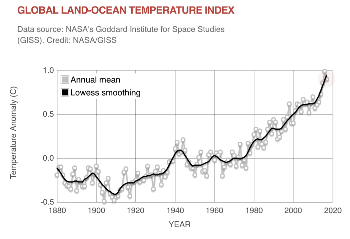
On the contrary, here is a high accuracy graph from NASA using the same data as above, clearly showing the exponential increase in global temperature especially from 1950 onwards:
As another example of low decoding accuracy consider the following graph that was released by an anti-abortion group, Americans United for Life, which claims that during 2006-2013 abortions went up at a diametrically opposing rate as cancer screening and prevention services. This graph was also presented by Republican Rep. Jason Chaffetz to a congressional hearing. I reproduce this graph here:
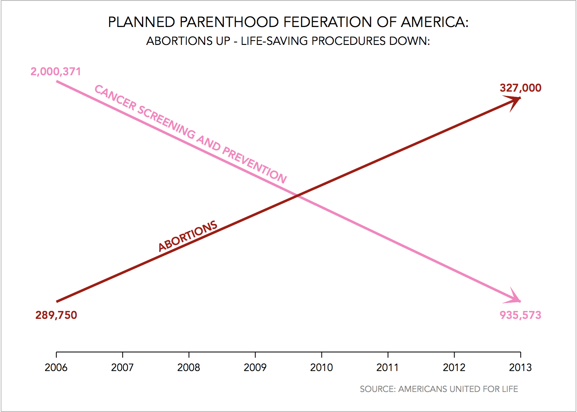
This graph is inaccurate because it uses two different vertical axes scales and does not say anything about it. The pink colour line goes from 935,573 to 2,000,371 and the red line from 289,750 to 327,000. The rate of change from 935,573 to 2,000,371 is -53.23% whereas the rate of change from 289,750 to 327,000 is 12.85%. The two trends are not diametrically opposing. Once we remove the artefact introduced by the invisible two y-axes, the increase in abortions becomes nearly flat:
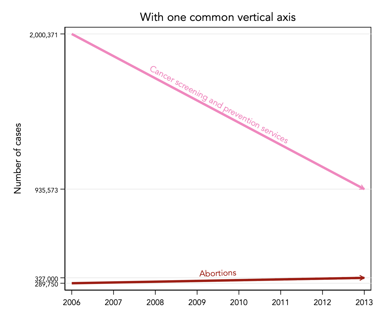
In fact, the trend in abortions would become nearly negligible if I adjusted for population growth, or show abortions per capita.
As another example of inaccurate encoding of data see the analysis on OECD top marginal tax rates, and how a graph published in the 2018-2019 Australian Federal budget has encoded the wrong coordinates for France thus presenting a misleading distance between France and Australia.
Back to Qualities of data graphics ⟵ ⟶ Continue to Completeness
