This case study demonstrates an example of how we can use the recast() option in Stata’s twoway suite of graphs, in order to transition from the point, to the line and the area implantation, each time encoding another piece of information.
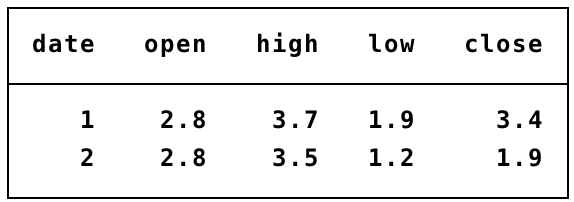
Consider the problem of the encoding the open price, close price, high price and low price of a security in two consecutive days. Consider the following demo dataset of just two observations:
As in every data graph, we begin with encoding the coordinates of all four price variables using the point implantation against the pseudo-date variable (taking the values 1, 2):
. twoway (scatter open high low close date)
This gives the left hand side graph shown in the below panel of graphs, which encodes the magnitude of prices.
The Graph Objective involving the visualisation of these four types of prices is typically concerned with comparison, particularly how the open price is related to the close price, and how the high price is related to the low price. Thus, we need a way to draw connections between the two pairs and the line implantation is a natural candidate:
. twoway (scatter open high low close date) (rspike open close date) (rspike high low date)
This gives the middle graph reported below. The lines encode the distance between different prices. This graph encodes two line implantations on top of the point implantation, but we cannot differentiate between the lines because they lie on the same direction.
To differentiate between the two lines we could consider replacing the encoding of the line with an area implantation, as for example a range bar:
. twoway (scatter open high low close date) (rbar open close date) (rspike high low date)
This gives the right-hand side graph reported below. The key point of this exercise is to show how the transition from point, to line to area implantations can be used to encode additional information.
Now we can distinguish between the levels of price (point implantation), the range of low to high that indicates extend of disagreement or uncertainty in price discovery (line implantation), and the magnitude of the daily return as the difference between close and open price (area implantation).

There are still limitations of the final graph (to the right) that will be resolved once you learn about encoding retinal variables, which is the next step in the Graph Workflow. A key problem with the current state of the graph is that does not tell us that the first set of prices represents an increase in prices and the second represents a decrease in prices.
Back to Points to lines to areas ⟵ ⟶ Continue to Volumes
