There is a great deal of debate in Australia regarding the ageing population and how the working age population may struggle to support the retiring population. The Australian Institute of Health and Welfare (AIHW) explains that in 2016, there were 3.7 million (15%) Australians aged 65 and over, increasing from 319,000 (5%) in 1926 and 1.3 million (9%) in 1976. The number and proportion of older Australians is expected to continue to grow. These trends can have dire economic consequences.
To use the words of the Federal Treasury: “In 2002 there were more than five people of working age to support every person aged over 65. By 2042, there will only be 2.5 people of working age supporting each person aged over 65.“
The graph objective is to visualise this key message by the Federal Treasury, that given the current data we project that in 2042 there will be only 2.5 people of working age supporting each person aged over 65. To do so, I must the evolution of the composition of the working age population by comparison to the retiring age population from 1971-2017 (the current data), and then fit a predictive model for up to 2042.
Note that the graph objective involves both a temporal question (the evolution during 1971-2017) and a comparative question of classes that add to a total.
Data management
The data is sourced by the Australian Bureau of Statistics (ABS), Australian Demographic Statistics, Jun 2017, Table 59. Estimated Resident Population By Single Year Of Age, Australia. It covers the period 1971-2017.
The data management involves recoding the raw age into the aforementioned age categories per year, and then calculating the proportion of each category to the total per year. This could be done separately for the male and female population but for simplicity I report here only one graph for the pooled population. The trends are similar for both genders but somewhat more adversely severe for males.
I follow a data reduction approach, that contracts the dataset to just 141 values: 2017 – 1971 + 1 times 3 age categories.
The predictive model is a simple time trend model, whereby the cumulative percentage of 65+ year olds and separately the 0-14 year olds is each regressed on a cubic time trend, of the following type:

Visual implantations
Given the graph objective, the ideal graphical tool for encoding both a temporal question and compositional categorical data is the stacked-area chart.
The stacked-area chart encodes evolution using the line visual implantation and encodes categories using the area visual implantation. The areas are stacked to a total (here the total of 100%) and they are represented across time as a unified area. In this way, we can decode two key messages from the stack-area: (i) evolution over time by decoding the timeline trends, (ii) overall weight/importance of each category by decoding the size of areas.
In addition, I add another area implantation with high opacity that encodes the range of values that have been projected from 2017 to 2042.
Retinal variables
The line implantation will act as the boundary of each area as it stacks to the total. It is important to the increase the visual prominence of the line because it carries am important message (evolution) that needs to be decoded. I apply the Gestalt principle of Figure/Ground to encode the line as the Ground (the background). In this way, the areas appear as disconnected but I keep the line quite thin in size so that the impression of disconnection is only subtle.
I choose a less saturated palette of colours with a scaled colour value for the area, by showing the retiring age category with the darkest shade given the emphasis of the question.
The colour value retinal variable is helpful for encoding the opacity in the area that indicates the set of projected values.
Graph identification
There is no need to internally identify the line implantation as it is understood explicitly as a timeline. The area implantations are internally identified on the areas themselves as ‘0-15 years old’, ’16-64 years old’ and ’65+ years old’.
External identification involves a grand title describing the Graph Objective and period of study, plus a note acknowledging the data source. I also externally identify the y-axis title explaining the unit of measurement, and a set of informative x-axis labels that make it clear that the observed values are from 1971 to 2017, with projections up to 2042.
Instead of regular axes labels, I directly identify the beginning of period and end of period proportions for each one of the categories to allow for fast decoding of the timeline evolution.
Graph enhancement
I choose to suppress the y-axis scale that holds the years, but I still report the beginning and the end of the time period, 1971 and 2016 as headings to the vertical axes.
The aspect ratio is a little bit wider than the default to assist in the decoding of both the line and area implantations of the long timeline.
Visual decoding/perception
Here is the proposed solution:
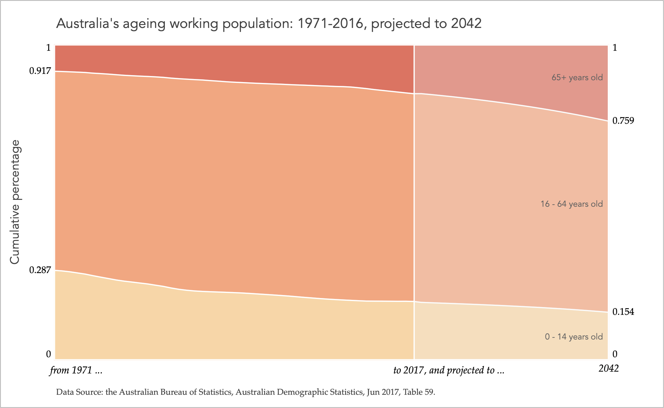
The under age population has shrank from 29% to 19%, the working age population has slightly increased from 63% (0.92-0.29) to 66% (0.85-0.19), and the retired population has increased nearly doubled from 8% (1-0.92) to 15% (1-0.85). That is, in 2016, the ratio of the working population to the retired population in 2016 is 4.4:1 (66% over 15%), and to the retired plus under age population is 1.9:1 (66% over 15%+19%).
The most alarming message of all from the graph is the monotonic trend, thus the dire projections by the Federal Treasury department. Given this predictive model, in 2042 there will be about (0.759 – 0.154)/(1 – 0.759) = 2.51 working age people supporting the retired age population.
Download the Stata code for reproducing this analysis: australia_ageing_pop.do


