Graph objective
The traditional way for showing periods of economic contraction (recessions) is via the use of reference areas, as shown in the graph just below. To see the detail, right-click to open the image in a new tab:

This type of representation is considered standard practice, which however I find to be quite misleading. Using such reference areas accurately encodes the length of a contractionary period, as defined by the National Bureau of Economic Research (NBER), but it wrongly suggests that all recessions are of equal severity. Notice how all contractionary periods are incorrectly encoded with the same reference area height.
Another useful information that is missing, is how long it took for the economy to recover from the contraction. This of course depends on the context. For example, the above graph plots the evolution of the S&P 500 price index (in log-scale with base 2). A very important question is the following: if someone invested in this index as at December 2007 (the beginning of the Great Recession, or Global Financial Crisis), then how long it took for the market to recover at that same level. The answer, as shown in the analysis below, is 5.2 years. This is a long time to wait for an investment to start earning returns.
Data management
The price data is sourced from Robert Schiller’s website. The business cycles data is sourced from the NBER.
The two datasets are merged on the basis on month-year. All analysis is done using monthly data.
The key data management step is the transformation of prices on a log-scale with base 2 given the exponential growth and the difficulty in visualising the nominal data. The base 2 of the log helps decode price evolution in terms of doubling rate.
The Stata code provided at the end of this page describes the steps for data management for reproducing this analysis.
Visual implantations
A time plot chart requires the use of the line visual implantation, hence to encode the price index.
In addition, the recessionary periods are encoded using the area visual implantation. As explained above, the traditional way of encoding contractionary economic periods is rather misleading, because the height of the areas is held constant. I correct this error by calculating the height of each area to reflect the highest and lowest price within each period. That is to say, the height of each reference area would reflect the extend of the price drop as a consequence of the recession, and the length of the area would reflect how long the recession lasted.
Moreover, I will encode another line visual implantation that would show how many years it took for the price to recover following the drop. Given the prospective nature of prices, I allow for up to 3 months in advance of the official date of the recession in order to calculate the price drop (this is subjective but some time must be allowed).
Retinal variables
The main piece of information is the evolution of price, so this is encoded using dark colour (black) and a solid slightly thick line.
The reference areas of the contractionary periods are encoded using a pale red colour. I choose a reddish colour because of its negative connotation in the financial world.
The reference lines indicating the recovery periods are shown with a dark blue colour and a dashed texture in order to reduce their visual prominence given their proximity to the price line chart. The reference lines are also thinner than the price line.
Graph identification
A legend internally identifies the reference areas and the reference lines. The legend is placed within the plot region in order to save space, and given the abundance of white space.
The context of the reference lines is directly identified by indicating the length of time, in terms of years, that it took for the market to recover following a recession.
External identification includes a short title, informative axes titles describing the variables and their unit of measurement, and axes labels. I also add a note acknowledging the data sources, and the choice to show recovery periods that extended beyond 1.5 years.
Graph enhancement
The graph objective is inspired by finding a suitable way to show the length and severity of recessionary periods and the time it takes for the market to recover. These two piece of information are encoded using graph enhancement tools: reference lines and reference areas.
Following the transformation of price on the log-scale with base 2, I choose to show only integer values the y-axis to help decode the price evolution in terms of doubling rate.
Specifically, it holds that as log2(1)=0, log2(2)=1, log2(4)=2, log2(8)=3, log2(16)=4, and so on. The value of 11 indicates 11 doubling time, thus 211=2048. This is an intuitive way for anyone to see how quickly the market grows.
Given the long time series, it is imperative that we apply a wide aspect ratio. This allows to see not only the steepness of slopes in the timeline, but also it represents more truthfully the length of recovery periods.
Visual decoding/perception
Here is my proposed solution (to see the detail, right-click to open the image in a new tab):
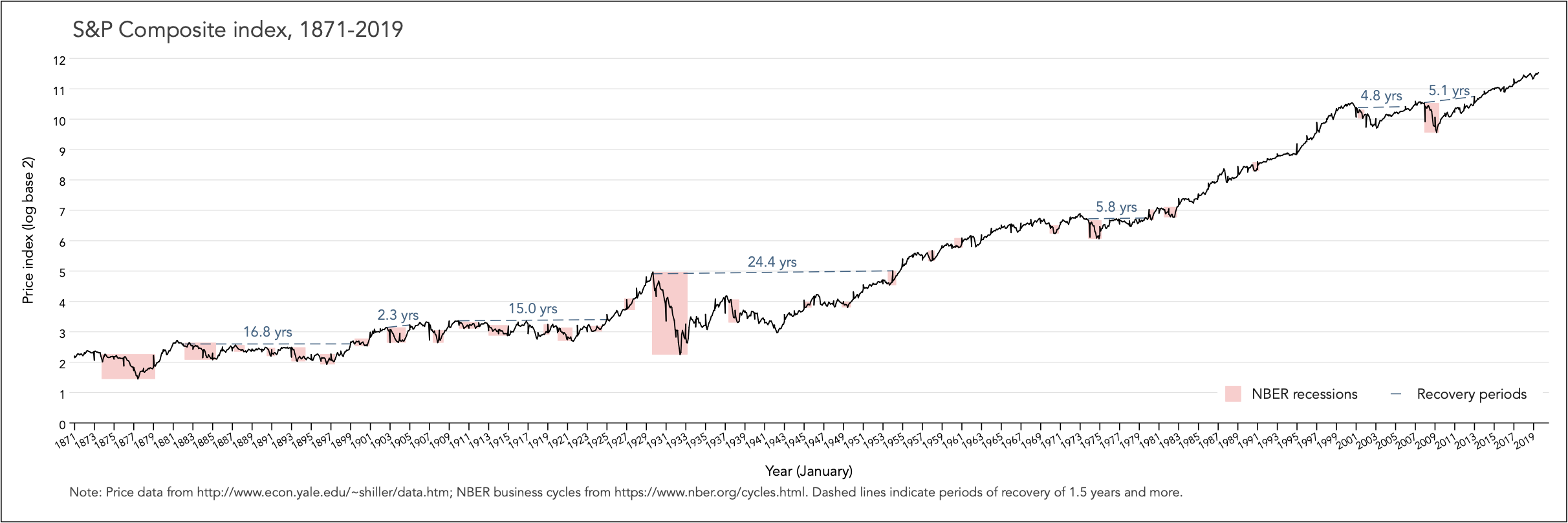
I find this representation of contractionary periods quite compelling. The August/1929 – March/1933 Great Depression now stands out as the most severe economic shock since 1871. This in contrast to the traditional representation, as shown at the top of this page, which suggests that it is the October/1873 – March/1879 recession that was the worst (notice the widest reference area). Indeed, the 1929 recession was much sharper (steeper price decline) and deeper (longer recovery period) than any other recession in recent history.
Another interesting observation that is often overlook in discussion of the December/2007 – June/2009 Great Recession, is that its pre-recession peak price was very close to recovery price following the March/2001 – November/2001 dot-com bubble recession (considering the log-scale). In fact, given the expectation of exponential returns, one could argue that it took 9.9 years for the market to recover from the effect of the 2000 and 2007 recessions combined.
Download the Stata code for reproducing this analysis: recessions_traditional.do; recessions.do


