Graph objective
One of my students alerted me to this gem:
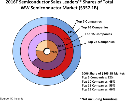
The narrative is very interesting. The accompanying article explains how ongoing M&A activity has led to the fast consolidation of the semiconductor industry worldwide. In 2015, the top five companies (Intel, Samsung, Qualcomm, Broadcom, SK Hynix) held 32% of the global market share, and in just one year they increase their hold to 41%. If this is a trend that continues then there should be real concerns for increased prices.
The graph above is meant to describe the degree of industry concentration, but there are so many problems with this approach. In fact, I would classify this graph as one of the worst I have ever seen, because the data is so simple yet the designer has went into great lengths to introduce unnecessary complexities.
The graph violates the quality of accuracy. The graph uses a series of ‘donut charts’ in an attempt to show how a limited number of companies hold a large piece of the ‘pie’ of global sales. However, all donuts should be of the same size, because the whole of the donut is supposed to represent the total of global sales, i.e. a constant. Right now the graph lies, because it suggests that the Top 5 companies hold 41% market share that is shown to be about twice as large as the 76% market share that is held by the Top 25 companies!
Another obvious problem is the use of the many colours. The colours do not encode any variation in the data and they only serve a decorative purpose. This choice violates the quality of relevance and the quality of efficiency.
The graph also violates the quality of consistency, as it shows the data for 2015 using donut charts and the data for 2016 in a tabular format. As a result, the connection between the two is far from obvious and their comparison very much cumbersome.
Data management
The data is effectively reported as part of the graph shown just above. There are two years of data, 2015 and 2016, each with 5 observations for the market share of the Top 5, Top 10, Top 15, Top 25 and All companies in the industry.
There is no particular data management involved, other than recording these values manually in a dataset. The Stata code provided at the end of this page gives this data.
Visual implantations
In line with the author’s original intend of showing how a few companies hold a big chunk of the global market share, I also employ the area visual implantation to try and convey this message. Instead of donut charts, I use a squared area, whereby a square of 100×100 indicates the total global sales. Then, a smaller square of 41×41 would indicate the market share of the Top 5 companies in 2016.
I construct two such sets of squares, one for 2015 and another for 2016, and lay them side-by-side. Then, I use the line visual implantation to show how quickly the market share of the Top 5 and the rest groups have increased over two years. Although the steepness of the lines would not be an exact measure of the growth rate, they could still be used to compare the growth steepness across the many categories (Top 5, Top 10, Top 15, Top 25).
Retinal variables
The encoded variation in the different sized squares reflects incremental proportions towards a total. Encoding different colours, as shown in the original graph and the graph just above using Stata’s defaults, would therefore give the wrong impression of categorical variation.
Instead, it is most appropriate to use the colour value retinal variable to encode this sort of variation, where darker increments of value would indicate higher industry concentration.
Graph identification
Internally identification includes the direct identification of years, 2015 and 2016, and the categories of Top 5, Top 10, Top 15, Top 25 and Total market share, including the values for each category. Such direct identification is necessary because it is difficult to compare with fair accuracy the size of areas, thus recording the actual values in each area enables quick and confident visual decoding.
Given the small dataset, it is useful to directly identify the data values for each category to allow for effortless decoding.
External identification includes a title describing the key question, and a note acknowledging the data source.
Graph enhancement
The most important step in graph enhancement is to specify an aspect ratio that maintains the squared proportions of the areas.
Notice also how I have suppressed the display of axes and other information that add unnecessary complexity and detract attention.
Visual decoding/perception
Here is my proposed solution:
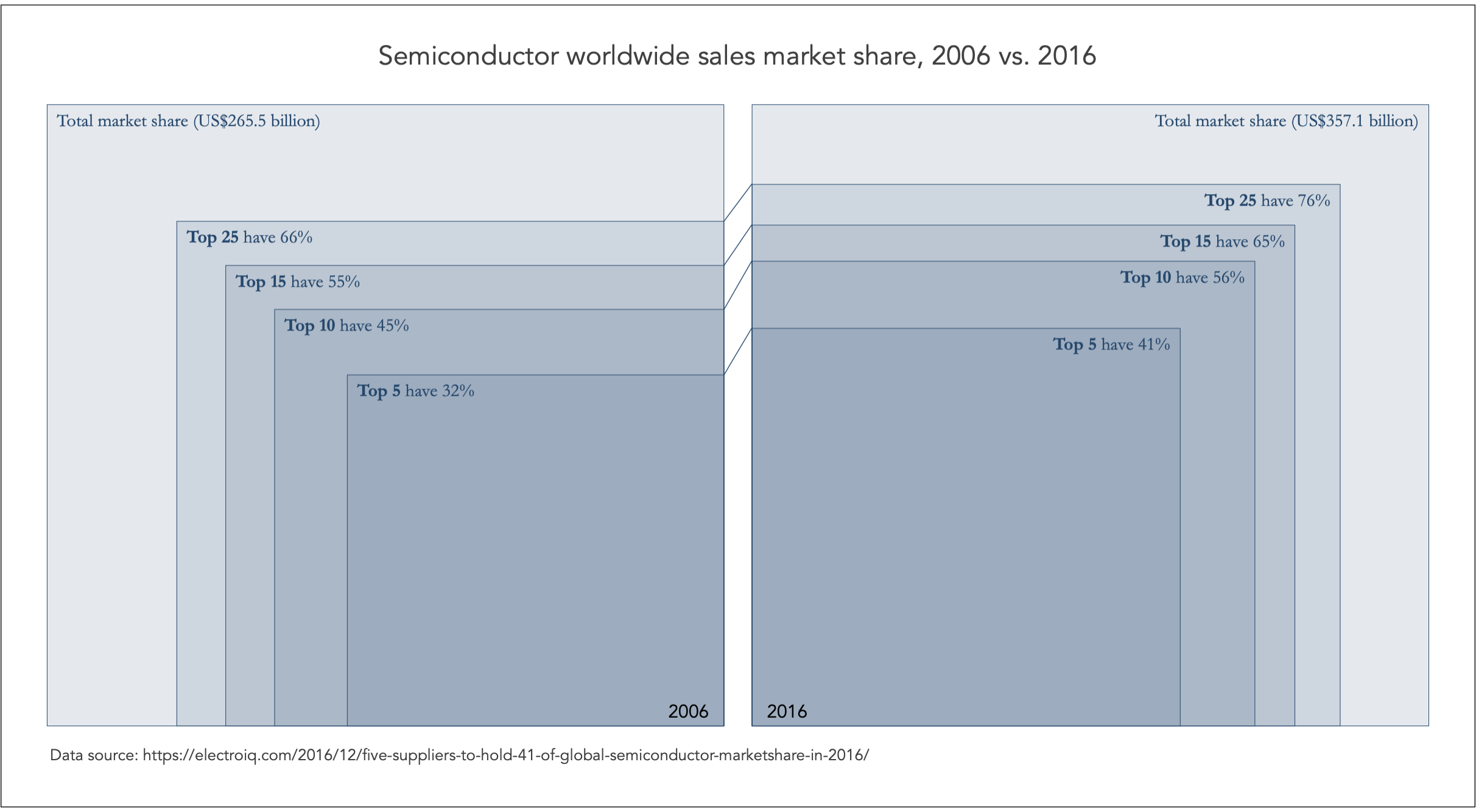
Although there are known limitations in our visual perception in using the area implantation for comparing the sizes, I feel that this design overcomes many of these problems. First, the graph makes it clear that the market share size is the same for both 2015 and 2015, given the focus on comparing proportions.
Second, it is clear the progression of market concentration through the series of enclosed squares, and the darker shades help differentiate this progression. I find that the most important design aspect in this graph is the direct identification of values; without this it would be impossible to decode the visual information.
Third, it is also clear how the industry concentration has increased from 2015 to 2016, and the line implantations connecting the two sets of squares suggest that the increased in concentration is proportional for Top 5, Top 10, Top 15, and Top 25. Notice how the line slopes are roughly the same.
Download the Stata code for reproducing this analysis: semiconductor_sales.do


