During the SARS-COVID-19 crisis, the Australian government implemented the policy of encouraging the voluntary adoption of a Bluetooth tracing app, COVIDSafe, to help with contact tracing and mapping the spread of outbreaks. The government defined a 40% uptake target from the population of smartphone users aged between 14 and 75 years as a prerequisite for lifting isolation measures.
Together with Prof Robert Slonim and Dr Doron Samuell we created an open letter endorsing this app, in order to help the efforts of meeting and going beyond this narrowly defined target. The ultimate aim is to help accelerate the lift of isolation measures safely. This open letter was available at https://endorsecovidsafe.com/ but this website has been deactivated.
This grass roots initiative has proven to be very very successful with prominent Australians from all walks of life signing the open letter and more than 130 organisations also officially endorsing the app.
The purpose of this post here is to discuss the design of a graph that is disclosed in that website, which reports the uptake growth over a period of 3 weeks. This graph was circulated widely across media.
Graph objective
The graph objective is twofold.
First, the graph must show the evolution of the app’s downloads since the launch date and relative to the policy target of 40%. I must say that the government never explained why 40% would be sufficient, especially since research has determined that we need at least 60% of the population for this type of technology to work, and other countries requiring 75-80% uptake. But, this is matter for another discussion and here I take the 40% target at face value.
Second, the graph must show how the uptake growth in Australia compares directly with the uptake growth in Singapore. Australia’s COVIDSafe app was directly inspired by Singapore’s TraceTogether app, the first Bluetooth contact tracing app launched to help fight the spread of SARS-COVID-19. Many parallels were drawn between Australia and Singapore in the days leading to the launch and the days that followed the launch. So, it is important to show how well the Australian uptake fares by comparison to that of Singapore, especially since the Singapore experience was quite poor. Singapore failed to motivate its citizens and residents to take up the app in large numbers. As a result, Singapore could not monitor contact tracing effectively, and during 21-27 April it saw a new surge of outbreaks with 900 new cases per day. This was partly due to the inability to trace dozens of infected cases back to a source.
Data management
The data has been collated from various news sources and offical statements from government spokespeople, as also documented in the do-file that is provided at the end of this webpage.
The data is inputed manually and it is available as part of the Stata do-file that is provided at the end of this webpage.
Visual implantations
The pace of app downloads is encoded using a line implantation. The steepness of the line encodes the growth rate in uptake. From experimental research, we know that the uptake of voluntary new policies is steep in the first handful of day and then growth slows down and comes to a halt in about 2 weeks days past the launch. The same behaviour is observed here.
I also use the area implantation to encode the area under the uptake curve. The area implantation makes more salient the uptake magnitude relative to the target. It enhances faster and more accurate decoding.
In addition, the point implantation is used to encode the position of each uptake rate by day, and comparisons are drawn between Australia and Singapore.
Retinal variables
The Endorse COVIDSafe website has a dark green theme colour, so I apply the same baseline colour to encode the timeline and area under the curve. The data on Singapore is encoded using a dark blue colour. The desired target is encoded with a dark red colour. The other targets are encoded using a light grey colour to reduce their visual prominence.
The reference lines are encoded using dashed patterned lines. The common dash pattern across the four reference lines explains that these form a group of comparative information, in accord to the Gestalt principle of similarity.
Graph identification
Given the public domain and widespread distribution of the graph, it is important to have sufficient self-contained identification that will ensure quick and unambiguous decoding.
External identification includes a grand title describing the overarching graph objective, as well as the unit of measurement in the timeline as I choose to suppress the y-axis title. A note to the graph is carefully placed with an arrow pointing to date 03/05 indicating the date when the website was launched. All reference lines indicating the competing targets are carefully identified. I also provide a list of day labels spanning three weeks since the launch.
There is no need for internal identification because Singapore’s blue points are directly identified as “Singapore” and shown to be different than Australia’s green data points.
Every data point is directly identified with the uptake rate. The latest point in the time series is also identified as percentage to the target population of interest thus indicating the distance from the 40% rate.
Graph enhancement
A key objective of this graph is to demonstrate how close and how fast the uptake rate approaches the baseline target of 40%. I use reference lines to show this information.
Up until 10 days after the app’s launch, we were not told how to translate the 40% uptake target in terms of number of people. As at 5th of May, a Sydney Morning Herald article cited the Prime Minister “aiming for 40 per cent of the country’s 16 million smartphone users“. As we explain in this webpage, the PM’s definition of population of interest is very narrow and focuses only on smartphone users aged from 18 to 75 years old. It is evident that this a political definition not related to any epidemiological study. I reference this target as “PM’s definition”.
In addition, I show another three reference lines indicating auxiliary targets. I choose as the most relevant target as the 40% of smartphone users aged from 14 years old and above. This includes the younger more mobile portion of the population as well as the more vulnerable portion of 75+ year olds. The other two targets that are referenced are the Australian Bureau of Statistics (ABS) estimate of 40% individuals in households with smartphone, and the 40% of the total population.
Although the website and the graph were created as at 03/05, I extended the timeline to the 16th of May. The timeline target projection of meeting the target by the 16th of May is based on the following assumptions. First, based on the Singapore experience, failure to meet a critical mass within the first 3 weeks will result in the uptake rate stagnating and the app failing. Second, by the 3rd of May the Australian government already started discussing easing some aspects of the isolation and not meeting the target soon would indicate a premature lift of restrictions.
Visual decoding/perception
Here is my proposed solution to the graph objective:
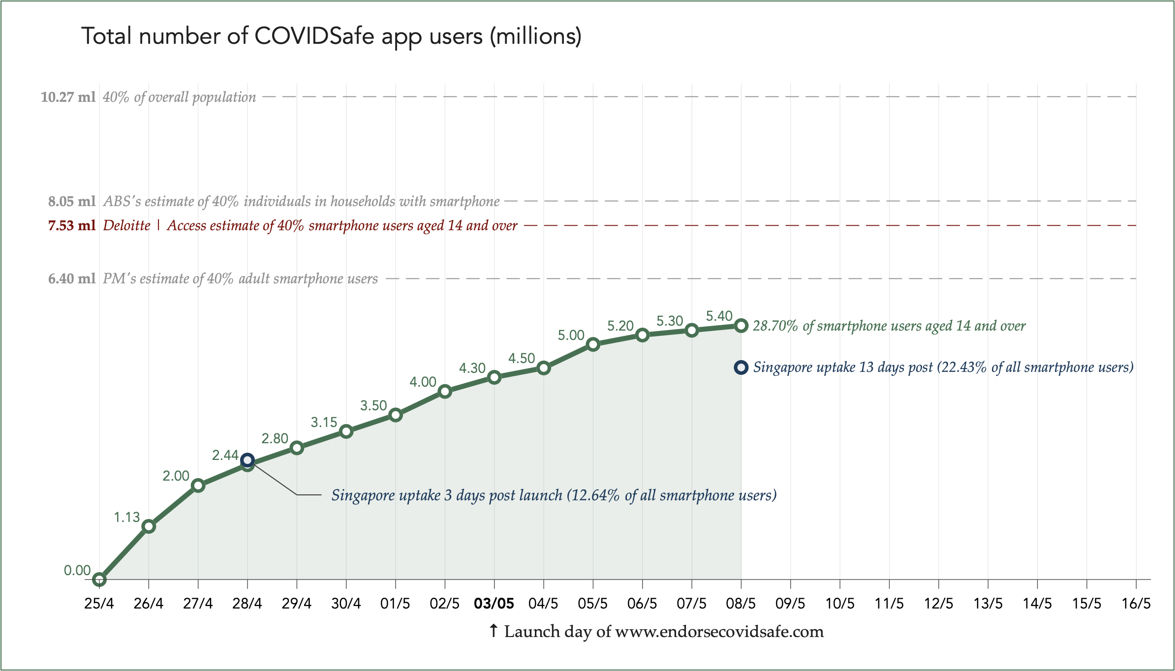
The app was launched on the 26th of April, and about 2.44 million Australians installed COVIDSafe within three days of the launch, translating to about 12.4% of smartphone users aged 14 and above. This rate is directly comparable to that of Singapore, which achieved 12.8% within three days. Australia continued to perform well and passed Singapore’s uptake rate by reaching 28.7% in 13 days post the launch.
Now the curve seems to have flattened and for the last three days (9, 10 and 11 of May) the government has stopped reporting uptake numbers. It looks unlikely to meet any of the targets, even the most generous defined by the PM. In fact, there could be negative growth many have started uninstalling the app. So, although Australia fared somewhat better than Singapore the first two weeks, it too fell into the complacency trap and failed to make effective use of the Bluetooth tracing app.
On Friday 8th of May, the Australian federal government went against its own advice and prematurely announced the lift of restrictions to cafes, restaurants and retail shops. This is before they even met the lowest definition of the baseline target of 40%, that according to their own analysis was a prerequisite for opening up again. With such low uptake numbers the tracing app is basically ineffectual. On Saturday 9th of May, the main streets were full of overconfident shoppers and families not observing basic social distancing rules. This was bad policy as it led to a second outbreak.
Download the Stata code for reproducing this analysis: uptake.do


