Sunspot activity refers to the number of dark, cool, intense magnetic field regions on the Sun’s surface. These areas, known as ‘active regions’, drive solar flares and coronal mass ejections that can impact Earth’s satellites, communications, and power grids. Ultraviolet radiation also increases dramatically during high sunspot activity, which can have a large effect on the Earth’s atmosphere. Sunspot activity has a strong cyclical variation, with the cycle repeating every about 11-years.
Sunspot activity is an example of a long cyclical time series with sharp inflections, which must be graphed using appropriate aspect ratios that would reveal its localised variation. As explained in Cleveland (1993) and in Christodoulou (2017), an appropriate aspect ratio for sunspot activity that optimises the contrast of the successive line segment slopes is of the order 0.05:1. This means that the y-axis size must be 20 times longer than the x-axis size, making this an impractical aspect ratio for any form of publication.
The Solar Influences Data Analysis Center (SIDC) of the Royal Observatory of Belgium collects observations on sunspot activity and issues the Sunspot Index and Long-term Solar Observations (SILSO). SIDC addresses the issue of the wide aspect ratio by publishing the sunspot series using a split-and-stack design:
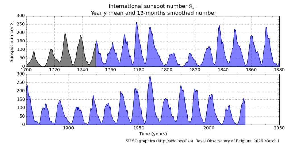
This is a great design with a simple solution that works very well. The designer of the graph has paid particular care to meet the qualities of data graphics, with encoding design choices that adhere to decoding accuracy while maintaining encoding relevance and decoding efficiency, This is a highly informative data plot for the following reasons: (1) while an aspect ratio of 0.05:1 is impractical, a simple split in two panels doubles the aspect ratio to the more manageable 0.1:1, (2) the design repeats the last ten years presented in the first panel as the beginning ten years in the second panel thus emphasising continuity in the series, (3) the bottom panel is purposefully shown as incomplete to make it clear that this is a ‘plot in-progress’ that updates as new information arrives, (4) it maintains a common y-axis scale across the panels (but not exactly in the x-axis).
The purpose of this post is to place the design of this graph within the context of the graph workflow model, and reproduce the graph using more detailed monthly data with more panels.
Graph objective
The graph objective is to present the long cyclical time series in a stack-and-split design using an optimal aspect ratio that maximises the contrast of the successive slopes, in order to reveal the different degrees of inflection when the series increases toward a peak compared to when it decreases toward a trough, and this cycle repeats every about 11 years.
Data management
The data is sourced from the SIDC data repository on total sunspot numbers. The relevant data series is “Monthly mean total sunspot number, which it is provided in semi-colon-delimited form in the file “SN_m_tot_V2.0.csv” . SIDC’s published data protocol describes the contents of the data.
The data is read in delimited form keeping only three variables: year, month, sunspot number. Using the year and month, a datetime is reconstructed in lapsed months, resulting in 3,590 time steps, from January 1949 to February 2026 (the time of this post).
Visual implantations
The time-evolution of sunspot activity is encoded with a line implantation that is recasted as an area implantation to enhanced decoding efficiency. Line implantations are naturally perceived as evolutions over time thus making decoding intuitive.
The long line is split into three panels, covering the periods of January 1749 to December 1859, then January 1849 to December 1959, and lastly January 1949 to December 2059. That is, the last ten years of a series are the same as the first ten years of the next series. This encoding design choice aims to simplify complexity in the decoding of a very long time series.
Retinal variables
The line implantation is encoded in bright orange colour, reminiscent of the brightness of the sun’s rays. The area implantation is also encoded in orange but with 50% opacity for two reasons: (1) the reduced brightness in the area applies a colour value of lesser importance compared to the line because it is the line that encodes the actual data, (2) it makes it easier to decode the y-axis grid lines.
The size retinal variable is also used to increase the visual prominence of the line implantation, because, again, it is the line that encodes the data and not the area. The proposed solution to the graph objective is shown at the end of this page, in full colour.
However, the choice to use colour is indeed an encoding design choice that does not necessarily increase the informativeness of the encoded data series. The use of colour only makes it more pleasant to view the graph, but even this is debatable as different people enjoy different colours.
There is only one piece of information that requires encoding – the evolution of sunspot series, so there is no real need for colour. Instead, we could encode the series in simple grayscale and be ultra-economic in our encoding choices. To do that, in lines 54-56 of the provided do-file routine, simply replace the following commands with grayscale values, where gs16 is for white and gs0 is for black:
. local bgcol gs16
. local fgcol gs0
. local lcol gs0
These commands switch the colourful graph to a grayscale graph.
Graph identification
External identification includes a grand title describing the graph objective, with a subtitle providing more context on the unit of measurement for the numbers in sunspot activity. The subtitle makes redundant the need to add a y-axis title. The x-axis title is also suppressed as it is self-evident that the scale is time and the range of time is from 1749 to 2049. A note to the graph documents the source of the data.
External identification also includes axes labels, which play an important role in the decoding accuracy of this graph. The y-axis labels make it clear that the scale range remains constant across panels, where the x-axis labels explain that the last ten years in one series repeat as the first ten years in the next series.
There is no need for internal identification as there is only one data series encoded in the graph.
Graph enhancement
Graph enhancement plays an instrumental role in the design of this graph, specifically the choice of aspect ratio. Christodoulou (2017) provides a detailed analysis of the question of optimal aspect ratio with a user-written command that automates the calculation of several heuristic criteria. To proceed with the do-file routine, you must first install the following command from the SSC library:
. ssc install optaspect
The do-file routine then applies one of the optimal aspect ratios estimated by the command optaspect, by optimising the contrast of slopes of the successive line segments.
Another graph enhancement choice is the salience placed on y-axis grids, effectively acting as reference lines that help decode the variation in the time series. The highest grid line is set at 400 which is close to the maximum average monthly sunspot (398.2) observed in any month during 1749-2026.
Visual decoding/perception
This is my proposed solution to the graph objective (the colourful version):
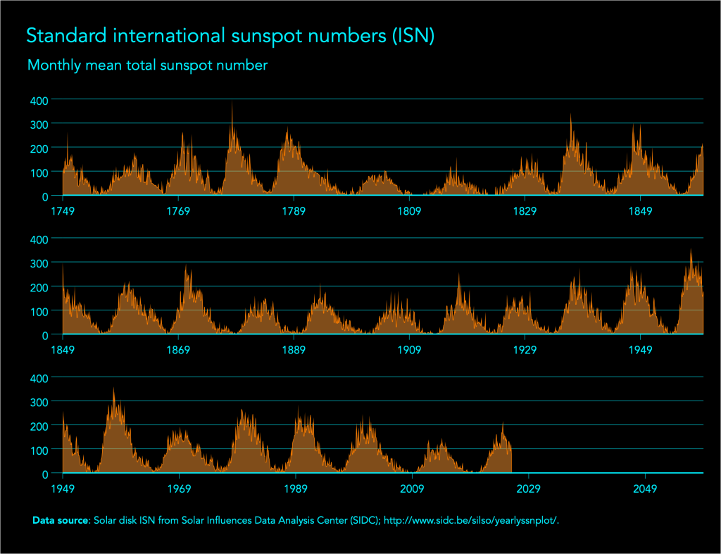
The split-and-stack design with the optimal aspect ratio clearly shows the peaks and troughs over time, and how sunspot activity tends to rise more sharply at the beginning of its cycle and declines more slowly at the end of its cycle. Also, it holds that the taller the peak the steeper is the rise and more gradual is the fall, whereas this asymmetric behaviour is not present in cycles with shorter peaks.
Download the Stata code for reproducing this analysis: sunspot.do


