Hans Rosling (1948 – 2017) was the Professor of International Health at Karolinska Institute and co-founder and chairman of the Gapminder Foundation. He was a prolific public speaker on public health and development economics. His TED Talks are legendary.
He is particularly known for his use of data graphs in demonstrating how the data does not support our (often gloomy) perception of the state of the world. Some of his views have been collected in the posthumous book Factfulness: Ten Reasons We’re Wrong About the World – and Why Things Are Better Than You Think.
Graph Objective
One of Hans Rosling’s most influential data graphs, entitled “200 years that changed the world” was shot into fame by BBC’s program Joy of Stats, which cleverly animated this data graph seemingly in real space – this made great television.
In tribute to his work, I will exactly reproduce this data graph using Stata. The graph objective is to show how the world has changed over the last 200 years in terms of life expectancy (a health measure) and income per person (an economic prosperity measure). It is worth sitting through the original presentation by Hans Rosling to learn more.
Data Management
The data is sourced from the Gap Minder project, including data on income per person (GDP per capita, PPP inflation adjusted), data on life expectancy in years at birth, and data on total country population. Income is transformed using the logarithmic function.
Although the original approach classify countries (defined as United Nations members) into six broad world regions, Gap Minder has since revised its approach and now classifies only four world regions: Africa, Asia, America, and Europe. In their documentation, they say: “The World can be divided in many ways. We use four simple regions just to make it easier to memorise the overall trends and patterns. There is no official way to divide the Eurosian continent into Europe and Asia.”
The original data graph does not show any countries with less than 25 years of life expectancy, but the data has plenty such observations. It is important to understand that these are expected life expectancy estimates at birth (not actuals), and some of these estimates are quite unreasonable, e.g. the expected life expectancy of Fiji in 1875 was 1 year, and of India in 1918 was 8.75 years. Similar to the original graph, I also exclude observations with life expectancy of less than 20 years. I cannot make sense of these estimates, so we should interpret the data from early years with great caution.
Visual Implantations
The graph is a simple scatter plot between life expectancy and income, hence the use of the point visual implantation.
Retinal Variables
The point implantation is encoded using three retinal variables.
First, the colour retinal variable encodes the four world regions of Africa, Americas, Asia and Europe.
Second, the size retinal variable encodes the country population, hence the larger the size of the circle marker the greater the population of the country.
Third, the motion retinal variable encodes the time in terms of years, from 1800 to 2018.
Graph Identification
External identification includes the a grant title indicating the graph objective, axes titles that describe the variables and units of measurement, and regular axes labels.
Internal identification is achieved in two ways. The retinal variable of colour is identified in a legend, and the retinal variable of motion is identified by printing in large font each year. The retinal variable of size (i.e. the country population) is self-evident hence it does not need to be identified, or perhaps I should have said something in a note to the graph.
There is no direct identification in the graph but one could directly identify the countries of interest in order to follow their evolution over time.
Graph enhancement
I find the addition of axes grid in the form of reference lines to be helpful. The reference lines provide a benchmark of comparison.
I impose a ‘golden’ aspect ratio with approximate dimensions 8:13. This makes for an appealing image that is pleasant to decode.
I also add some shading in the graph region, as per the original design.
Visual decoding/perception
I reproduce the original graph first in GIF animation using GIFmaker. Given the fixed format animation and the large storage size, I show here only the graph for period 1999-2018. You can adapt the Stata code at the end of this webpage to produce an animated graph for the entire period:
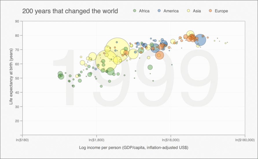
The power of this graph lies in its animated timeline, showing the evolution of the relation between health and economic prosperity. You can see that even in this small sample of 20 years, the world is becoming healthier and more well-off. There is still considerable variation and a large gap between the poorer and richer countries, but Hans Rosling’s key message is that overall the world has certainly become a better place for all (relatively speaking).
Alternatively, as explained in the discussion on the motion retinal variable, one could use a movie maker software to animate the same set of graphs. The advantages of considering a movie the ability to pause, resume, rewind and fast-forward. Here is how this would look like using iMovie on Mac OSX:
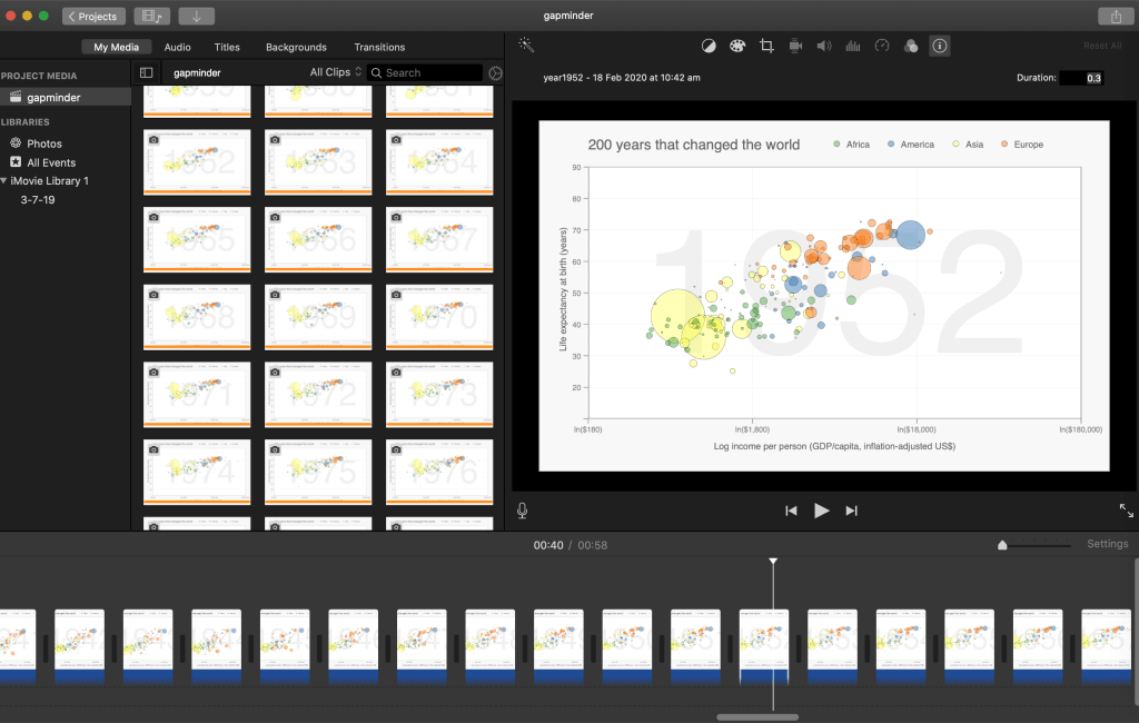
I cannot load the movie on the website because of its large storage size. To learn how to proceed, read the instructions in motion retinal variable.
Download the Stata code for reproducing this analysis: hans_rosling_200years.do


