Graph objective
The Taiji Cove drive hunt takes place annually at the Japanese fishing village of Taiji, where dolphins and other small cetaceans (like mink whales) are driven by fishing boats into a small bay to be killed for their protein or captured for training and eventual sale to dolphinariums.
The Taiji Cove drive hunt has been the source of considerable negative publicity particularly following the graphic footage released by Oscar-winning documentary The Cove that documents graphic images of how the small sea mammals are slaughtered. Taiji officials and the Japanese government continue to defend this practice as being economically rational and part of a deeply rooted cultural tradition, and have made compromises over time.
The graph objective is to document the “Evolution of kills and captures” of this annual hunt since the 2001 season, when recording of estimates began. Professional ethics suggest to approach this controversial question in an objective manner and take no sides in the debate. I simply wish to report the number of dolphins and other small cetaceans killed and captured every year and the potential effect that activism may have had.
Data management
There seems to be two non-reconcilable sources of data on the number of cetaceans driven, killed and captured. The Ceta Base is a non-profit organisation that compiles detailed daily data from 2010 using estimates provided by witnesses on the ground. They say that data is gathered from land-based observer reports and from official progress reports released by the National Research Institute of Far Seas Fisheries (NRIFSF) of the Fisheries Research Agency of Japan (FRA) and the Fisheries Agency of the Ministry of Agriculture, Forestry and Fisheries, the Government of Japan. I was unable to find which source is given priority or any web links of the aforementioned agencies where data is supposedly stored.
The other source of data appears on places like the Whale and Dolphin Conservation charity (WDC) and the Black Cove blog covers a longer period 2001-2016, but is only provided as yearly aggregates. They say that it is also collected from volunteers on the ground including the Sea Shepherds Conservation Society and complemented by the Ceta Base, but do not represent the official Fisheries Agency estimates. I am not sure what that mean, because if they are using Ceta Base estimates then they should be taking into account the Fisheries Agency estimates (according to Ceta Base).
For the overlapping period 2010-2016, the numbers of cetaceans killed from the second source is generally greater than those disclosed by the first source. I do not know the reason for these discrepancies. I complement the WDC dataset with the 2017-2018 observations from Ceta Base, to form a timeline of events during 2001-2018. Please proceed with caution when interpreting the results because of what seems to be low accuracy data.
The data reports the number of cetaceans killed and captured (to be sold in dolphinariums). I calculate the total number of ‘casualties’ (i.e. killed plus captured), as I would like to graph the total number of ‘casualties’ and show those captured as being part of the whole.
The data management process is described as part of the Stata code that is provided at the end of this page.
Visual implantations
Two line visual implantations document the evolution of casualties and captures. The lines are converted to area visual implantations with baseline 0 in order to enhance decoding when interpreting the trend over time that appears to be falling for casualties but not so for the portion of animals captured and sold alive.
In addition, I encode point visual implantations as part of direct identification for identifying directly key data values on the timeline.
Retinal variables
There are two line implantations that track the evolution of total casualties (number of cetaceans killed plus captured) and the number of cetaceans captured. It would be a mistake to encode the two timelines with different colour hues or different texture because it would suggest two independent categories. The variable ‘captured’ is part of the variable of ‘total casualties’, and therefore the former should be shown as being part of the total. For this reason I choose to apply the size retinal variable, whereby total casualties are shown with a thick navy colour line and the number captures is shown with the same color but thinner line.
In addition to the line implantations, I double-up the encoding of the same information using area implantations by shading the areas under the two lines up to the baseline value of 0 (i.e. the activists’ target value). There are two reasons for doing so. First, showing only lines does not convey the information that the variable captured is part of the variable total, whereas encoding a ‘stacked-area’ type of graph makes this explicit. Second, showing areas helps decode the declining trend much easier by making it clear that the gap with the baseline value of 0 is closing.
Graph identification
Internal identification of the two line visual implantations is achieved by encoding the variables’ description next to the lines themselves, within the plot region.
External identification includes a graph title describing the graph objective and a note acknowledging the source of the data. The note explains how the data for 2001-2016 comes from WDC and the date for 2017-2018 comes from Ceta Base.
External identification also shows the 0 value as the baseline value for the y-axis, and the the year labels on the x-axis.
Given the small dataset, I directly identify all data values of total casualties and some selected key values of variable ‘captured’ on the the encoded lines. For variable captured, I choose to directly identify the beginning, ending, and the four largest values over the period.
In addition, direct identification also identifies two key events in the timeline that add important context and can help explain the downwards trend: the 2009 release of The Cove documentary, and the 2014 Action for Dolphins lawsuit against the Taiji Whale Museum. I choose the dark orange colour to identify these events because it contrasts well against the navy colour.
Graph enhancement
The use of direct identification as described just above obviates the need of a y-axis grid of values. In fact, there is no need to have any information on the y-axis scale other than showing the baseline value of 0. The decision to suppress the y-axis lines is also informed by an American Statistical Association graph standard that advises to suppress the y-axis scales on both ends in timeline graphs, so that there is no suggestion of a beginning or ending of time.
I take this advice a step further, and emphasize even more that there is no ending in time and that the practice will continues in future periods, by encoding the x-axis future years of 2019 and 2020 to indicate forthcoming Taiji Cove hunting seasons.
I reduce the overall visual prominence of the x-axis labels, ticks and grid lines. Finally, I adjust the aspect ratio to about 1:2.2, which I find to be more suitable for this graph.
Visual decoding/perception
Here is my proposed solution (right-click to open image in a new tab):
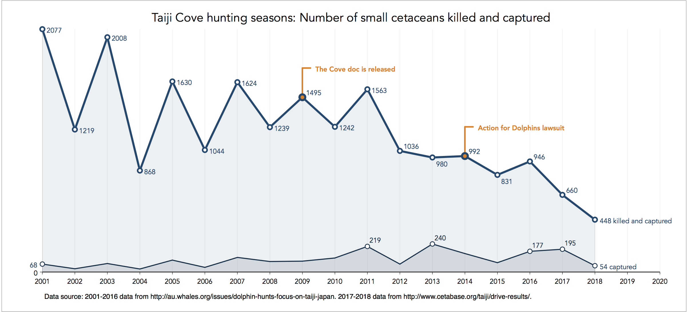
There is an evident downwards trend for the total number of ‘casualties’ and a slight upwards trend for those captured every season, thus a downwards trend for those killed as evidenced by the shrinking area between the two timelines.
It is rather puzzling to see a pseudo-seasonal type of variation from year-to-year (the sort of zig-zag pattern in early years). I could not find any economic or environmental justification for this pattern, and does not appear to reconcile with the fishing quotas set by the Fisheries Research Agency of Japan (although I could not find information dating back to 2001). If you know why this is happening please let me know.
The graph addresses the graph objective of documenting the evolution of number of cetaceans killed and captured during the 2001-2018 Taiji Cove hunting seasons. An important piece of information that is uncovered by the graph is that although the number of cetaceans killed is falling, the number of those captured (mostly dolphins) is rising. This is not surprising because capturing and training dolphins to be sold at dolphinariums is more lucrative than slaughtering the animal for its meat.
Thus, a second graph objective would to investigate the rate in which the number of captured cetaceans has been increasing especially by comparison to the number of those killed. This graph objective is investigated in a separate analysis on Taiji Cove captured dolphins.
Download the Stata code for reproducing this analysis: taijicove.do


