Graph objective
Financial statement data is governed by a unique and rather complex data generating process, that measure two types of variation: stocks that accumulate over time (as measured in the balance sheet), and flows that reset every year and measure the change in stocks (as measured in the income statement and the cash flow statement).
The graph objective is to demonstrate how the stocks of equity investment and capital investment of BHP Billiton Ltd have accumulated over the period 2011-2016. Equity investment and real capital investment are stocks measured at a given point in time but represent cumulative amounts over periods.
Stocks accumulate through periodic flows. The opening equity balance (from the beginning of the period balance sheet) increases or decreases through the period’s net income (as reported in the income statement), and decreases through dividends (as reported in the cash flow statement), plus some other smaller magnitude events (such as revaluations and accounting adjustments), to give the closing equity balance (as reported in the end of the period balance sheet). There may also be share repurchases and share issues but there has been none for BHP Billiton during this period.
A similar relation applies for BHP Billiton’s real capital investment. The beginning of the period net property, plant and equipment, is depleted through depreciation, disposals, divestments and impairments, and replenished through new capital expenditure and acquisitions, plus some other small accounting adjustments, to give rise to the closing balance of property, plant and equipment.
It is important to note that although the effect of flows on stocks is continuous throughout the financial period, this transactional data is proprietary and can only be observed through the company’s internal record keeping. We can only work with public data that discloses the total flows and the end of period stocks.
Data management
The data is sourced directly from BHP’s annual reports, 2011-2016. I manually input the data into Stata and the code is provided at the end of this page.
I calculate the running sum by year, that is the accumulation of flows on the opening balance of property, plant and equipment, and generate a new variable that holds a time-varying observation index.
Visual implantations
The graphing of stock-and-flow movement naturally lends itself to a line implantation, like in the movement of a stream (the flow) that falls in pools of water (the stock).
In addition, I will also apply the point implantation in order to to identify key information in the time-line movement, specifically the beginning of period stock, as well as the replenishment and depletion effects.
Retinal variables
I use the shape retinal variable to encode the differences in stock and flows. Stocks are shown with large circles. The key flows that describe material increases and decreases in stocks are shown with squares. The accounting adjustments that are somewhat immaterial are shown with very small dots.
I encode the line using BHP’s brand colour (orange). Thankfully, the orange colour is generally neutral and carries no interpretative meaning. I also use the navy color to encode labels and identify events on the line using different point shapes.
Graph identification
Internal identification applies a legend that identifies the different events on the time line.
Direct identification is used to identify the year values, as well as the beginning value of the stock as at 2011 and the ending value of the stock as at 2016. The graph’s aim is to give an impression of the stock-and-flow movement and not a detailed table look-up function.
External identification provides a grant title and acknowledge the source of the data.
Graph enhancement
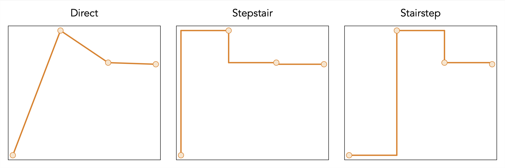
The most important step in graph enhancement is the form of line connection. Stata’s and other softwares’ default setting for line implantations is to directly connect coordinates, thus resulting in an angular effect whose aim is to encode the rate of change over time.
For this graph objective, the information implied by the angled lines would be misleading as they suggest continuity along the x-axis. The x-axis is in fact artificial, it simply represents an equidistant index with no particular meaning. Also, direct connection would imply varying degree of steepness in flows that could mislead too.
Instead, the line is best connected in a stairstep configuration. For example, as we move from index 1 to 2, the line should go flat starting from 1 and at 2 it should increase vertically. To demonstrate the differences between connecting styles, here is how it would like for the data that is indexed from 1 to 4, which includes the first year stock and the three flows of that period:
Furthermore, the stock-and-flow line movement must be brought into focus, and there is no need for the separation between graph region and plot region or even any auxiliary information that comes through this separation. Therefore, I suppress all graph features and show only the plot against a blank canvas, plus its identification.
Visual decoding/perception
Here is the proposed solution for real capital investment:
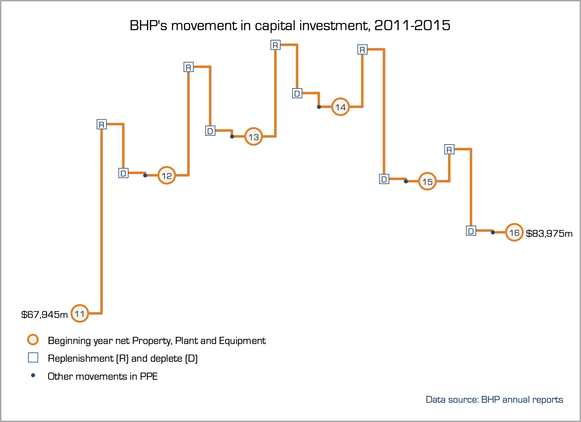
The proposed solution to the graph objective demonstrates the accumulation of capital investment for BHP from about AU$67 billion in 2011 to about AU$83 billion in 2016, through a schedule of net capital replenishment during 2011-2014 followed by net capital depletion during 2014-2015. The steep depletion of capital during 2014 (nearly twice as large as the replenishment in 2014) was due to a demerger event, and raises the question on the consequences to equity investment.
Every line item in the balance sheet can be articulated to corresponding line items from the income statement and the cash flow statement, and can be graphed in the same manner. I repeat this exercise for the equity investment balance, with the resulting graph:
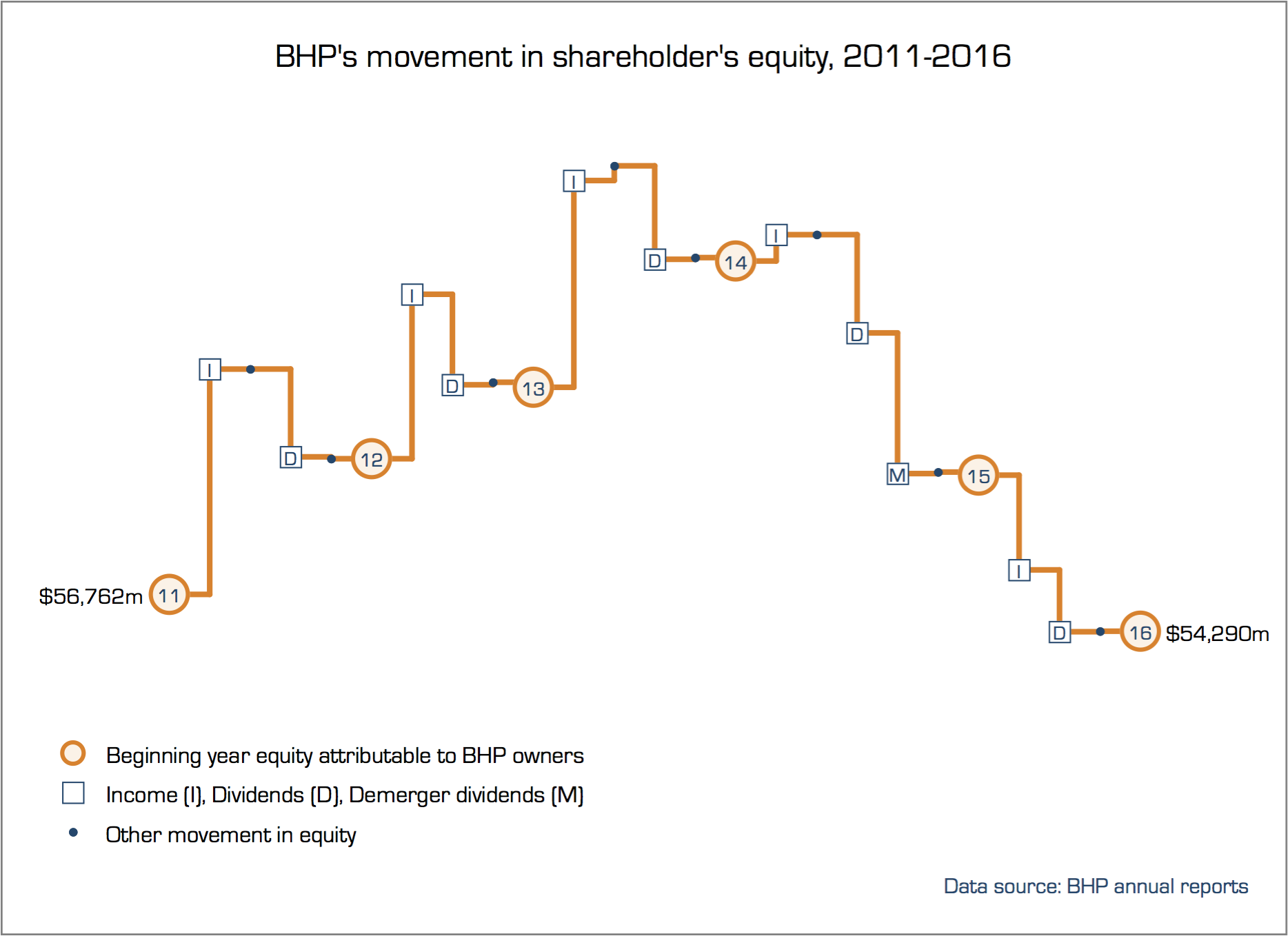
It is now evident that BHP’s equity has suffered as a result of the demerger event in 2014 and continued to fall in 2015, reaching a level in 2016 that is in fact lower than 2011.
For a competing form of data graphing using the same data, see the analysis on BHP’s waterfall of real capital that employs a waterfall chart to convey the same information, plus an inflation-adjusted analysis of real capital.
Download the Stata code for reproducing this analysis: bhp_equity.do; bhp_ppe.do


