Graph objective
The 2018-2019 Australian Federal budget was released with the following gem (in page 1-15):
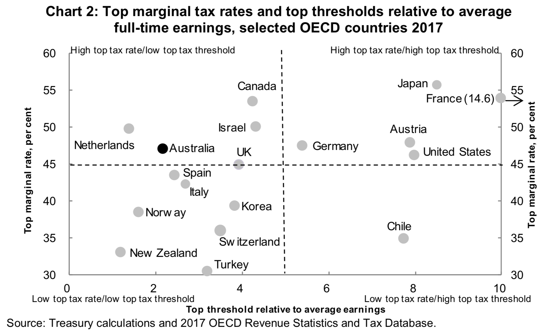
This graph was used as evidence to support the following argument (Graph Objective): “Chart 2 shows that Australia’s top marginal tax rate currently cuts in at about 2.2 times average full-time earnings. This compares with 4 times average full-time earnings in Canada and the UK and 8 times in the US. Without change, Australia’s ratio is projected to drop to about 1.7 times average full-time earnings in 2024–25, reducing our international competitiveness and ability to attract and retain talent and skills. Under the plan, this ratio will still fall, but more modestly to about 1.9 in 2024–25.”
I am not going to delve into the validity of the economic argument. I am more interested in addressing the shortcomings of this graph that violates so many fundamental principles and qualities of data graphing:
- The graph violates the quality of accuracy, as it shows France’s top threshold as 10 whereas it is 14.6 (as admitted in parentheses and a rightwards pointed arrow). By changing this ordinate value, the graph lies about the distance between France’s top threshold and the other countries top thresholds.
- The graph is inaccurate for another reason. The data is sourced from OECD.Stat Tax Database which incorrectly recorded Australia’s top personal income tax rate at 49%. In understand that the person who did this graph corrected for OECD.Stat’s error by replacing Australia’s top marginal tax rate in 2017 with 47%, but then why did s/he not not correct for the top threshold that is also incorrect?
- The graph violates the quality of completeness as it only shows a selection of the data, and does not tell us how this sample of countries was formed. The following list of countries have been excluded: Belgium, Czechia, Denmark, Estonia, Finland, Greece, Hungary, Iceland, Ireland, Latvia, Luxembourg, Mexico, Poland, Portugal, Slovakia, Slovenia, Sweden. What is common about these countries that makes them non-comparable to Australia? And what makes the selected lit of countries comparable to Australia? For instance, why Norway is there and the neighbouring Finland is not?
- The graph violates the quality of relevance. The graph is cluttered with unnecessary identification and the visual prominence of the data is very low by comparison to these supportive information (i.e. there is low data-to-ink ratio).
- The graph lies by arbitrarily allocating countries into four groups, and suggesting that Australia belongs in the same group as Israel, Canada, the Netherlands and perhaps the UK. Importantly, it does not telling us how these groups have been formed, e.g. how did the group “High top tax rate/ low top tax threshold” was defined, and why is this a relevant classification?
- The graph violates the quality of efficiency and iteration. It is pretty obvious that whoever did this graph spent more time trying to hide information rather than reveal information.
Overall, this is a shockingly bad graph. I will attempt to address all these problems, and also produce a monochrome graph of publication-quality (in a Federal budget).
Data management
The data is sourced from OECD Revenue Statistics and Tax Database Table I.7 on `Top statutory personal income tax rate and top marginal tax rates for employees’.
In addition, I observe the ISO 3166-2 jurisdiction codes so that instead of visualising long country names I visualise 2-digit code, e.g. United Kingdom would be encoded as UK.
Lastly, I observed the Wage Price Index, Australia Jun 2018 from the Australian Bureau of Statistics in order to make a rough calculation of projected growth in average wage. By looking at the historical data, an educated guess suggests a growth of between 1.6-2.5% per annum, and I choose to apply a 2.1% compound rate. The merged dataset is available upon request.
Lastly, I find visualising the relation between the top marginal tax rate and the top threshold relative to average earnings awkward for three reasons. First, there are instances of large top threshold relative to average earnings, e.g. France with 14.6 and the person who prepared that original graph found it necessary to truncated France’s threshold at 10. Second, the great majority of countries have thresholds between 1 and 5 which makes visualisation difficult. Third, it is non-intuitive to think in terms of top threshold relative to average earnings’; a more intuitive measure would the inverse of this ratio: `average earnings relative to top threshold’. In this way, the base value of 1 suggests that the top thresholds in the country is set exactly equal to the income earnings by the average person, or in another words, the average person pays the top threshold. Taking the inverse also disperses the concentrated density and can observe differences in variation and naturally formed groupings more clearly
To be consistent with the published graph in the Federal budget I also replace Australia’s top marginal tax rate at 47% (and not 49%).
Visual implantations
The main visual implantation is the point, that encodes the coordinates of top marginal tax rate with the average earnings relative to top threshold.
In addition, I use the line visual implantation to connect Australia’s 2017 coordinate with the projected coordinate in 2024, which is a central argument in the 2018-2019 Federal Budget.
Retinal variables
In the original graph, Australia is correctly encoded with a darker coloured circle against the rest of the countries that are encoded with a lighted colour circle. The application of the value retinal variable in this way shifts the attention to Australia as being the main point of interest, by comparison to the rest of the OECD countries that are assigned equal weight of importance.
I also encode another circle for Australia with the same value but of smaller size circle that would indicate the 2024 projected position, and I plan to connect the two circles with a thin line.
Graph identification
There is no need for internal identification as the encoding choices are obvious.
Instead, I apply direct identification to encodes the ISO 3166-2 country codes as part of the point implantation, and therefore enable effortless contrast between countries without occupying a great deal of visual prominence. Direct identification also encodes the context of the smaller point implantation that encodes the position of the 2024 projection for Australia.
External identification encodes the values of the coordinates for Australia of those countries with the most extreme values in the sample; these are shown as axes labels. As usual, external identification includes a graph title describing the relation between top marginal rates and top thresholds for the sample of OECD countries in 2017.
Moreover, I add a note to the graph to acknowledge the key data source, and importantly the exclusion of four OECD countries with exceptionally small top marginal tax rates (the y-axis title) and very high average wage to top thresholds (the x-axis title).
Graph enhancement
I denounce the arbitrary quadrant classification by the Federal budget graph. I do not see the point of classifying countries in this way, especially in such ad hoc manner.
The Graph Objective, and the discussion in the Federal budget, is concerned of comparison of Australia with the rest of the OECD countries. This means that, if there must be such classification, it should be done by comparison to Australia’s coordinates. Therefore, I suppress the grids and axes scales lines and instead show only reference lines that intersect Australia’s coordinates, as well as the coordinates of the countries with most extreme values. This forms four broad areas in the graph relative to Australia’s position.
Visual decoding/perception
Here is the proposed graph addressing all limitations described above:
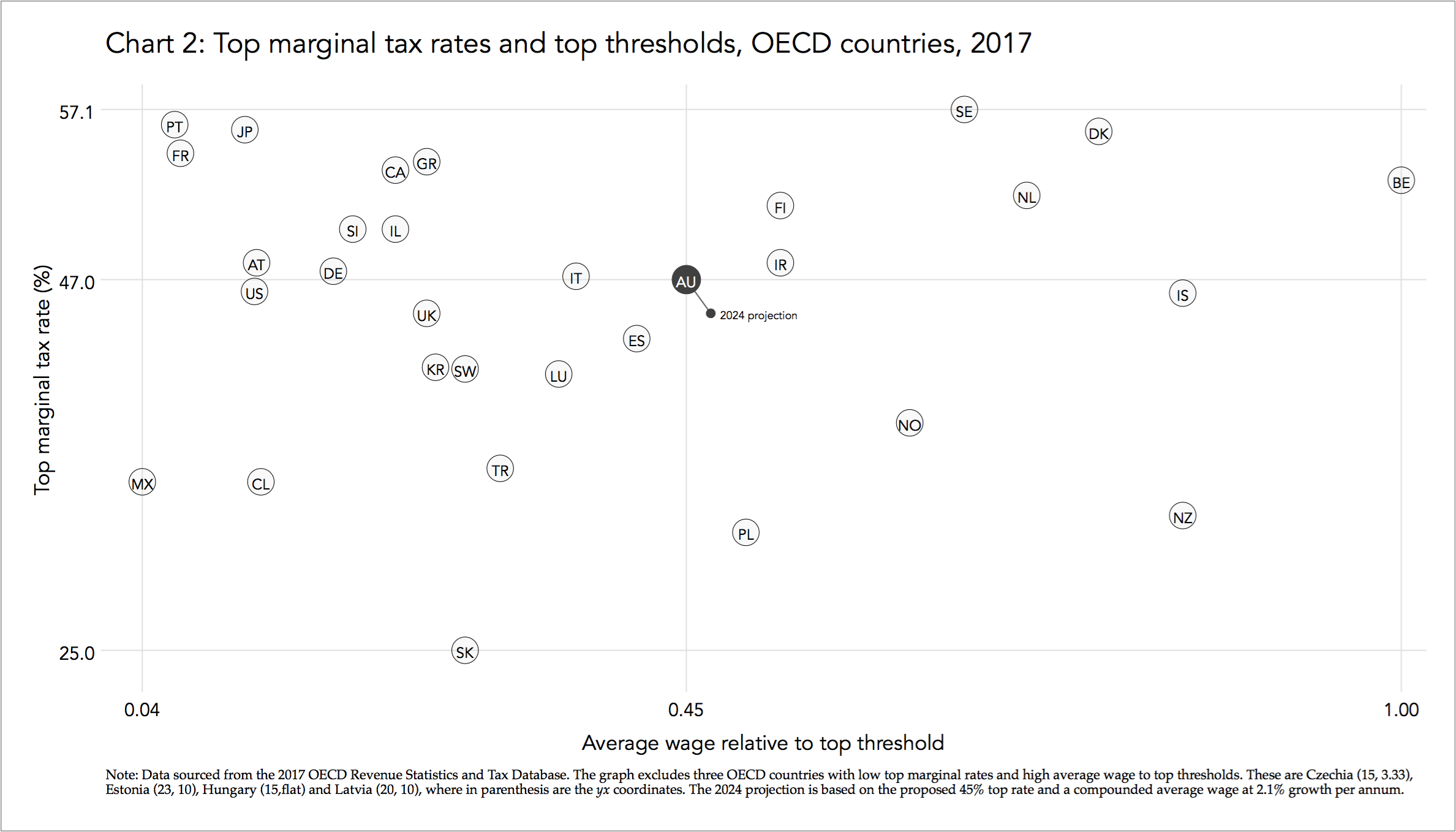
A key takeaway from this graph is that the government’s proposal of new tax system does very little to reposition Australia in terms of competitiveness.
Australia’s projected position appears to be immaterial.
Download the Stata code for reproducing this analysis: marginal_tax_rates.do


