The Kahneman and Tversky (1979) prospect theory describes certain fundamental behavioural tenets for decision making under uncertainty.
First, people derive value in terms of the relative changes in gains and losses and not in absolute utility terms. That is, people feel gains and losses in terms of their change in current wealth and not in their absolute level or the final state of wealth achieved. Second, the value function is concave for gains and convex for losses. This non-linear S-shape value function explains that we feel the difference of change in wealth in a decreasing marginal rate. Third, the slope in losses is steeper than the slope in gains, hence we feel losses more than we feel gains and the larger the change in wealth the larger the asymmetry (a behaviour known as ‘loss aversion’).
Graph objective
There is ample evidence in support of prospect theory, both experimental and empirical. The equity markets, that are often described as one of the largest natural experiments of human behaviour, also behave in line with prospect theory.
The new information on gains and losses can be measured through earnings surprises, which is calculated as the difference between the actual earnings per share as announced by companies listed on the stock market, and the earnings consensus expectations projected by financial analysts’ leading to the announcement. Standard economic theory states that earnings carry news that are value-relevant that the market eagerly awaits to incorporate into its valuation of equity. The value assigned to the gains and losses is measured by the reaction in the cumulative abnormal return, which is the return in excess of the expected return that was earned in the days surrounding the earnings announcement.
The graph objective is to visually mine the relation between the earnings surprise (the new information) and the cumulative abnormal return (the value assigned to the new information), from a densely distributed cloud of data.
Data management
The raw data was sourced from the Compustat and CRSP databases and cannot be provided. But, I am happy to provide secondary data on the estimated earnings surprises and cumulative abnormal returns. Please contact me if you need this secondary data.
The relation between the earnings surprise and the cumulative abnormal return is described by the following scatter graph:
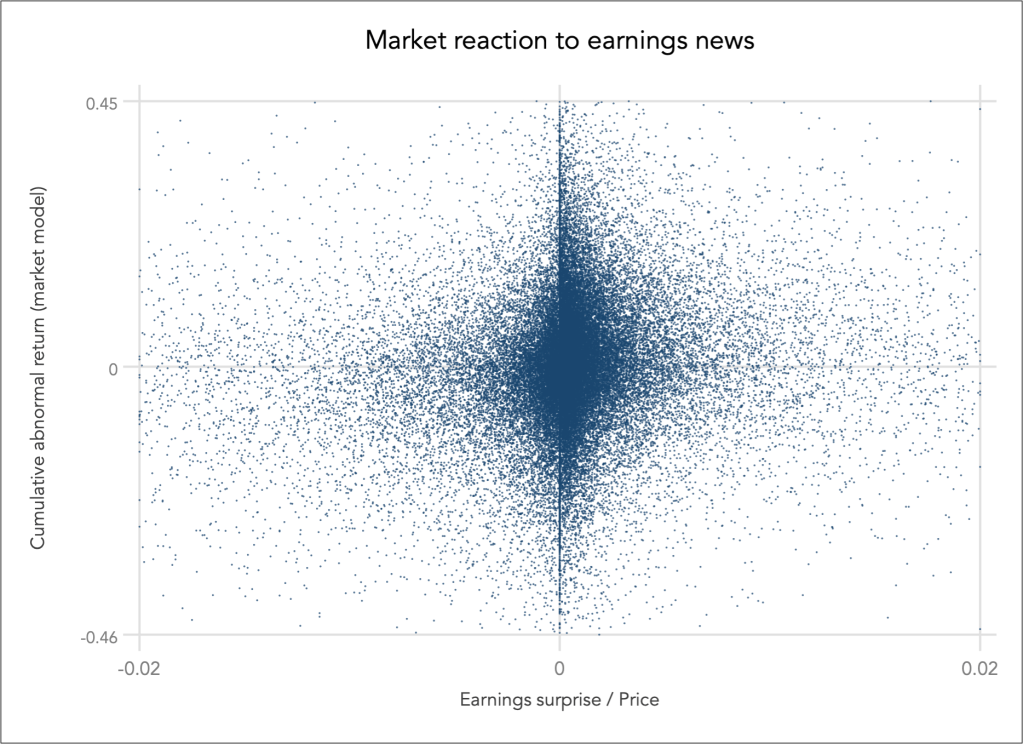
The sample contains 55,983 observations and it is very difficult to say anything about this bivariate relation for two reasons: (1) the data is very about the origin, (2) stock market data is naturally noisy, very noisy. To explore any potential relation between the two variables we are better off employing a data reduction approach, particularly quantile smoothing.
Quantile smoothing summarises consecutive localities in the bivariate distribution and graphs the pairs of quantiles. I estimate the average earnings surprise over 100 quantiles (i.e. percentiles), and then calculate the median of earnings surprise and the quartiles of the cumulative abnormal return for each of the 100 quantiles, effectively creating a new dataset containing a summary description in terms of local robust central tendency.
That is to say, I have reduced the dataset of 55,983 observations into just 300 observations of 100 percentiles times 3 quartiles.
Visual implantations
It is imperative that the coordinates of the reduced dataset are encoded using point implantations, as in a scatter plot. This is an important disclosure given the application of data reduction.
In addition, I estimate three locally weighted scatterplot smoother (LOWESS) for each of the quartiles of cumulative abnormal returns, that is are naturally encoded using a series line implantations.
Retinal variables
The point implantations are encoded using small circle shapes with translucent colour so that we can decode any overlapping data points.
To distinguish between the three quartiles of cumulative abnormal returns, I apply the colour hue retinal variable for both the point and line implantations.
Graph identification
The internal identification of the retinal variables is achieved by identifying the quartile of cumulative abnormal return directly next to each LOWESS line, as Q1, Q2 and Q3. The note to the graph explains what is each Q and that the lines indicate LOWESS smoothers.
External identification includes stating the overarching graph objective as a title to the graph, that is describing the market reaction to earnings news. In addition, I identify the variables and in axes titles, minima and maxima for each axis, and a note to the graph acknowledging the data sources and the application of data reduction.
Graph enhancement
There is no need for detailed table look-up so I suppress all grids and details labels. The graph objective is concerned with discovering the behavioural pattern in which the market reacts to earnings news so the emphasis should be on the shape of that pattern (here using LOWESS smoothing). Therefore, I increase the visual prominence of the line smoothers and the few data points and reduce the visual prominence of every other information.
Due to the calculation of ‘stacked quartiles’ on the cumulative abnormal return that needs to be shown as the y-axis variable (i.e. the effect variable caused by earnings news), the graph surely benefits from a tall aspect ratio.
Visual decoding/perception
Here is my proposed solution:

It is evident that the market behaves in accordance to prospect theory predictions. For the typical or median prospect (the blue line), investors react to gains and losses in a similar fashion to the classical prospect theory value curve.
For the more promising prospects (the orange line), investors continue to ascribe higher value to higher gains and there is considerable value ascribed for large losses. The reversal takes place because in promising prospects, large losses are seen as temporary and are expected to reverse. This phenomenon is also known as ‘big bath‘ and it is due to an accounting practice of flushing out future expenses in the current period so that future periods will look more profitable.
For the less promising prospects (the green line), investors penalise heavily large losses, but they also seem to penalise unexpected large gains that are received with great suspicion and perceived to be subject to manipulation.
Download the Stata code for reproducing this analysis: value_function.do


