Graph Objective
The graph objective is concerned with graphing the travel choice of individuals from Melbourne to Sydney, in terms of how long it takes to get from one city to the other and how much it costs to get there.
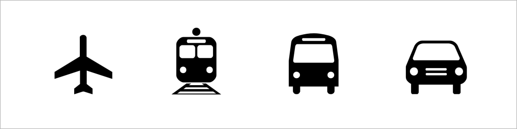
There are four ways one can travel from Melbourne to Sydney: car, bus, train or plane. I wish to get some insight on the cost relative to time travelled, as I expect to see a variety of choice.
Individuals who are in a hurry would almost certainly take a plane unless they do not feel comfortable getting on planes, and the variation in price would depend on how early one books a ticket and the type of ticket (economy or business).
Trains are meant to be the most accurate mode of transport in terms of travel time but they take much longer than planes. I do not expect to see much use of buses unless the price is much lower than trains, since they are even slower and offer less amenities.
Given the cost of petrol in Australia, the use of cars would probably be relatively expensive and can take even longer, but still many individuals enjoy long drives especially through scenic routes.
This is an exploratory graph objective.
Data management
The data is from Greene (2018, Econometric Analysis, ch.18), and contains information on the choices made by 210 individuals for travelling from Melbourne to Sydney.
The time travelled is measured in minutes travelled plus the time spent in terminal waiting for the bus, train or plane; for cars the terminal time is zero. The cost of travel is a generalised measure of cost that is equal to the sum of in-vehicle cost and a wage-like measure times the amount of time spent traveling.
Clearly, since the cost of travel is a direct function of time travelled, we expect to see a strong relation between the two. The key question is what sort of relation this is for each mode of travel.
No particular data management is required. The data is already in good shape for data graphing.
Visual implantations
Travel time is measured in terms of minutes and travel cost in terms of dollars. The comparison of these two interval-ratio scale variables indicates the use of a scatter graph, hence the choice of point visual implantation.
Retinal variables
Given the need to distinguish between modes of travel, which is a nominal categorical variable, I choose to apply the shape retinal variable. Specifically, given the small dataset of only 210 observations and the largely non-overlapping density of observations of the four travel modes, I choose to apply isotype symbols as provided by the Travelcons font:
In a scatter plot, it would be hard to tell the difference between the symbol of a car and that of a bus. For this reason, I also apply the colour hue retinal variable in order to enhance the contrast between the isotype symbols.
I admit that by applying both shape and colour hue I am doubling up the use of retinal variables in encoding the same source of variation, and this design choice would be usually classified as a violation of the quality of consistency However, I am convinced that this is necessary for this data as it enhances decoding accuracy considerably, which is the foremost quality to uphold.
Graph identification
There is no need for internal identification because all encoding choices are self-explanatory from the isotype symbols.
External identification includes a graph title identifying the graph objective, also providing a list of all possible travel modes in order to eliminate any ambiguity (car, train, bus, plane). In addition, I identify axes titles describing the two variables and their unit of measurement. A note to the graph acknowledges the data source and the use of the Travelcons font.
Graph enhancement
Perhaps the most important graph enhancement step is to adjust the angle of the plane isotype symbol. As shown above, the default angle is 0 degrees (i.e. the plane points upwards), however this default direction would be misleading as it would suggest a 90 degree angle for the relation between cost of travel and travel time. Instead, I run a linear regression of cost on time and then translate the estimated slope in terms of degrees, using this formula:

As a result, as shown in the graph below, the nose of the plane how shifts towards the direction of the slope.
Moreover, I apply a wider aspect ratio that the default that helps with decoding variation more accurately. I also add gridlines on the two axes to enable table look-up functionality but make sure to reduce their visual prominence.
Visual decoding/perception

Planes appear to be well separated from the rest of the modes of transport. Their time varies from about 100 minutes to about 4 hours and for a few cases even more. It usually takes no more than 1 hour and 30 minutes to fly from the main airports Melbourne to Sydney. It can be faster from other smaller airports. For the longer flights, recall that time travelled includes waiting time in terminals which can be bummer especially when there are delays. The relation of cost with travel time is very steep, thus suggesting that the cost hikes very quickly for every minute travelled with planes. Remember that cost refers to ‘generalised cost’, which means that it is not the flight tickets that become more expensive (given the fixed distance between the two cities), but rather the added costs particularly the opportunity costs.
The graph makes it clear that there are two clusters of trains. The train from Melbourne to Sydney takes about 12 hours so the cluster to the right-hand side seems to be as expected. But I find the cluster of trains on the left to be really confusing. There is no high-speed rail in Australia and there is no way one can get from Melbourne to Sydney with the current trains in about 300 minutes. This could suggest a problem with the data (if you know the answer to this please let me know too). For trains, the travel time seems to have no particular relation with the cost of travel, which makes sense because trains have predetermined fixed schedules with little or no variation in the service offered.
Buses seem to be all over the place, and like some of the trains also some of the buses times appear to be unattainable. I cannot see how a bus can make it from Melbourne to Sydney in just 250 minutes. There is no clear relation between cost and time travel for buses.
The choice to travel with cars offers a very different insight. It is clear that the longer it takes to travel the more expensive it is to do so. Some cars travel too fast for my liking and some are impossibly fast (perhaps a data problem again). Other cars may take close to day, but is not unusual as some choose to take an overnight break on the way.
Download the Stata code for reproducing this analysis: travel_mel_syd.do


