Graph objective
I read this interesting coverage on income tax in the US, and my attention was drawn on this graph:

I find this to be the most appropriate data graph (aka staked-area plot) for this type of compositional data, here showing the composition of federal revenue by type.
The stacked-are plot achieves two goals: (i) it shows how components add to a total, (ii) it shows the comparative timelines. The graph makes it clear how corporate tax has shrunk over time being replaced by payroll tax that is related to funding Social Security and Medicare (i.e. Federal Insurance Contributions Act tax, FICA). At the same time, income tax remains as the largest contributor of government revenue at well above 40%.
The graph objective is therefore to represent the composition of federal receipts from tax. I attempt to reproduce this graph, by adding even more context. The graph above also lacks careful consideration, but otherwise it is accurate and quite efficient.
Data management
The data is sourced from The White House Office of Management and Budget. Table 2.2 – Percentage Composition of Receipts by Source: 1934–2023 already provides the sources of revenue as percentages. All we have to do is to add them up to the total of 100% by year.
A stacked-area plot is effectively a running sum over the components within each year. To reproduce the above graph, the key data management task is to start with income tax as it is, and then express corporate tax as corporate tax plus income tax. Then, payroll tax becomes payroll tax plus corporate tax plus income tax, and so on.
In addition, I also look at the difference between individual income tax ad corporation income tax over time, again using an area plot.
The Stata do-file for reproducing this analysis is provided at the end of this page.
Visual implantations
The stacked-area plot is based on a series of overlapping area implantations that, in this case, drop to the baseline of 0. We begin by encoding the area that is to shown further in the background, here the other tax category. Then, we encode the one of top of that (excise tax), and we finish with the one furthest in the foreground (individual income tax).
Other than the encoding of areas as contrasting magnitudes, another piece of important information that is not easily seen in the above graph is the contrast of time trends. These are encoded using line implantations.
Lastly, I encode another area overarching all categories spanning from 2018 to 2013 to make it clear that these values are mere estimates and not observed realisations.
Retinal variables
The colour retinal variable encodes the different types of tax. I choose contrasting colours of low saturation.
To enhance the contrast of time trends I encode the timelines using thicker white line implantations (size retinal variable). The thick white lines seem to work well against the contrasting palette of area colours.
The overarching area is encoded in semi-transparent white (value retinal variable) that maintains the underlying hues but reduces their saturation even further thus suggesting lower weight of confidence.
Graph identification
I suppress the legend and internally identify the different categories directly in each area part. I also identify the semi-transparent area directly as ‘estimates’.
External identification includes a title stating the Graph Objective, a note acknowledging the data source, a y-axis title explaining the unit of measurement, and regular axes labels to assist decoding.
In addition, I directly identify certain key events over the timeline that add context and assist with decoding the trend.
Graph enhancement
The most important step in graph enhancement for a stacked-area plot is the order of categories. Typically, but not necessarily always the case, the largest category is shown as the first category. In this case, it makes sense to do so because Individual income tax consistently contributes the lion’s share in tax receipts, and shown this as first it gives the impression that is the foundation of the federal revenue scheme. The choice to show Corporate income tax as the second category follows from my desire to accommodate the contrast between the Individual tax and Corporate tax. Social insurance ad retirement receipts follow third as the next largest category, then Excise tax and lastly the Other category that carries the lowest significance given the lack of proper identification.
I widen the aspect ratio to give the impression of a long period of time, but not too much because then we can lose the detail across the contrasting areas.
Visual decoding/perception
Here is my attempt:

The graph now elucidates the steady fall in Corporate income tax, shown to be substituted by Payroll tax (social insurance and retirement receipts). It is also clear that the Individual income tax is in fact rising over time, projected to about 50% in 2023, while at the same time the Corporate income tax shrinks further to a historical low of a mere 9% (0.59-0.50), even lower than in 1934 of 13% (0.27-0.14). Let this sink for moment. These insights were difficult to discern in the original graph because of two subtle design flaws: highly saturated colours and lack of line implantations for encoding time trends.
This analysis prompts me to investigate further, in a secondary Graph Objective, to show Individual income tax has overtaken Corporate tax over time and by how much. I apply again an area implantation to encode the difference between the two, and I also add some more context by identifying the successive administrations:
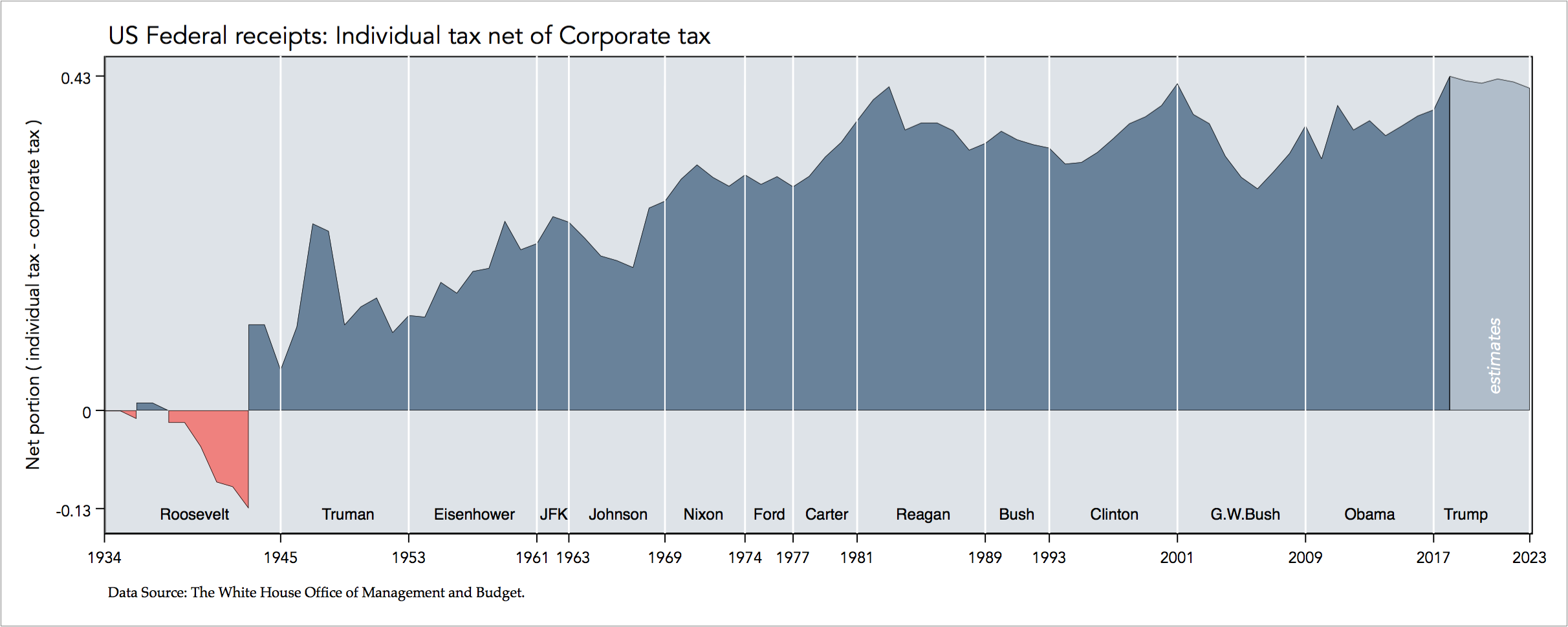
This graph emphasises the increasing differential between the portion of individual tax and the portion of corporate tax.
Download the Stata code for reproducing this analysis: us_income_tax.do


