Graph objective
The Economist published a graph that purports to show how Russia’s military spending has nearly doubled in 2014 from 2007 (baseline year), while during the same period the European NATO’s military spending was reduced by 20%. Here is that graph:
Robert Farley (Patterson School) has labelled this graph as the Worst.Graph.Ever. because it suggests that Russia spends more on military than European Nato, whereas it is in fact the other way around in terms of nominal spending. Andrew Gelman (Columbia) wrote a short commentary in the Washington Post explaining that may not be the worst graph ever “because at least the numbers are right there for readers to see.” Yet, the conclusion remained that European NATO in fact spends more on military than Russia.
I agree that The Economist’s graph is clumsy, and I generally find The Economist’s graph scheme to be somewhat juvenile, but at least in this case they have provided full disclosure. I the criticism to be unwarranted. The graph makes it clear that its graph objective is to convey the doubling of military spending by Russia using an index, by comparison to the relative reduced spending by the European NATO. The index is identified in large font on the right hand side, and additional area implantations (the ‘bubbles’) admit that although Russia has increased military spending it still spends only about a quarter of the European NATO in nominal terms.
In fact, I would argue that the graph is lying to the other direction. Farley and Gelman are upset that the graph is incorrect to suggest that Russia spends more than the European NATO. They should be upset that the graph does not show this message even more forcefully. The main problem with this graph is that it is out of context. First, military spending can only be measured in terms of the capacity to spend, as percentage to GDP. Second, US$1b can get you more military equipment in Russia than in European NATO.
I could not find information about the second issue but I can do something about the first issue. The graph objective is to contrast the military spending to GDP of Russia against that of European NATO.
Data management
The data on military spending is sourced from the Stockholm International Peace Research Institute (SIPRI). The data on GDP is sourced by the World Bank. I merge the two sources of data.
Military spending is reported in millions whereas GDP in current USD is reported to the dollar. Both measures are expressed in 2017 US dollars. I rescale military spending by multiplying by 1,000,000, and then calculate the percentage military spending to GDP.
Then, I reshape the data so that the military spending of the two jurisdictions appears as two different variables rather than in a panel set up. There are now three variables in the dataset: Russian Federation military spending to GDP, European NATO military spending to GDP, and year.
The data management procedure is described in the Stata code provided at the end of this page.
Visual implantations
The graph objective is concerned with the direct contrast between the military spending of Russia and the European NATO. This could be shown using a simple contrast of two timeline plots or even taking the difference between the two and only plotting the difference. Although both of these approaches are acceptable, none conveys strongly the message that Russia has consistently spent more on military than European NATO for 24 years, 1993-2017.
To convey this ‘feeling’ of disproportionate spending we need the help of certain design principles. An effective way of showing how Russia outspends the European NATO in military is by showing at the same time how the European NATO fails to spend as much as Russia in military. To do that, we can use ‘positive space’ to show the density of observations and another time use ‘negative space’ to show the absence of density. This is based on the Gestalt principle of Figure/Ground that, amongst other things, explains the power of empty space in conveying important information.
A simple way of operationalising this technique is to contrast the two measures in a connected line chart. I employ the point implantation to encode the coordinates of the contrasting military spending for each year, and then the line visual implantation to connect the points in order of year to show how the relationship has evolved over time. I also overlay a 45 degree reference line that shows the boundary for recognising which jurisdiction spends more.
The area above the 45 degree line indicates the ‘positive space’ where Russia is shown to spend consistently more on military as percentage to GDP, and the area below the 45 degree line indicates the ‘negative space’ where European NATO is shown to never spend more than Russia.
The empty below the 45 degree line is the answer to the Graph Objective. The rest of the information is provided for context and further analysis.
Retinal variables
The encoding choices involve one line implantation and one point implantation, both encoded using black colour.
The area above the diagonal is shown with a faint red colour and the area below the diagonal with a faint blue colour. This is to emphasize the message that the area above encodes more spending by Russia relative to European NATO and the area below encodes the opposite ressult.
Graph identification
The encoding choices are internally identified in the note to the graph, by explaining that 93 is the year 1993 and 17 is the year 2017. This statement makes it clear that the line drawn from 1993 to 2017 is in fact a timeline of the relation between the two measures.
External identification includes a graph title, and a note that acknowledges the source of the data but also how one should decode the numbers 93 and 17. I also identify regular axes labels to enable detailed table look-up, and to make it explicit that the two axes are on the same scale range.
Graph enhancement
Graph enhancement is an important step in this graph. It is imperative to have a squared aspect ratio, at 1:1, to correctly convey the message that both y and x dimensions cover the same scale, over 0-9%.
The squared aspect ratio is also critical in accurately encoding the steepness of the 45 degree reference line. The reference line segments the graph into two large triangular areas. The area above the line indicates the space where the Russian Federation spends more, and below the line is the space where the European NATO spends more on military relative to GDP.
I provide a detailed grid in both axes to enable accurate table look-up. So it is clear that in 1993 Russia spent about 8% where the European NATO spent about 3%, and in 2017 Russia spent about 3.5% and the European NATO spent less than half as much at about 1.5%.
I also suppress the lines surrounding the plot region, and reduce the overall visual prominence of the grids, ticks, labels and axes titles.
Visual decoding/perception
Here is the proposed solution:
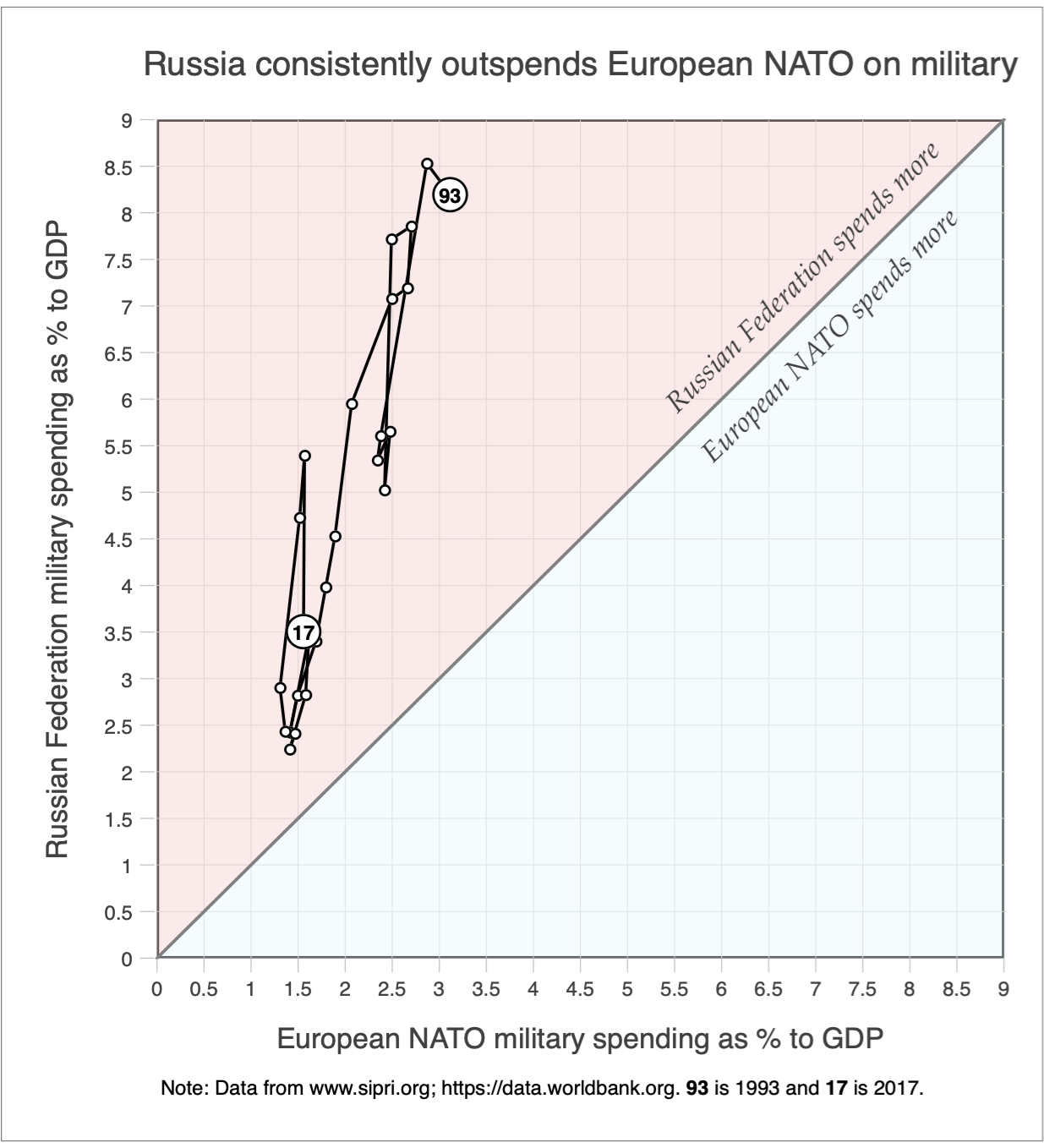
The graph objective is achieved by demonstrating the vast empty negative space in the area below the 45 degree line. Specifically, it is shown that in the last 24 years, the European NATO has never spent more than the Russian Federation in military as percentage to GDP.
Moreover, remember that this graph does not take into account the fact that 1% of GDP in Russia produces far more military equipment than 1% in European NATO, particularly since most of the military equipment are manufactured in countries with high labor and material costs (UK, Germany, France, Italy).
The perception of imbalanced spending by Russia by comparison to European NATO is further enhanced by a competing data graph presented in the analysis of Russia tilting the scale in military spending.
Download the Stata code for reproducing this analysis: military_spending.do


