This post follows the analysis on the Imbalance in Military Spending. To understand the context, you must first read that analysis before you proceed below.
Graph objective
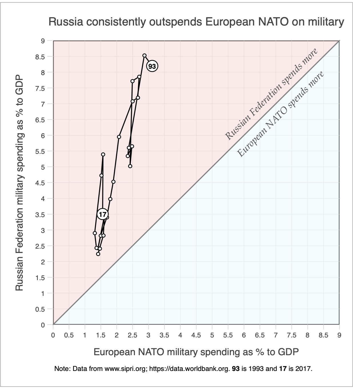
The analysis on the Imbalance in Military Spending shows how Russia has consistently spent more on military than the European NATO during 1993-2017. Here is the resulting graph from that analysis:
The graph objective in this analysis is to further enhance the perception of the original message, by showing how Russia has ’tilted the scale’ on military spending to its favour. That is to say, I want to visually show a figurative ’tilting balance scale’, and do so in a scientific manner that preserves the data properties.
The data density in the graph above reminds me of an old-fashioned balance weighing scale that is heavily imbalanced. The 45 degree line resembles to a scale pointer that indicates the point of balance, and the two triangles on either side are the scale pans.
I wish to emphasize this perception by rotating the entire graph on its origin by 45 degrees to the left, so that what appears now as the 45 degree line becomes a vertical axis, the x-axis becomes the 45 degree line and the y-axis becomes the 135 degree line.
To achieve this result, I multiply the vectors holding the ordinate values (vertical axis) and the abscissa values (horizontal axis) with the following rotation matrix:

where x’ and y’ hold the transformed rotated set of coordinates. The rotation principle is based on simple Euclidean geometry, with θ indicating the angle of rotation. For the 45 degree rotation it holds that θ = 𝜋/4. To learn more about degrees and angles see the discussion on Unit Circle.
Data management
The data source and data management process is reported analysis on the Imbalance in Military Spending. The only other data management step is to generate the rotated coordinates by 45 degrees as described in the Stata code provided at the end of this page.
Visual implantations
As in Imbalance in Military Spending, I employ a connected type of scatter plot, i.e. using both the point and line implantations. The point implantation encodes the coordinates of the contrasting military spending for each year, and the line implantation connects the points in the order of year so that it encodes the yearly evolution.
Retinal variables
The point implantation is encoded using small hollow navy colour circles, with the exception of the starting year (1993) and the ending year (2017) that are encoded using orange colour filled circles to assist decoding. The line implantation will be encoded using a relatively thick navy line.
Graph identification
Internal identification labels the beginning and ending years next to the respective point implantations.
External identification includes a graph title that explains how the user should interpret the graph as a ’tilting scale’. The note to the graph that originally acknowledged the source of the data has been removed as I found that it detracted from decoding, but this information should still be disclosed in the text.
A critical part or external identification is the regular axes labels in order to enable detailed table look-up and an accurate contrast of military spending between the two jurisdictions.
The vertical reference line (what used to be the 45 degree line) is identified as the “balancing line of equal spending”, thus making it clear that Russia has heavily imbalanced limitary spending by comparison to European NATO.
Graph enhancement
Graph enhancement is an important step. It is critical to maintain a square aspect ratio, 1:1, otherwise the angles and the lengths of line segments would be distorted. The vertical reference line is also an important piece of information, that also relies on setting the aspect ratio to 1:1.
The grids in both axes enable accurate table look-up, and the rotated axes titles explain in which side of the ‘balancing scale’ is either jurisdiction.
I suppress the lines surrounding the plot region, and reduce the overall visual prominence of the grids, ticks, labels and axes titles.
Visual decoding/perception
Here is the proposed solution:
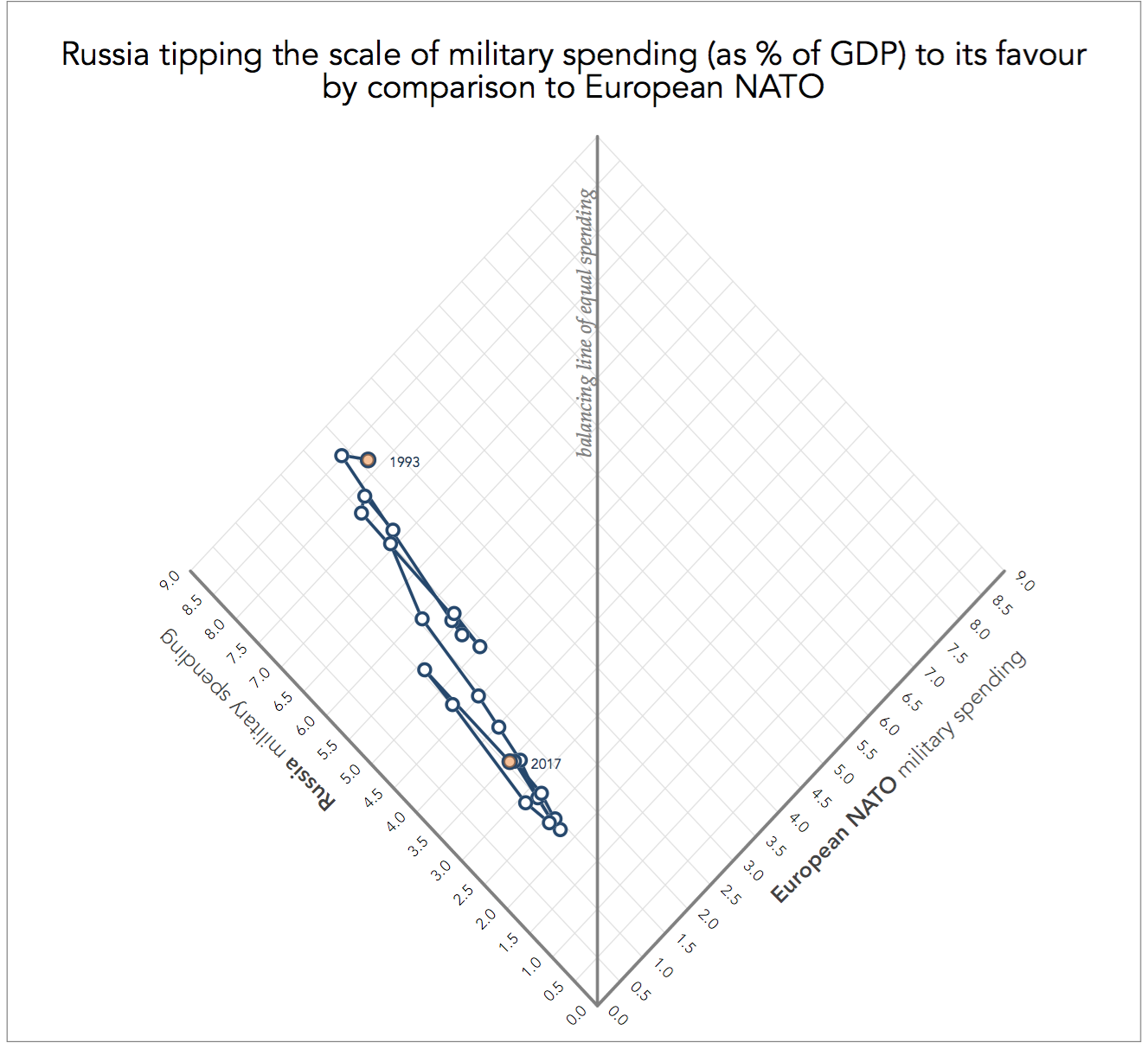
Although the graph is unusually arranged, it preserves all data properties. This is the same 2D Cartesian plane as the graph presented in imbalanced military spending just rotated by 45 degrees.
I find this graph to convey the message of imbalance more forcefully, particularly because it relies on the partition on the so-called felt axis that assists with the maximisation of visual stress. In the words of Donis Dondis (1973, A Primer of Visual Literacy):
“In visual expression or interpretation, this process of stabilization imposes on all things seen and planned as a vertical axis with a horizontal secondary referrent which together establish the structural factors that measure balance. This visual [horizontal] axis is also called a felt axis which better expresses the unseen but dominating presence of the axis in the act of seeing. It is an unconscious constant” (p.23).
By rotating the plane and making the 45 degree line into a horizontal line, I effectively enforce the felt axis as a conscious constant.
Download the Stata code for reproducing this analysis: military_spending.do


