Charles Joseph Minard (1781 – 1870) was a French civil engineer who is widely recognised as one of the early masters of data visualisation.
In my opinion, Charles Minard is perhaps most innovative data visualisation scientist given the limited technology of his time, and was very prolific in producing several intricate graphs. His is particularly known for his ability to reduce multidimensional complexity of important questions to simple graphs that could be easily decoded even by the general public.
Graph Objective
Charles Minard is notably known for its figurative diagram of Napoleon’s march to Moscow in 1812. The war campaign was disastrous, starting with about 422,000 troops from the Polish border to Russia, reaching Moscow with only 100,000 and returning defeated with just 10,000 soldiers. The graph shows the extent of devastation, and is a masterpiece of simplifying complexity as it encodes seven dimensions: size of army, direction (advancing or retreating), the distance travelled, latitude and longitude, location related to significant battles, temperature, and date. Here is the original graph:
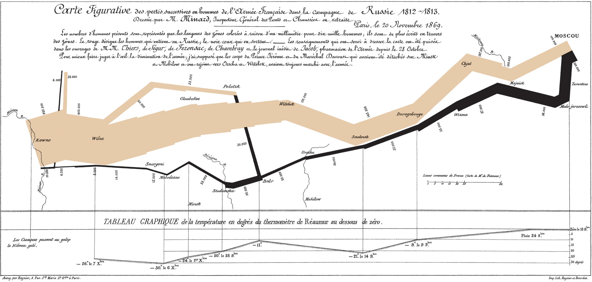
This graph has been described by Edward Tufte (1983, The Visual Display of Quantitative Information) as “probably the best statistical graphic ever drawn“. As a tribute to Charles Minard, I will try to reproduce this graph (as closely as possible) using Stata.
Data management
The data is sourced from Leland Wilkinson’s website on the Grammar of Graphics. The data, although accurate in recording latitude and longitude, is not accurate in representing the figurative representation by Charles Minard so I make some manual adjustments to latitude and longitude. I also pair the longitude of temperature with the longitude of march locations.
The most important aspect of data management is finding a way to encode the widths of the line segments so that they represent the size of the advancing and retreating army. This is done by expressing the size of the army in relative terms, as portions to the maximum at any given point in time.
The code for reproducing the entire analysis is provided at the end of this page.
Visual implantations
The original graph relies on encoding line implantation, by connecting key locations in the march to Moscow and counting the army’s size.
The bottom part of the chart encodes another piece of information using another line implantation with fixed line width. This line encodes the temperature during the return march from Moscou (Moscow) to Kwono (Kaunas).
Additional line implantations are employed to connect temperature information with the location of the return path. These vertical lines also act as connections between the temporal data of the date that the temperature was recorded with the spatial data of key locations.
The point implantation is also used to encode locations of key battles and events.
Retinal variables
The key retinal variable in the original graph is size as applied on the relative width of the line implantation. The width is determined as the relative size of the army at different stages of the campaign (relative to the maximum). Here is a first pass on this encoding approach:

This is the core of the graph. The many colours make it clear that it is a succession of several line plots each connecting only two coordinates. The rest of the information that is encoded is mostly based on tailored encoding around this output.
The colour retinal variable is used to encode the direction of advancing army (sandstone color) and the direction of the retreating army (in black). I reproduce the sandstone colour using the Color Picker tool that returns the RGB scale of (226,205,175).
Graph identification
Charles Minard placed great deal of emphasis on detailed identification that adds context to the graph.
Considerable direct identification labels the exact size of the army at different locations. Importantly, the identification of the wider line segment as 422,000 troops and the thinest segment as 4,000 assists greatly in interpreting the varying line widths.
The graph is a masterpiece of simplicity and the choices of visual implantations and retinal variables are self-explanatory, and obviate the need for internal identification.
External identification is also extensive and adds useful context. There is a grand title describing the Graph Objective, translated as “Figurative Chart of successive loses of the men in the French army during the Russian campaign, 1812-1813”, followed by a subtitle identifying its creator, Mr. Minard, his position, as well as the date and location when the chart was created. Below the grand title and subtitle, the text explains some key events in relation to significant battles and river crossings. At the bottom of the graph, there are two small notes with addresses identifying the place where the graph was printed.
Graph enhancement
The wide aspect ratio enhances the graph objective by enhancing the feeling of a long march to war.
The suppression of axes (with the exception of the temperature axis) brings into focus the main message without any distracting reference details.
Charles Minard also encoded the location of river crossings as major reference events (e.g. the crossing of the Berezina river cost about 36,000 losses to Napoleon, hence why ‘Berezina’ is still used today in French as a synonym for catastrophe). I could not find coordinates for encoding river flow and this is the only part of the graph that I failed to reproduce.
Visual decoding/perception
With the exception of minor details, and the lack of encoding for the rivers, the graph is very close to the original. The graphing process is tailored to this Graph Objective and cannot be generalised to other datasets.

Notice how lines have rounded edges. This effect reflects Stata’s understanding of first principles for data graphing, as described in the Graph Workflow model.
The first step of every data graph is the encoding of coordinates on a plane, and the natural way of encoding a coordinate is through a dot. The connection of two dots makes a line and the thicker the line the larger are the connecting dots, thus the rounded edge effect.
I could have reproduced the angled edges by using Stata’s spiked lines with thick width, but I actually prefer rounded edges than the original encoding with angled edges, because rounded edges suggest a more natural gathering or dispensing of the army troops in a gradual manner.
Download the Stata code for reproducing this analysis: minard.do


