Graph objective
The graph objective is to understand which factors may have driven shot success by LeBron James and Stephen Curry during the 2014/2015 NBA season.
There are several factors that could determine the success of a shot in a basketball game. Distant shots could qualify for a 3-pointer but are less likely to be made. The distance of 2-pointer shots may be closer but the nearer you get to the hoop the more likely you are to be guarded more closely. The shot clock plays an important role, with less seconds left on the clock forcing a less calculated shot. The defender distance is clearly also a factor. Touch time and dribbles can be influential too. Many coaches advocate (at least in Greece where I learnt the game) that the best shot is taken from a stationary position, following a pass and a small step to balance the shot. Dribbling too much can throw you off balance. All of the above, of course, are not necessarily the case for professionals who specialise in niche situations.
Data management
The data is sourced from the NBA API.
I reduce the data to just two players: LeBron James and Stephen Curry, and the 2014/2015 season. I also remove certain extreme values that indicate extraordinary shooting situations such as taking shot with distance more than 30 feet and having no defendant in a proximity of 11 feet.
The analysis looks at the variation of a number of potential factors with differing scales, e.g. shot clock measured in seconds, dribbles measured in numbers, shot distance measured in feet. Therefore, a key data management step is to standardise the range of variation of these variables.
Given my choice of using parallel coordinates to contrast this variation (as I explain below), it is best to standardise by dividing each variable through its maximum value.
Visual implantations
For each basketball player, I plan to contrast the variation of six variables: shot success, shot clock, touch time, dribbles, defender distance, shot distance. Shot success is a binary variable, but the rest are quantitative interval-ratio variables.
Therefore, I need a five dimensional coordinate system for the quantitative variables that could be encoded twice for the binary classification. I choose to use the parallel coordinate system, whereby the scale of the five dimensions will be shown parallel to each other. This is why it is best to standardise the range of the scale, as explained just above.
A parallel coordinate system encodes the point visual implantations on the parallel axes and then connects the points using lines across the axes. In this way, the points encode the location on the scale, from smallest to largest, and the lines encode the direction of transition from one variable to the next.
Retinal variables
The binary classes of shots made versus shots missed is encoded using the colour retinal variable. I choose to encode the two classes using a bight yellow hue and a bright blue hue.
There are close to 1,000 shots taken by each player which means that there will be 1,000 lines intersecting hence the need to be drawn very thin. The thinner the line the more difficult is to be seen using unsaturated colours. Therefore, saturated colours compensate for the loss of thickness (i.e. the size retinal variable).
Graph identification
The colour retinal variable is internally identified using a legend that is placed inside the plot region to save space. The legend also identifies the number of shots made and missed by each player.
The parallel axes scales are externally identified as going from Zero to Max. I am not interested in identifying detailed scales for two reasons: the graph is not meant to facilitate a detailed table look-up, and everyone knows what is Zero and what is Max for shot clock, touch time, dribbles, defender distance and shot distance.
External identification also includes a title describing the graph objective and a note acknowledging the data source.
Graph enhancement
Given the many parallel axes it is important to maintain a wide aspect ratio to allow for easier decoding of the many sloping lines.
Information from fully saturated colours cannot be easily perceived in white or bright color backgrounds. So it is important to switch to dark background.
Visual decoding/perception
Here is my proposed solution, first for LeBron James:
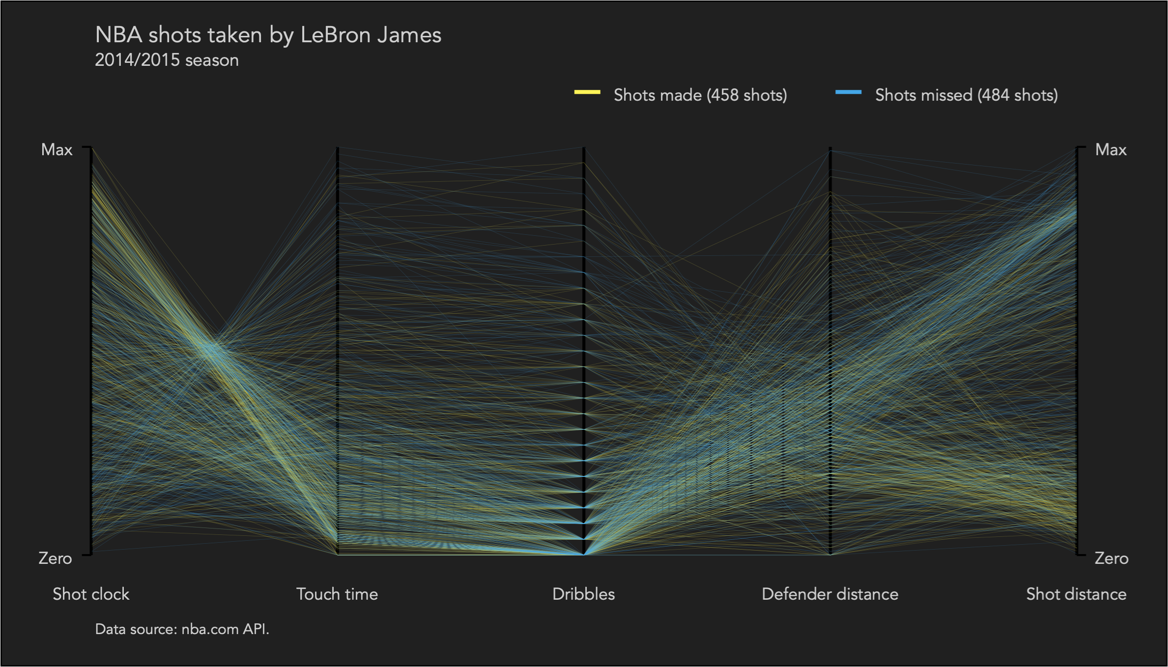
I decode first the positions of the point implantations on the parallel axes. The shots taken by LeBron James have a great deal of variation in terms of shot clock and shot distance, but he mostly maintains a low touch time and number of dribbles. In terms of shot success, he seems to make more shots with more time on the clock and shorter shot distance, while surprisingly the defender distance does not seem to be play a defining role.
Next, I decode the directions and density of the line implantations connecting the points. Many shots are made with more time on the clock, low touch time, low number of dribbles, and medium defender distance, and almost half are very close to the basket and the other half far away.
Here is how this looks for Stephen Curry:

It is remarkable that the two players have nearly identical number of shots made and missed, and the patterns in the parallel coordinates graph look remarkably similar.
The data suggests similar patterns for Stephen Curry as with LeBron James, but with the key difference that Stephen Curry has a much more tight variation in shot clock, touch time and dribbles. Specifically, Stephen Curry likes to take shots with more time on the clock whereas LeBron James also takes last second many shots. It is also surprising (to me at least), to see that Stephen Curry, although being a point guard, he keeps the ball much less than LeBron James.
Download the Stata code for reproducing this analysis: nba.do


