Graph objective
I recently read a very interesting analysis on the modern evolution of Human Height during the 20th century by Our World in Data, which is a great place to learn about current trends in our world.
The analysis demonstrates that although genetics is the most important factor for determining height, human growth can be hindered by malnourishment, diet, disease and health care. The analysis also draws a convincing correlation between human growth and economic development.
The analysis is impressive, but I want to add to this analysis one more piece of information. I would like to see a ranking of countries from shortest to tallest in 1896, and how their average height has changed in 100 years. I do not want to draw any correlations with other variables. I just want to see which countries have experienced the most dramatic leaps in human growth and which have stalled, or perhaps reversed. Then, we can think about factors that may be driving this ranking.
Data management
The data was originally sourced from NCD-RisC. The dataset contains heights at age 18 as recorded from 1896 to 1996, for both men and women. Given the large graphical output, I analyse only the data for women. However, the Stata code provided at the end of this page can be easily adapted to look also into the height for men.
There are 100 years of data, from 1896-1996, and 200 countries. Given the complexity in the data and the excessive year-to-year variation, I reduce the data to three points in time: 1896, 1946 and 1996. The 50-year intervals will help explore the changes in height in the pre- and post-WWII period. Again, given the availability of the Stata code, one could easily adapt the code to explore other periods.
Visual implantations
I plan to organise the graph showing a list of countries in a vertical orientation (on the y-axis), like reading a long list from to bottom. The x-axis will show the scale of height in centimetres (cm).
I apply the point visual implantation to encode the magnitude of height (position) in three points in time: in 1896, 1946 and 1996.
In addition, I apply the line visual implantation to encode the magnitude of change in height from 1896 to 1946 and from 1946 to 1996.
Retinal variables
Given the long list and the many stacked horizontal lines, I make use of the shape retinal variable to apply appropriate markers for encoding the magnitude of height in different years: in 1896 I apply a small dot that appears indistinguishable from the overlaid line; in 1946 I apply the pipe symbol ‘|’ that indicates a ‘break’ in the time series (like a turning point); in 1996 I apply a much large dot that is noticeable and acts as a natural ‘stop’ to the lines.
The height in all countries has increased from 1896 to 1946, but for about one third of the countries the height decreased from 1946 to 1996. To distinguish increases from decreases I employ the use of the colour retinal variable.
I also adjust the size retinal variable to make the many line implantations and the pipe symbols a little bit thinner so that they are easier to decode.
Graph identification
The colour retinal variables are internally identified using a legend that is placed at the top of the data graph (i.e. one of the first pieces of information that one reads). The legend explains how blue lines and a pipe markers encode increases in height, and red lines and pipes encode decreases specifically during 1946 and 1996, and also a how large dot encodes heights in 1996.
I directly identify all country-specific values of heights in 1896 and in 1996. This means that where there are decreases in height from 1946 to 1996 (the red lines and markers), the identified values in the right hand side are representative of 1996 whereas for decreases is it the marker that is shown in the middle of the line. I acknowledge that this is a non-intuitive form of identification that could confuse decoding and I am open to suggestions for improvement.
External identification includes a grant title identifying the graph objective, plus a note acknowledging the data source. The y-axis identifies the names of each country. As some country names are much longer than others, I reduce the length of the lengthiest names without loss of context, e.g. change ‘Micronesia (Federated States of)’ into just ‘Micronesia’.
Graph enhancement
Given the very long list of 200 country names I apply a tall aspect ratio, that allows for accurate decoding of every country.
I reorder the countries in from shortest height to tallest height as measured in 1896, to focus more on the question of how much height has increased for each country given their starting point. This helps decode information related to the theory that there is a biological limit to how much or how fast humans can grow, and if a country’s citizens are already quite tall then they will not have as much room to grow as other countries.
I have tried also ordering using height as measured in 1996, which brings the focus to what is more relevant today, an equally interesting question.
I also add an alternating value grid on the y-axis that I shade in light grey, in order to help decode the many country labels and their associated values.
Visual decoding/perception
Below is my proposed solution (right-click to open the image in a new tab to enlarge). The graph orders the countries from the shortest to the largest average height for women at age 18 in 1896.
The country with the shortest height in 1896 is Guatemala and remains to be shortest in 1996. The country with the tallest height in 1896 is Sweden, but in 1996 this title goes to Latvia.
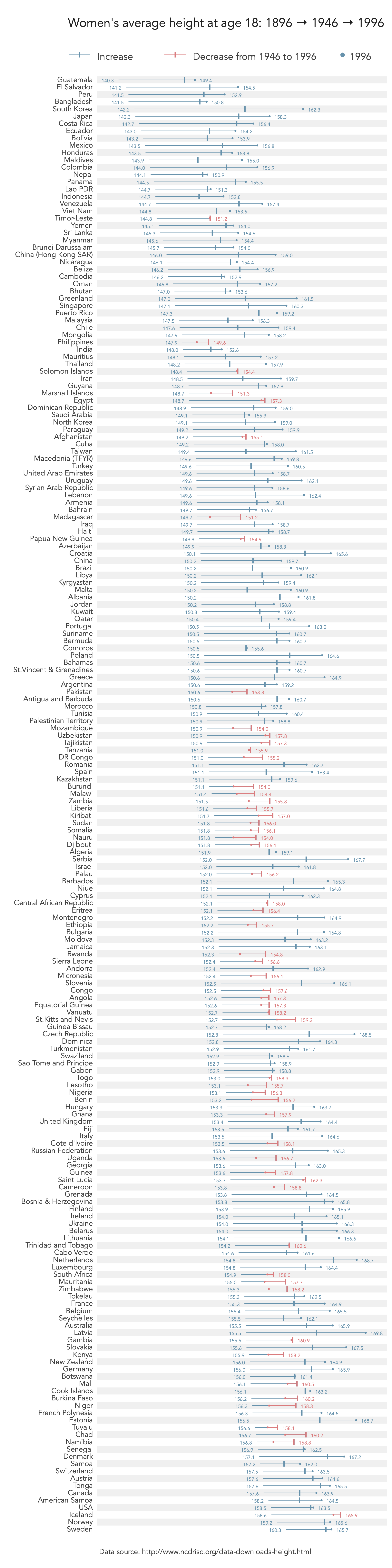
Guatemala’s average height increased by 9.1 cm, Swedens’s by 5.4 cm and Latvia’s by 14 cm. But the most spectacular increase in height was recorded in South Korea, by a whooping 20.1 cm from 1896 to 1996. The smallest increase was Namimbia and Niger by just about 2cm over 100 years. In fact, as shown by the red encoded lines, the women’s height in these two African nations increased considerably in the first 50 years, bit then decreased from 1946 onwards.
The other interesting piece of information is during the first 50 years (1896 to 1946) there was a steep increase in height overall, across almost all nations. However, in the last 50 years (1946 to 1996) there was either a much slower increase in height and about 1/3 of nations, and particularly a great number of African and Middle Eastern nations, have recorded sharp decreases in height.
Download the Stata code for reproducing this analysis: height_countries.do


