I extend the analysis on BHP’s real capital stock-and-flow movement in the following ways: (i) I observe also the 2017-2018 financials, (ii) I adjust for inflation, (iii) and produce a competing data graph, that is widely known as the ‘waterfall’ chart.
Graph objective
The Graph Objective remains the same as in BHP’s real capital stock-and-flow movement. That is, I wish to demonstrate how the stocks of capital investment of BHP Billiton Ltd has accumulated over the period 2011-2018. Real capital is a stock cumulative measure at a given point in time. The stock of real capital accumulates with periodic flows, through replenishment (new capital expenditure and acquisitions) and depletion (depreciation, disposals, divestments and impairments). In addition, I also show the periodic effect of inflationary pressure to the value of real capital.
Data management
I observe the Producer Price Index from the Australian Bureau of Statistics, from ABS’s Table 11 Input to the Coal mining industry. I observe the index as at every 30th of June, which is also BHP’s year-end. I input these data by hand and express the index in terms of 2018 AU dollars.
The data on financials is observed from BHP’s annual reports 2011-2018. I adjust the data presented in BHP’s real capital stock-and-flow movement to have only three periodic flows: overall replenishment, depletion, and the effect of inflation adjustment. Then, I merge the two datasets.
I then calculate the running sum of real capital by year, to show how replenishment increases the beginning real capital and how depletion reduces this amount, in cumulative terms. In order to construct the waterfall chart, I generate the lagged cumulative variable of the previous step in time. The current and the lagged cumulative will form the range for the waterfall bars for flows. The stocks of property, plant and equipment will range from the baseline of zero. This data management step is the key for making a waterfall chart.
The Stata code for inputting the data, and managing the data as described above is provided at the end of this page.
Visual implantations
A waterfall chart applies consecutive area implantations, in the form of ‘range bars’, that is bars with a specified baseline and maximum. The stock measures of cumulative property, plant and equipment (PPE) are encoded using bars that drop to the baseline of zero, thus indicating a measure that accumulates over time.
The periodic flows of replenishment, depletion and inflation adjustment, are encoded using range bars that measure the change in stocks, and explain how one the opening stock accumulates to the closing stock.
Retinal variables
The colour retinal variable is used to distinguish between the four categories encoded by the range bars: PPE, replenishment, depletion and inflation adjustment. I apply non-saturated colours as borrowed from Pantone’s colour of the year, which is a great source of beautiful soft colours for contrasting categories.
The effect of inflation adjustment is shown with hollow bars to reduce its visual prominence because this is a macroeconomic factor that is commonly felt across companies and not a consequence of BHP’s operations, i.e. there is nothing that BHP can do to counter this effect.
Graph identification
Internal identification provides a legend that identifies the use of different colours on the four categories.
Direct identification provides the value of property, plant and equipment (the stock) for each year using white coloured cont against the bar’s background. I choose white font because the key message of the graph is the comparison of the bar heights for PPE, and the data value is only provided for reference purposes.
External identification identifies the financial years on the x-axis, adds a grand title that identifies the key message of the graph, plus a note that acknowledges the data sources and the inflation-adjustment.
Graph enhancement
The aspect ratio is widened to convey the feeling of a long a period of time, thus reinforcing the message of the consequences of falling real capital.
I suppress the y-axis scale and instead show only the value of PPE at the end of every year. I also suppress the x-axis line, ticks and grid and show only the labels (the years).
I place the legend in the top right hand side, within the plot-region in order to save space, because if the legend was placed in the graph-region then it would reduce the effective space for graphing.
I reduce the visual prominence of the note, the legend and the title.
Visual decoding/perception
Here is the proposed graph:
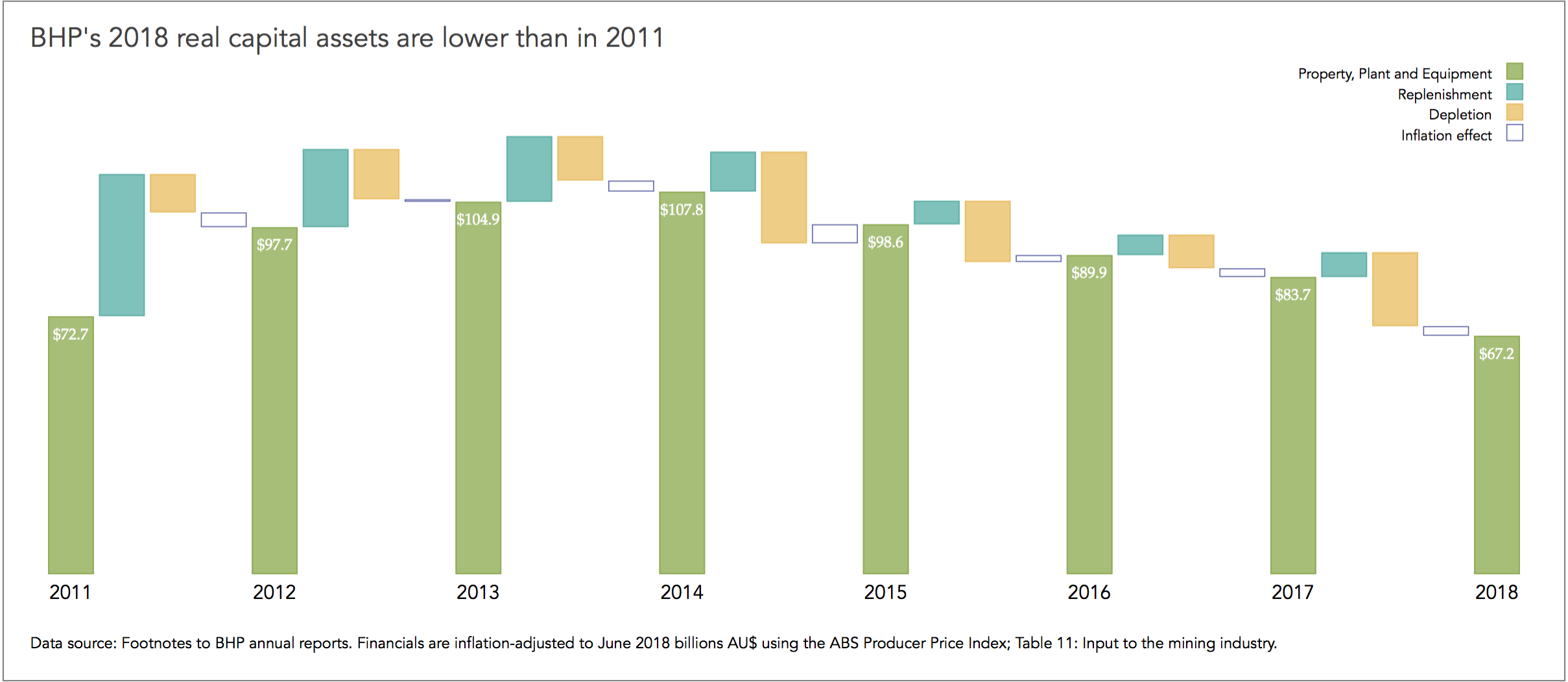
The waterfall chart explains how BHP’s real capital has accumulated in value over the period 2011-2018, resulting in a lower real asset base in 2018 by comparison to 2011. The fall begun during the 2014-2015 financial period when the price of oil, iron ore and copper fell considerably, plus a large cost from the demerger of South32. The fall continued in 2015-216 with the Bento Rodrigues tailing dam disaster that was constructed by Samarco and is owned by BHP to accommodate the waste resulting from the extraction of iron ore.
BHP has yet to recover its asset base.
Download the Stata code for reproducing this analysis: bhp_ppe_waterfall.do


