Graph objective
A PwC UK 2016 report on “Assessing the size and presence of the collaborative economy in Europe” was prepared for the European Commission’s Directorate-General for Internal Market, Industry, Entrepreneurship and SMEs (DG GROW). The narrative is very interesting but the graphical analysis in this report is dismal. I will focus my ire on just one of the data graphs produced.
Figure 3 of this report aims to show the scale of revenue and transaction value that is facilitated by collaborative economy platforms in Europe during 2013-2015. This is Figure 3:
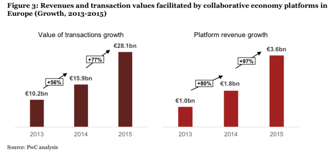
There are so many problems with this graph.
First, the data graph violates the quality of accuracy because it lies by suggesting that the two sets of bar charts are directly comparable. But they are not because they are on a different scale; notice how the €10.2bn bar is lower than the €1.8bn bar.
It violates the quality of accuracy a second time by incorrectly encoding the angles of the arrows that are supposed to represent the steepness in growth, e.g. notice how the arrow on +56% has a steeper angle than the arrow on +80%.
Third, it violates the quality of relevance. What is the point of the arrows? Is it not obvious that there is positive growth?
Fourth, it violates the quality of consistency. Why the different colour values of red on the two sets of bars? What are they supposed to mean? In fact, the choice of colours is inconsistent with the overall analysis in the report. Have a look at the report and see how these two colours are used. In Figure 2, that is presented adjacent to Figure 3, these colour values are used to encode the categories of ‘On-demand household services’ and ‘Collaborative Finance’. In Figure 4, these colour values encode the categories ‘>50’ and ‘>25’.
By reading the report, I identify two graph objectives relevant to Figure 3. The authors draw the following insight: “We estimate that last year, these platforms doubled their revenues in Europe.” This message is exactly repeated in page 3, page 6 and again in page 22. If this is the key graph objective then I struggle to see the benefit of this visualisation. It would suffice to just say “The platform revenue has increased from €1bn to €3.6bn during 2013-2015”, or if one wants to be more detailed “The platform revenue has nearly doubled from €1bn in 2013 to €1.8bn in 2014, and doubled again to €3.6bn in 2015”. In this respect, the graph violates the quality of simplifying complexity.
However, it appears to me that Figure 3 is supposed to serve a second graph objective. The authors argue how platform revenue in the collaborative economy has facilitated a considerable volume of transactions that is also shown to grow very fast. This is an important insight, but I cannot see how the current graph gives justice to this insight. Also the message is mixed. I am not sure what is most important: the magnitude of transaction value or the relative growth? The graph fails to show the latter altogether, that is it fails to reveal the diminishing economies of scale. In 2013, the €1bn platform revenue generated 10.2 times transaction value (10.2/1), in 2014 it was 8.8 times and in 2015 it fell to 7.8 times.
Data management
The source of the data is Figure 3 above. There are only 9 numbers in this graph, the three years and the six values expressed in billions of Euro.
The only data management necessary is to calculate the ratio of transaction value to platform revenue. This ratio measures the transaction value multiple relative to the revenue generated by the collaborative economy platforms. I do not find it useful to calculate any growth rates.
Visual implantations
The first graph objective is met by simply emphasizing the narrative. The report did this by repeating the same quote three times in the text. If the growth in platform revenue over the three years is such an important message then one could simply emphasize this message by means of a highlighted quote. This is not a data graph question, but I provide an example below (yet this is not something I would like to encourage).
The second graph objective needs more thought. The report wants to convey the message that the revenue growth in collaborative economy platforms has facilitated the growth in the value of transactions. This has important implications for policy makers, e.g. for added-value taxation. It doubt, however, that it suffices to show only the nominal value of transactions. I suspect that policy makers would also want to know about the diminishing economies of scale, that is to say that the transactions value relative to the platform revenue is falling.
Therefore, there are two measures to be visualised: (i) the value of transactions in billions of Euro exactly as originally visualised in the report, and (ii) the transaction multiple relative to the revenue generated by the collaborative economy platforms. Both of these can be shown in terms of billions of Euro so they can share a common scale. However, they must be clearly distinguished as separate measures. As such, I maintain the bar feature for total transaction value (i.e. an area implantation) as in the original graph, and I overlay a line implantation for the transaction multiple. In addition, to emphasize the position of the multiple measure I also encode a point implantation, which acts as the connecting points for the line.
Retinal variables
The area implantation occupies greater graph real estate than the line but the messages conveyed by both the area and the line are of equal importance. In an attempt to balance out their visual prominence, I choose a ‘quiet’ colour for the bars (colour retinal variable) and subdue its saturation (value retinal variable).
At the same time, I select a much darker contrasting colour for the line and increase its thickness (size retinal variable). The point implantation that indicates the line connection is encoded with the same colour and thickness as the line itself but with a hollow circle (shape implantation) so that it accentuates the position.
Graph identification
The area and line implantations are internally identified using an explanatory legend. The legend is placed inside the plot-region to facilitate fast decoding.
Given the small dataset, the data values are directly identified inside the bars and on top of the connected line using associative colours. The legend makes it clear that the values can be interpreted on the same scale.
External identification follows the guidelines of the original graph, including a title labelling this graph again as ‘Figure 3’, and a note that identifies PwC as the original source. In addition, I identify the years as x-axis labels and make it clear on the y-axis that there is a common baseline value is 0.
Graph enhancement
The most important graph enhancement step is the control of the aspect ratio. The default aspect ratio is wider than taller which makes the line looks relatively flat. This is misleading view that is corrected by calculating the optimal aspect ratio (using the Stata command optaspect) that explains that the best graph size for comparing the successive angles is about 1:1.
I reduce the width of the bars in order to emphasize the differences between years and make it easier to decode the change over time. I suppress the y-axis scale features with the only exception of the 0 value. I also suppress the x-axis sale line and reduce the visual prominence of the plot-region line but still choose to maintain its outline.
Visual decoding/perception
Here is my proposed solution to the first graph objective:
This signposted quote could have been highlighted in the report from the outset, as one of the most important findings. Notice how I avoided to talk about growth rates as there is insufficient time series data to do so.
Here is my proposed solution to the second graph objective:
The data graph shows that although the total value of transactions has been increasing, the transaction multiple relative to platform revenue is falling, i.e. a form of diminishing economies of scale. This is an insight that is not conveyed by original graph and not discussed in the report.
Download the Stata code for reproducing this analysis: collaborative_economy.do


