Graph objective
I am prompted to this analysis of US life expectancy for males, by reading the Stata version 15 manual entry for [G2] graph twoway line (p.278). In this manual entry, we are given some ill-fated advice for creating, what is claimed to be “an informative and visually pleasing graph”. Here is that graph:
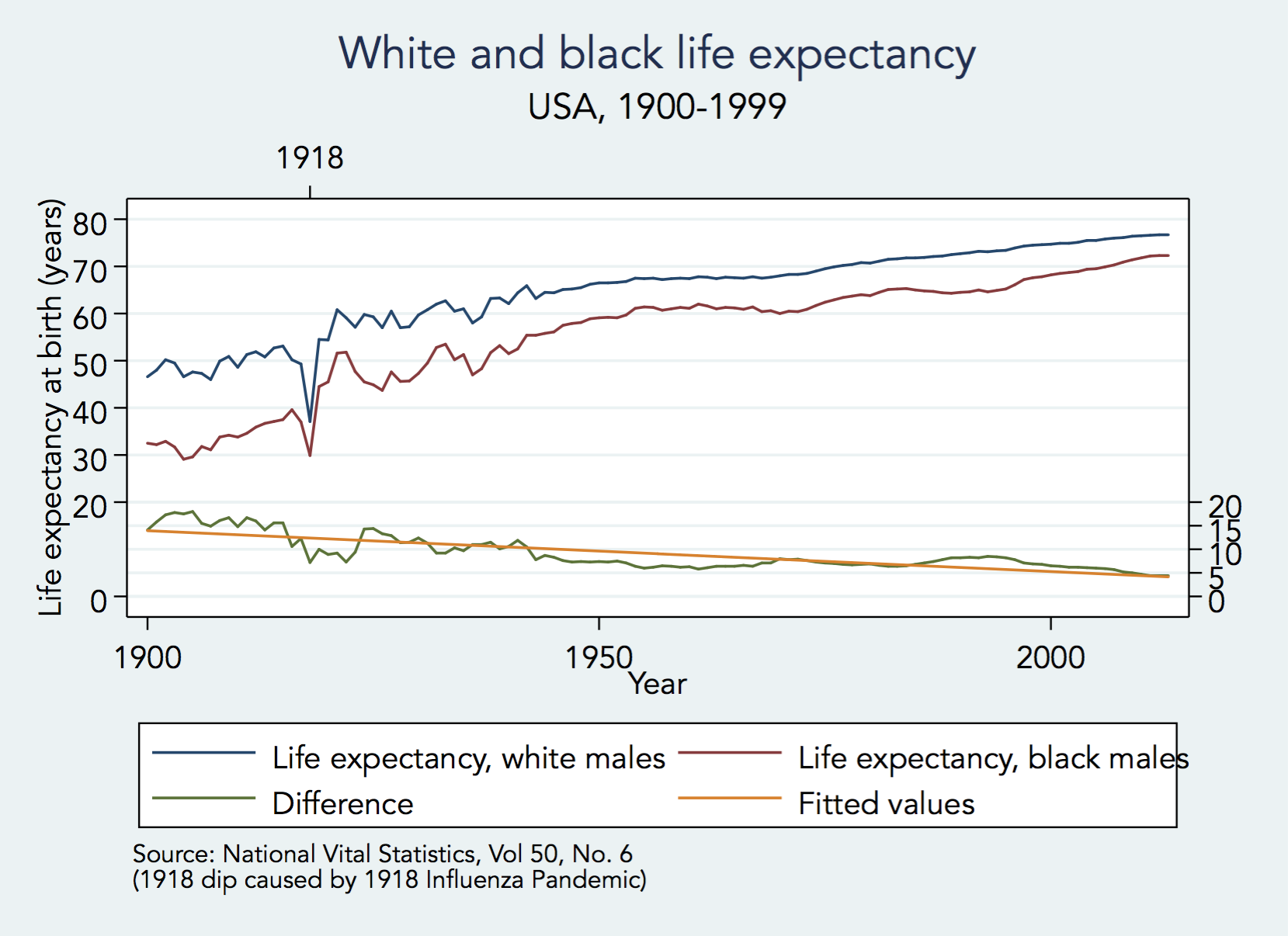
The graph satisfies the qualities of accuracy and completeness but fails in all other qualities for data graphing: relevance, consistency, efficiency, complexity and design. The visual prominence of the data is very low by comparison to the visual prominence of supportive identifying information. The data-to-ink ratio is very low indeed.
The graph objective is to report the time evolution of US life expectancy for black and white males, up to date. In the graph above, the linear fit on the difference in life expectancy is quite misleading as it suggests elimination and eventual reversal of the difference in life expectancy between white and black males.
Data management
The data used in the Stata manual is sourced from the National Vital Statistics, Vol.50, No.6. I update this data using the latest 2018 National Vital Statistics Reports Vol.67, No.5, Table 4. I revise the 2006-2013 estimates of life expectancy as per the latest report due to a change in methodology and include updates up to 2016.
The only other data management that is required is the calculation of the difference between the life expectancy for black and white males.
The Stata code for reproducing the data management and the rest of the analysis is provided at the end of this page.
Visual implantations
The Graph Objective suggests the use of two contrasting two timeline plots, thus the use of two line implantations: one for white male life expectancy and another for black males. We could contrast the two life expectancies in many other ways but using a timeline is very helpful in this case as I plan to encode key events on the timelines in order to provide context.
Contrasting the difference between two timeline plots is not an easy task, because we do perceive the vertical distance as the difference but rather the shortest distance between the two lines. Therefore, because the decoding of the difference in life expectancies is a key part of the Graph Objective, I also use an area implantation to encode the difference in life expectancies against the baseline value of zero (a key policy target).
In addition, I encode a collection of point implantations that encode key historical events that can help explain sharp declines in life expectancy, such as the 1918 influenza pandemic and the 1926 tuberculosis outbreak.
Retinal variables
I apply the colour retinal variable to contrast the qualitative categories of white males vs. black males. I choose two neutral colours that do not imply any ordered variation but also do not carry any racial connotation (e.g. using black to for black males).
The timelines are encoded with a thick line (size retinal variable) in order to increase their visual prominence.
The area implantation that encodes the difference in life expectancy is encoded with a lightly shaded colour that does not detracts attention from the two timeliness yet still is sufficiently visually prominent.
I choose the hollow circle (shape retinal variable) for the point implantation to encode the key events, and to enable direct comparison I repeat the encoding of the same events on every timeline.
Graph identification
I internally identify each timeline plot next to each line, describing one as “white males” and the other as “black males”, as well as the area plot as “difference”.
External identification includes a graph title and a note acknowledging the data source. There is no need for axes titles because the year labels on the x-axis are self-explanatory, and the context of the numbers on the y-axis are understood as “years” (as described in the title).
I directly identify the beginning and ending life expectancy values for the observed time period, plus the baseline value of 0 to eliminate any ambiguity.
Graph enhancement
I suppress the y-axis for four reasons: (i) an American Statistical Association graph standard advised to suppress the y-axis lines in timeline plots because they indicate beginning and ending of time, which is not true in this case, (ii) there is no need for a y-axis scale at all because the graph title already describes the measure and the unit of measurement (years), (iii) and I use direct identification to encode the beginning and ending values for each timeline and the area, (iv) table look-up is not an important consideration then there is no need for regular labels or a grid.
I also adjust the aspect ratio to 1:2 given the long time line to allow for comparison for the many successive angles from year-to-year.
Visual decoding/perception
Here is my proposed solution:

Although there is an overall increasing trend in life expectancy from 1900-2016, there is considerable variation before 1945 due to a number of devastating events.
Most recently, in 2015 and 2016, the US experienced two consecutive years of decline in life expectancy for both white and black males. After some basic research, I discovered this decline is due to a combination of reasons, and mostly attributed to the rise of deaths from the deadly diseases, including heart disease and cance, Altzheimer’s, and also because of the opioid epidemic.
The gap between the life expectancy of white males with black males is decreasing from 14.1 years to now about 4.6 years, but it seems to have stagnated between the range of 4.6-7.8 years for many decades.
Download the Stata code for reproducing this analysis: life_expectancy.do


