Graph objective
The graph objective is to draw insights on the likelihood that any given year is a year of positive or negative returns on the FTSE all-share index. The source of inspiration for this graph objective is the following visualisation approach:
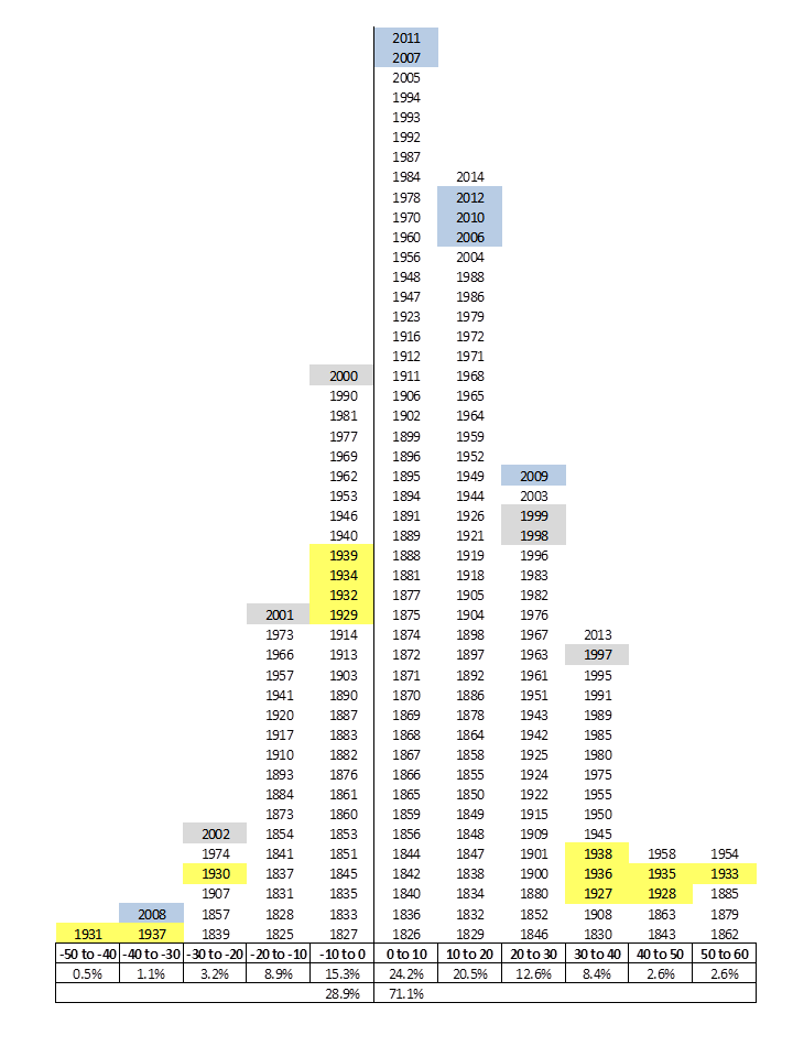
The graph is sourced from the blog ‘A Margin of Safety‘, but is also reported in slightly different forms here, here, here and many other places, but I was not able to track the pioneer of this visualisation approach, so please let me know if you happen to know who did this first.
Visualising annual stock returns in this way gives insights not only on the frequency or returns and the likelihood of how a year will turn out to be, but also on how a very bad year is likely to be followed by a very good year. Indeed, the graph suggests that if one survives the turmoil of an economic recession s/he will be nearly always be compensated the year after.
Data management
The historical data from 1800-2007 is sourced from Finfacts Ireland, augmented with data for the latest years from Yahoo! Finance.
To achieve the result of the above graph, I apply the following data management process. First, I calculate the annual return and categorise it into increments of 5%, e.g. from -10 to -5%, from -5% to 0%, from 0% to 5%, and so on. Note that the example graph above uses 10% increments. These binned categories form the x-axis that is assigned an index from lowest to highest. Then, I classify each year as belonging to each 5% return category according to its annual return, and sort the years from earliest to the latest by again assigning an index; these form the y-axis values.
The Stata code provided at the end of this page describes all data management steps.
Visual implantations
The graph is effectively a scatter plot, that uses the point implantation to encode the coordinates of two indices, each taking the values of 1,2,3…,n. The x-axis is an index from lowest to highest classes of 5% annual returns. As shown in the graph at the end of this page, the x-axis assigns the value of 1 for years with (-60%,-55%] annual returns and the value of n=40 for years with (125%,130%] annual returns.
The y-axis represents another index of those years that have the specific range of annual returns sorted from earliest to latest so the the latest years appear at the top of each bin. For example, there is only one year that has recorded the extremes of (-60%,-55%] and (125%,130%] annual returns, so the y-axis index for those cases is only 1, for the years 1974 and 1975 respectively. But for the x-axis index equal to 6, related to returns (-60%,-55%], there are two years recording these range of annual return, the earliest year being 1973 (y-axis index 1) and the latest year being 2008 (y-axis index 2).
In other words, the (x,y) coordinates for year 1974 is (1,1), for 1975 is (40,1), for 1973 is (6,1) and for 2008 is (6,2). Then, the scatter plot uses direct labelling to show marker labels of the years.
Retinal variables
I use the colour retinal variable to distinguish positive return years in black and negative return years in red. This follows the intuitive connotations associated with red and black in the financial world.
Graph identification
The most important design aspect of this graph is the direct identification of all data values from the year variable. Specifically, I suppress the scatter points and replace them with the values on years, thus giving the impression of a tabular display of data values. Each year value is specific to a coordinate.
The internal identification of the colour retinal variable is achieved by adding some text in the plot region, that explains how the red coloured years indicate negative returns and the black coloured years indicate positive returns. I also calculate the percentage of each region as a suggestive empirical probability, i.e. it is more likely to have a positive return year than a negative return year.
External identification includes a title and a note that acknowledges the data source and explains how years are stacked from earliest to latest. In addition, I provide detailed x-axis labels to explain the categorisation of returns into 5% bins.
Graph enhancement
The graph benefits from a wider aspect ratio that helps decode the detail in a density form that spans over a wide range of variation. There is no need for a y-axis so this is suppressed, and the x-axis index labels are replaced with meaningful information of the return range categories.
A reference line at 0 further emphasises the partition of negative and positive returns. To reinforce this division and add more context, the reference line is then shown to follow two directions, to the right are the positive returns, and to the left the negative returns. The encoded arrows make clear the directions.
Visual decoding/perception
Here is my take on this type of approach:
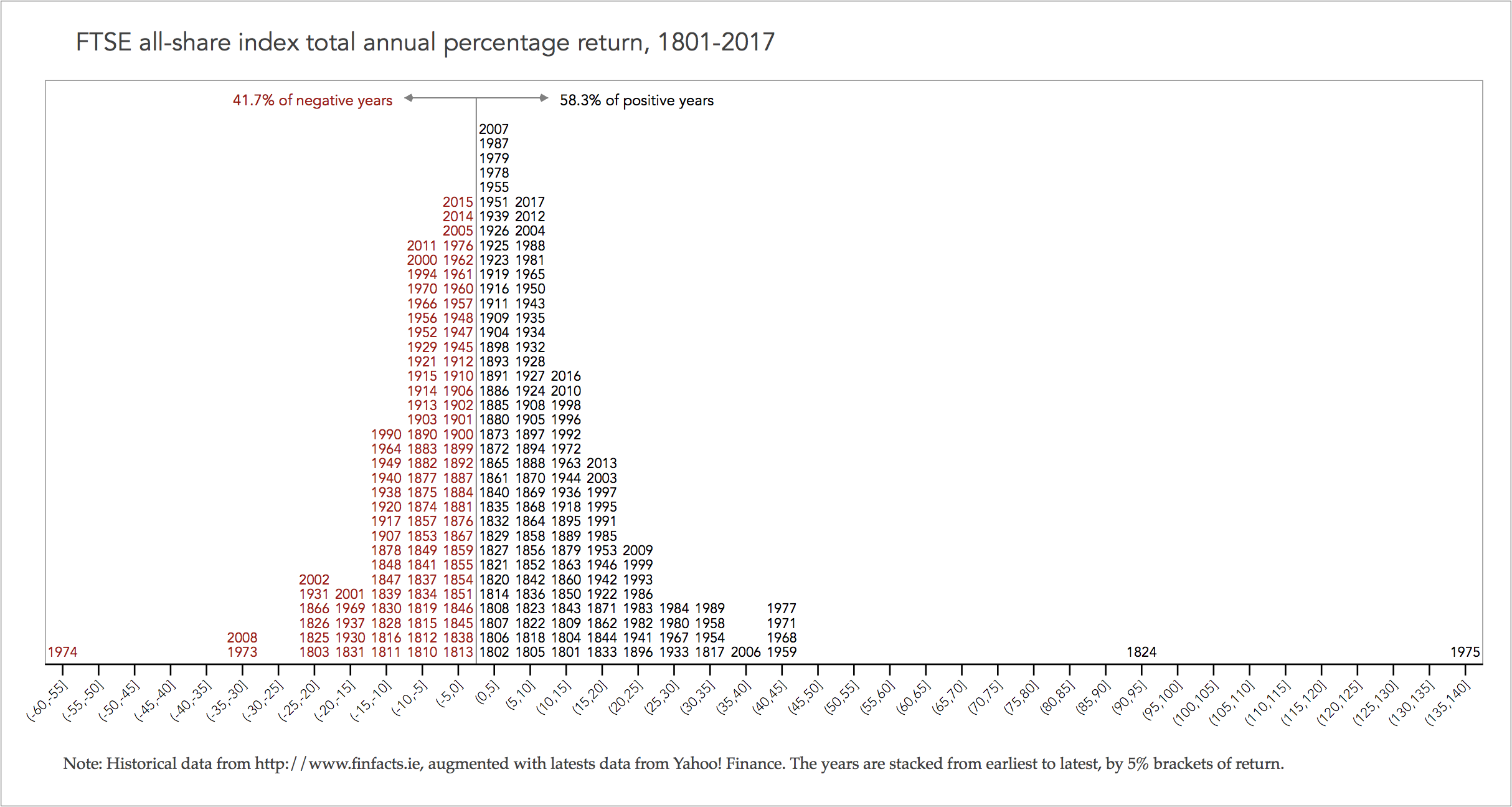
The graph shows that, for any given random year, it is more likely to observe a year of 0% to 5% return (the most number of years), with the latest year being 2007. The most important message of this graph is that a negative year is nearly always followed by one or more positive years thus compensating these losses, e.g. the 2008 hit of the Great Financial Crisis (aka Great Recession) of -35% to -30% returns was compensated by positive returns in 2009 (20% to 25%) plus 2010 (10% to 15%). Also, if there are two consecutive negative years then the subsequent years can bring even greater positive returns, e.g. in 1973 there was -35% to -30% return and in 1974 there was -60% to -55% return but in 1975 the market rebounded to the historical high of 135% to 140% return.
Download the Stata code for reproducing this analysis: ftse_annual_returns.do


